Community Insights Layer
Using General Analysis projects, you can now build insights faster. Using a combination of reference layers, filters, joins, and the data table, answers are just a few functions away. In this tutorial, we'll focus on interacting with the Analyst Community Insights layers in a large-scale project and finding two specific data values:
What is the Average Median Income within these Census Blocks?
Where are the Census Blocks that fall under & above that value within this location?
Before beginning this tutorial, add the following thematic layers to your Layers list from the Layer Manager:
Community Insights – Block Group (2021)
Community Insights is a collection of Data derived from the American Community Survey.
This dataset includes more than 400 metrics and attributes organized into these categories: population, household composition, employees, age, gender, education, disability, health insurance status, rent burden, heating fuel, year built, rent, income, internet access, language, nationality, poverty, race and ethnicity, transportation, and Veterans.
States
Median Household Income Exhibit
For this workflow, we'll start with how to set up and style this layer and then how to build the style to match this particular data point before making any exports. Then, we'll review how to build a filter highlighting the information for a particular area. We'll use a project focused on the Midwest and Southern US States seen below in its default state.
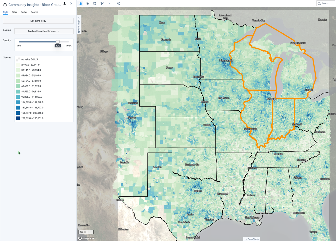 |
The Median Household Income for the Center of the US in Block Group format
Building the Symbology
The Median Household Income for the United States at the time of this ACS 5-Year Average release was $69,100. Considering this fact, we can use the layer's symbology to show that particular metric better. Here is how:
Select and make visible the Community Insights - Block Group (2021) layer.
Change the display column to Median Household Income.
In the Style menu, select Edit Symbology.
By default, the layer will display 12 Classes in a Natural Breaks (Jenks) format. We will select 7 stops to allow for 3 stops above and 3 stops below the median.
Use the Fill Ramp button to select the last Teal-to-Orange Diverging color ramp.
Select the Flip toggle so the lower values are in Teal and the highest areas are in Orange.
Select Save to retain this symbology for the main layer. Any layers that are filtered from this dataset will now match this symbology.
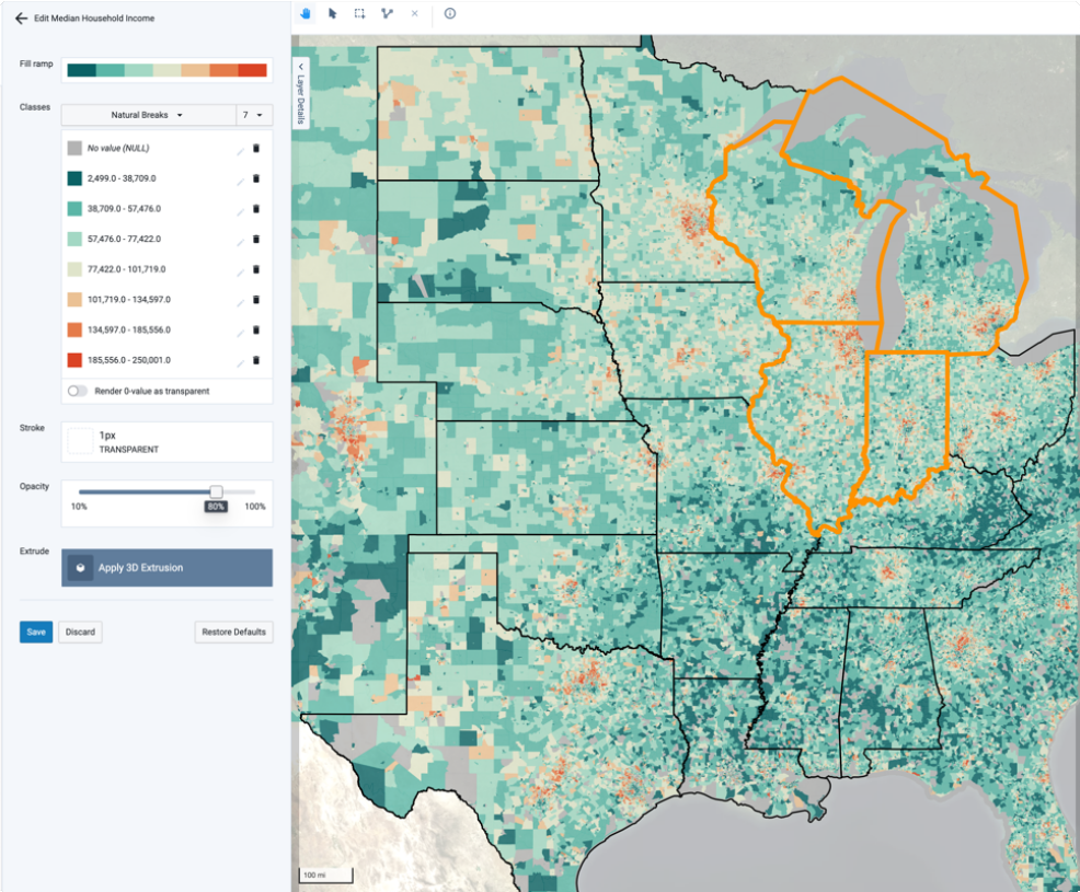 |
You can see in the image above that the system naturally sets up an "Observed Median" breakpoint 77,422 - 101,719 at the primary mid-point color stop. We'll now use the data we acquired from the entire Census table to build that realistic median point.
Click Edit Symbology again.
Select the Pencil Icon on the 4th Data Stop.
Build a $2,000 gap between the median here by inputting "77422" into the Lower Class Bounds field and "79422" into the Upper Class Bounds field.
Select Apply. The visual on the map will update to split the color ramp at that point. From this point, you can update the other color stops to better labeling and color ramps by editing each directly.
Select Save.
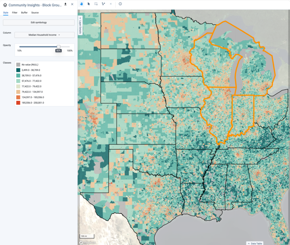 |
The resulting map of the Middle West. Note the reason for using Teal for lower values is because it doesn't overwhelm the user visually as much as an all Orange canvas.
Now that we have the Reference Layer's symbology set up, we'll take the next step and answer an inquiry about a small subset of the states. This will take you through joining and filtering for this layer set.
Filter-to-Area Workflow
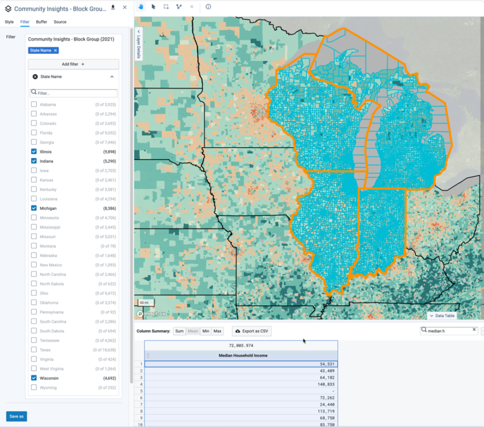
Now we'll prepare a Median Household Income dataset for only the states of Illinois, Michigan, Wisconsin, and Indiana. We'll also include the average median household income number for the region.
First, we must filter down the larger layer to just these states.
Select the Community Insights - Block Group (2021) layer from your Layers list.
Open the Data Table from the lower center of the Map window to visualize the data selection.
Open the Filter menu in the Layer Details sidebar.
Select Add Filter.
Select the State Name column.
Select the States from the list of State Names available. The system will then begin to select the geometries within those areas. Once the selection has been made, the Data Table rows will display the result of that query.
Use the data table's filter columns. Search to find only the "Median" columns in the dataset.
In this case below, I've selected 28,266 Census Blocks from the dataset of the 126,671 total for the entire area. 9.
Selecting the Mean will display the average of the entire column at ~$72k at the block group level.
 |
Next Steps
Now that we've answered the first question around all four states, there are more refinements to this question we could make. Try determining the average median household income across each state, then compare it to the states that border them.
Age - Senior Populations
A common workflow that users have highlighted is determining the areas of the country that have a majority or a higher-than-average population of Seniors over the age of 65. In the workflow below, we'll cover a straightforward way of removing some of the less important pieces of the data using symbology.
Visual-Filtering
To Visual Filter, you'll be setting up custom stop ranges as we did before, but using the Percentage column instead of the Median Income.
Select the Community Insights - Block Group layer to activate the layer.
From the Column selector, choose Percent Population Ages 65 and Over.
Open Edit Symbology and begin editing the data stops for the percentage. Since we're focused only on "above average", we'll build a 4-stop mapping of 0-25, 25-50, 50-75, and 75-100.
Within the Fill ramp, select the Light Yellow to Dark Red Fill ramp.
Save the symbology.
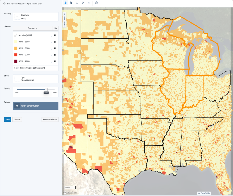
From this point, we will omit some of these color steps quickly by selecting the first and second color stops and reverting them to the #B3B3B3 Grey color.
To add dimension, open the Filter menu and build a filter that selects only the blocks above 50% within the Percent Population Ages 65 and Over.
You can also change the base map in the view to the "Dark" map to make those selections even more apparent:
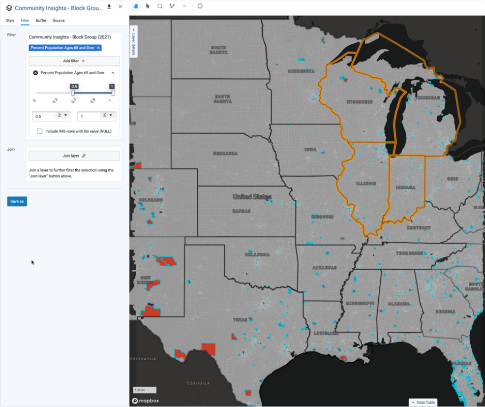
Opening the Data Table and searching "65 and" will reveal all of the relevant population columns.
We can now zoom directly in on specific concentrations of seniors and review the overall data to build quick result consensus.
Next Steps
From this workflow, we could elect to perform the same filtering by the State where these blocks are using the same Column within the Age data. We could also opt to build a secondary analysis where we also review the number of "Other" age groups within these blocks.