Climate Physical Risk Insights
Choose Climate Physical Risk Insights to identify concentrations of business risk across your U.S.-based locations. You can scan potential hazards and compare and rank sites based on current and future risks.
You can compare up to five different types of locations per assessment. Use the location_type field to organize your location portfolio based types that are relevant to your organization. Some examples of what location types could be:
Offices (corporate headquarters and satellite offices)
Retail stores
Multi-family residential
Warehouses
Manufacturing or industrial plant locations
Data centers
Use Case
Template
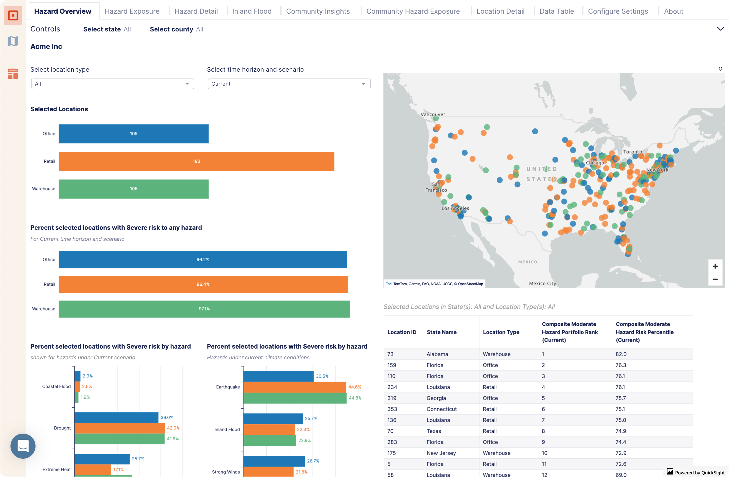 | Hazard Overview – Summarize the hazard risk to all locations in their current and future scenarios. Identify the locations at risk of climate hazards to help you determine which hazards are the biggest concern for the business. |
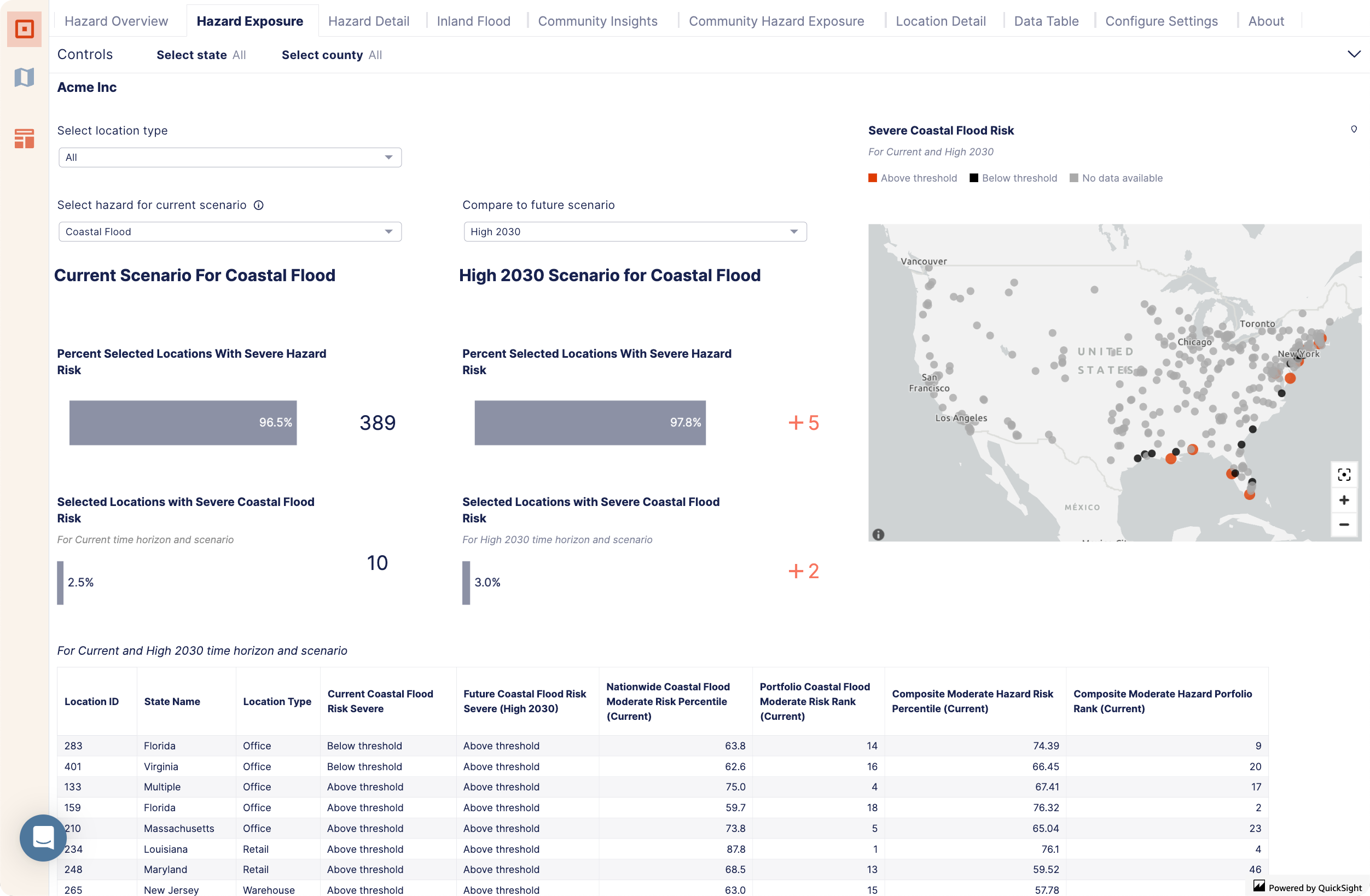 | Hazard Exposure – Choose the specific hazards you want to investigate. Determine which locations are exposed to the selected hazards across different location types. Identify the differences between current and future hazard exposures. Prioritize locations based on the risk from the specific hazard of concern, along with the overall composite hazard risk. |
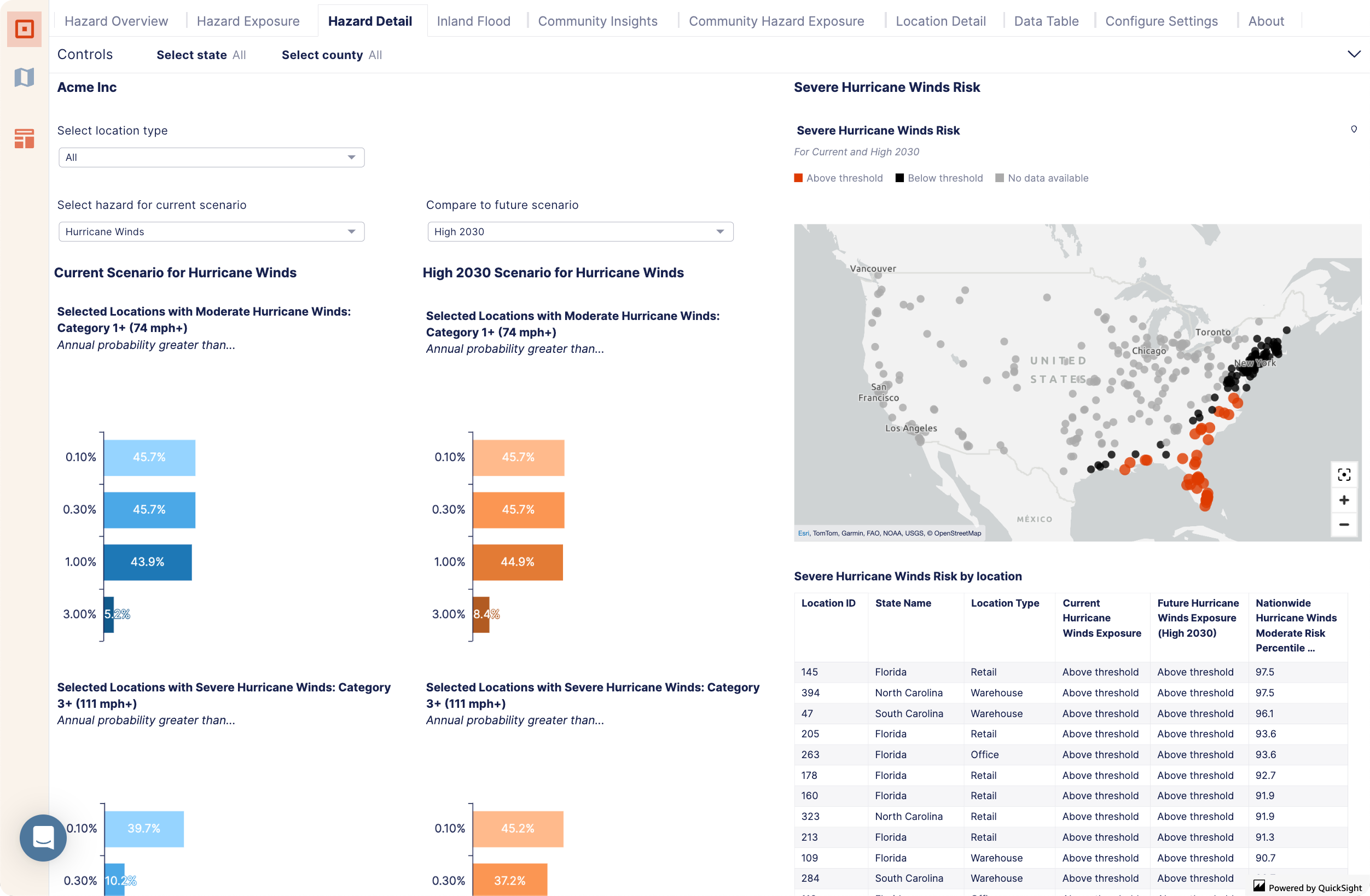 | Hazard Detail – Identify locations with higher hazard severity and changes in severity between current and future scenarios. Prioritize regions based on concentrations of hazard risk at varying severity levels. Hazard detail has selections available for coastal flood, hurricane winds, and wildfire. A separate hazard detail tab is available for inland flood. |
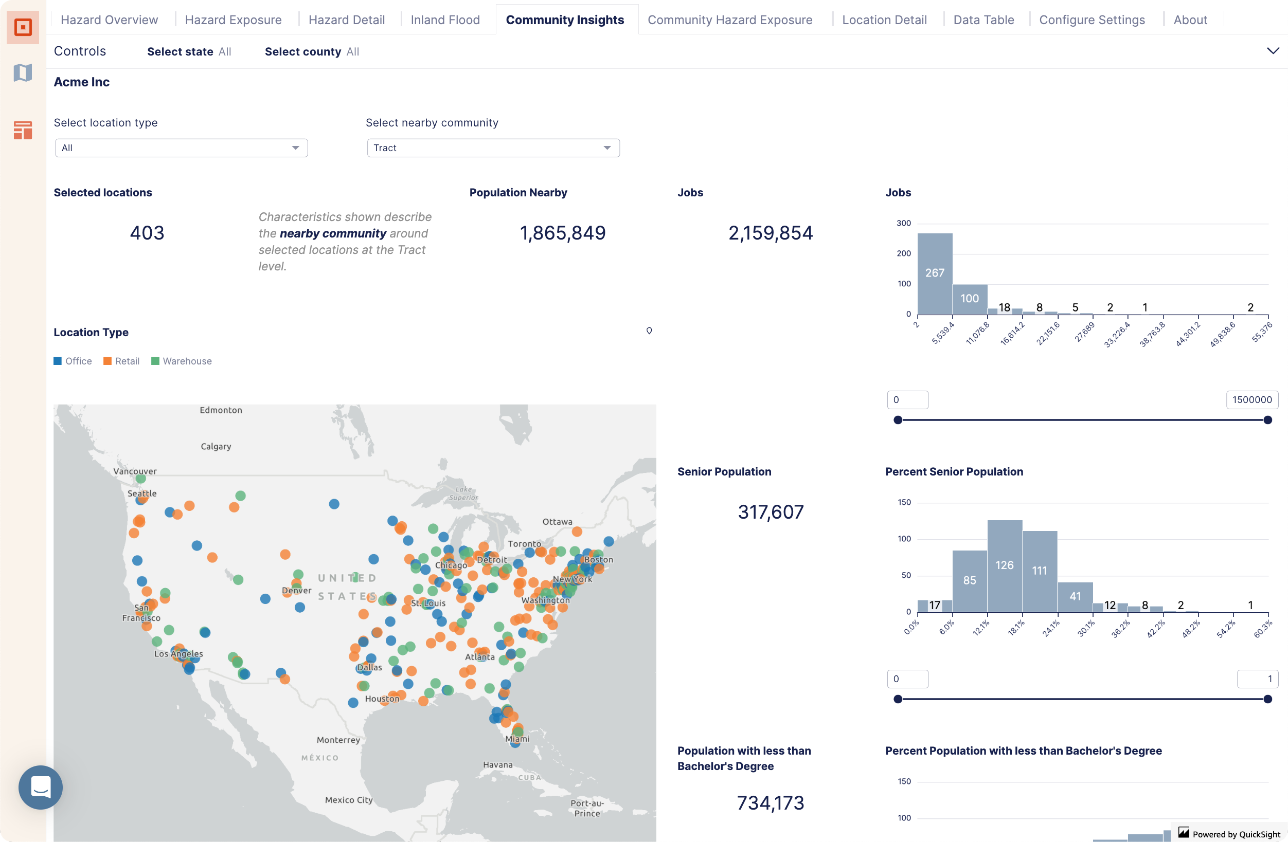 | Community Insights – Build awareness of community characteristics. Identify locations in communities that meet the criteria for an investment based on a selection of community metrics. You can use this information to profile the customer characteristics or employment shed in the nearby community. |
 | Community Hazard Exposure – Build awareness of community hazard exposure. Identify areas with higher or lower population exposure to specified hazards, including flood, coastal flood, wildfire, and hurricane winds. |
 | Location Detail – View details about a single location. Navigate from tables in other sections directly to a specific location to view its details or search for a specific location using its ID. |
 | Data Table – View and download key metrics about each location and view hazard risk summaries by scenario. If you export these tables, the datasets (available in the project) include more than what's shown in the dashboard. |
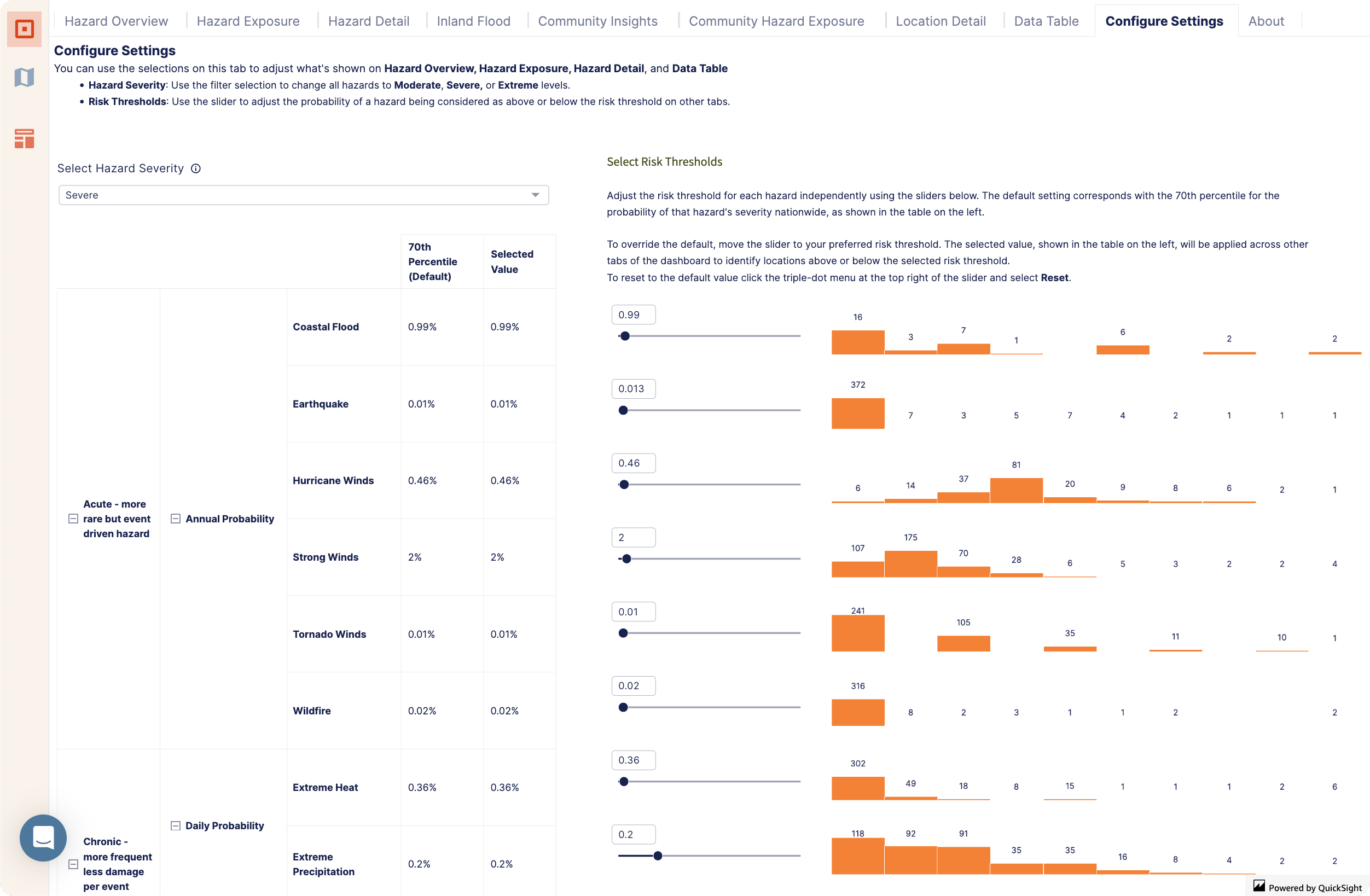 | Configure Settings – Adjust how risk summaries are presented throughout the dashboard. |
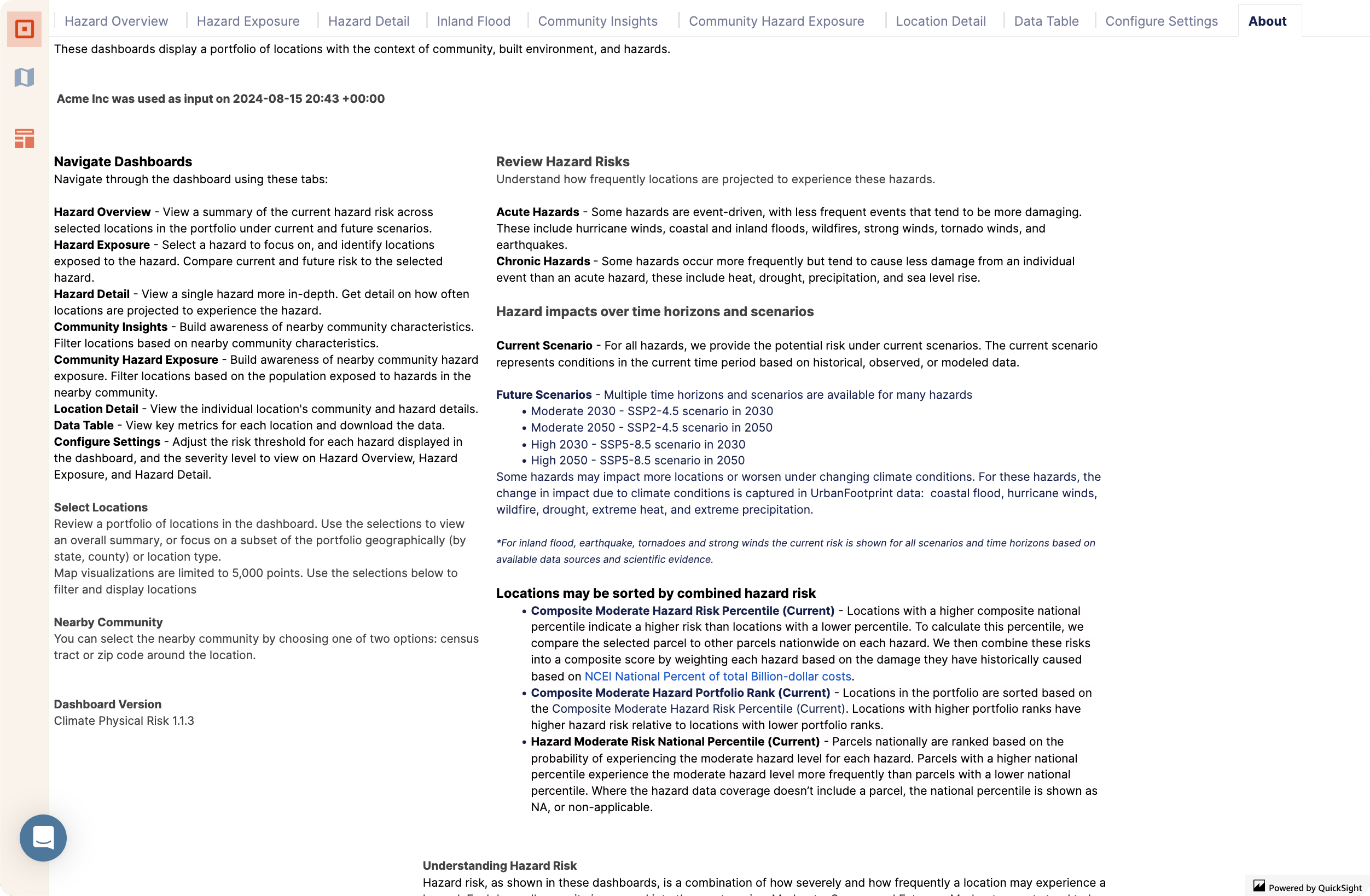 | About – Understand specifics about the metrics shown in the dashboard. |
Process
Climate Physical Risk Dashboard Workflow
This example shows how to find your assets, prepare data to run the Climate Physical Risk Insight dashboard, and review the resulting analysis.
Find Locations
Start by gathering your data. You can use any of the curated data sets available in the Layer Manager, or find your own from external data sources. In this example, both curated data sets and external sources are used to gather locations for the dashboard.
Create a General Location Analysis project to search for locations across the entire U.S.
In this example, we create a project in the Miami-Dade County area with county set as the boundary type.
Find your assets in the curated data sets available in the Layer Manager or other data sources and add them to the Layers list.
The example layers include:
Fire and Emergency Medical Services (EMS) Stations (2024)
Hospitals (2023)
Public Schools (2023)
Colleges and Universities (2022) filtered by NAICS code to only include junior colleges, colleges, universities, and professional schools.
To filter by NAICS code, select the layer and click Filter. Find the NAICS Description filter in the Add filter
 drop-down and select only colleges, universities, and professional schools, and junior colleges. Then, click Save as to save the filtered layer.
US Public Libraries
Data on airports and riverports from the Miami-Dade Open Data Hub
In this example, the external data sets include riverports and airports from the Miami-Dade Open Data Hub, which can be found by searching for ports.
Download any external data sets and upload them to Analyst.
In the example, download the ports data as a GeoJSON from the Miami-Dade Open Data Hub. Then, upload the GeoJSON to Analyst as a new layer.
Connect Locations
You must first consolidate all of your location data into one table before running the dashboard. You also have the option to add a category to your data if you are interested in seeing summary results grouped by location type. Once you have consolidated your locations into one table and added a category column if desired, you can re-upload this information as one layer in Analyst and run Climate Physical Risk Insights. This dashboard enables you to assess, review, summarize, and compare current and future physical climate risk to critical asset locations.
Download the layer data for each of your locations as a CSV with geometries and open each file using your chosen spreadsheet application.
Consolidate and categorize all the locations' layer data into one file, making sure to include the required columns. You can include any additional columns you'd like. In this example, the following columns were necessary:
geometryandlocation_id. Alocation_typecolumn is also included to facilitate results review.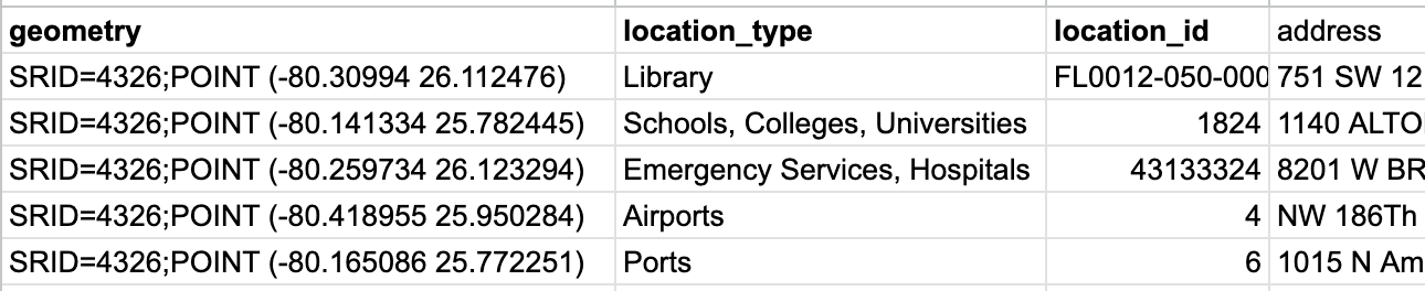
Sample consolidated CSV file showing additional columns
Save your file as a CSV.
Upload your CSV as a layer in Analyst. Click Add > Upload layer, and follow the instructions to create the new layer.
Filter the layer by the project area, which in this case is Miami-Dade County.
To run the Climate Physical Risk Insights, choose your uploaded layer. Then, select Insights > Climate Physical Risk Insights, and click Run Analysis.
The analysis can take up to several hours to run, but the time will vary depending on the number of locations.
Explore Locations
Explore locations in the dashboard for a preliminary overview and comparison of hazard risk.
Once the analysis is complete, you can review the dashboard.
Explore Hazard Overview to see a summary of locations, compare them, and identify the locations that pose risks to critical infrastructure by type.
For example, if you included a
location_typefield in your data, you can focus on one location type. Double-click the first location type in the ranking, which is Emergency Services, Hospitals, and select Focus only on Emergency Services, Hospitals. You can identify the top 5 locations in the location type with the highest risk by viewing the composite hazard rank.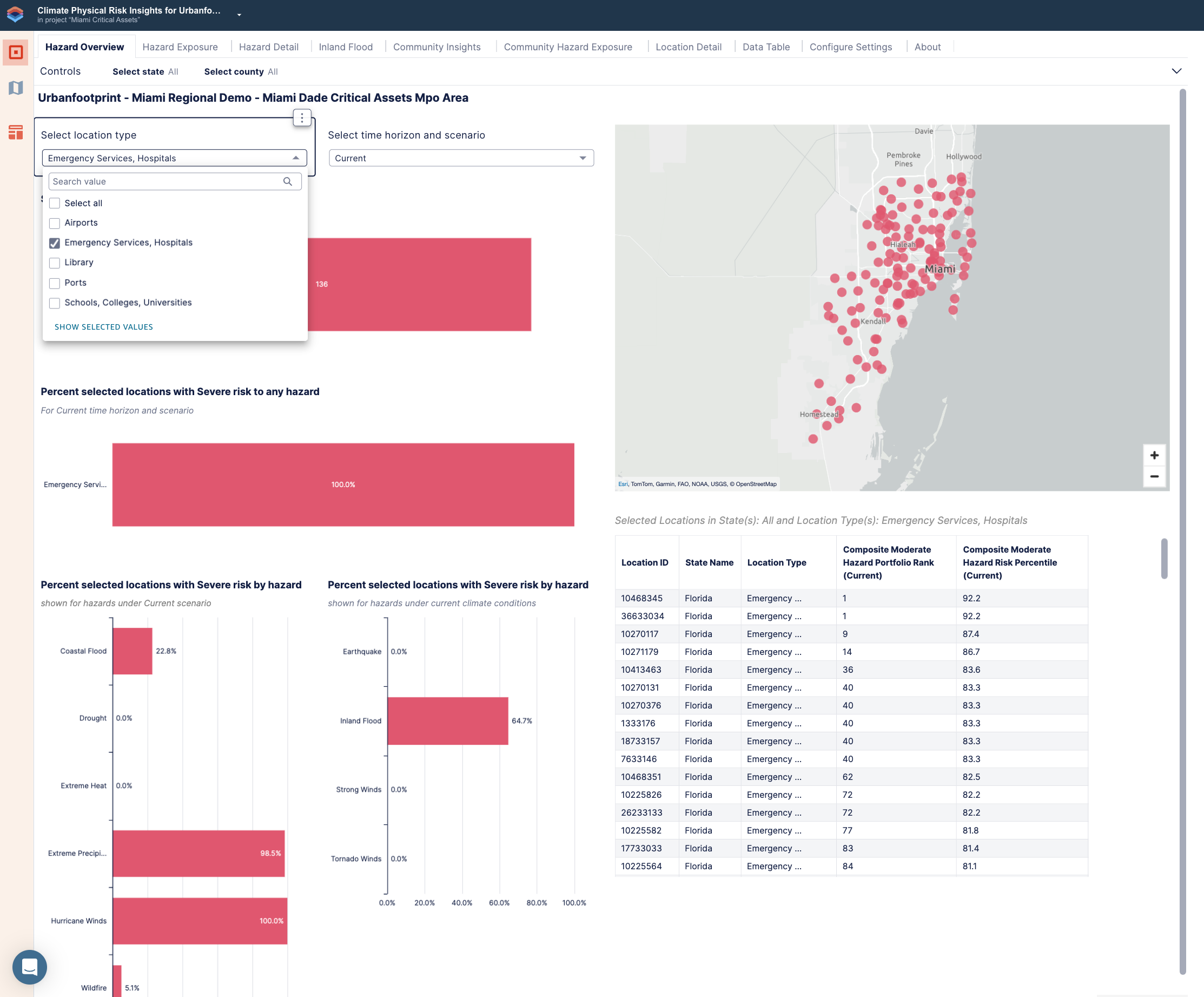
Hazard Overview focusing on Emergency Services, Hospitals
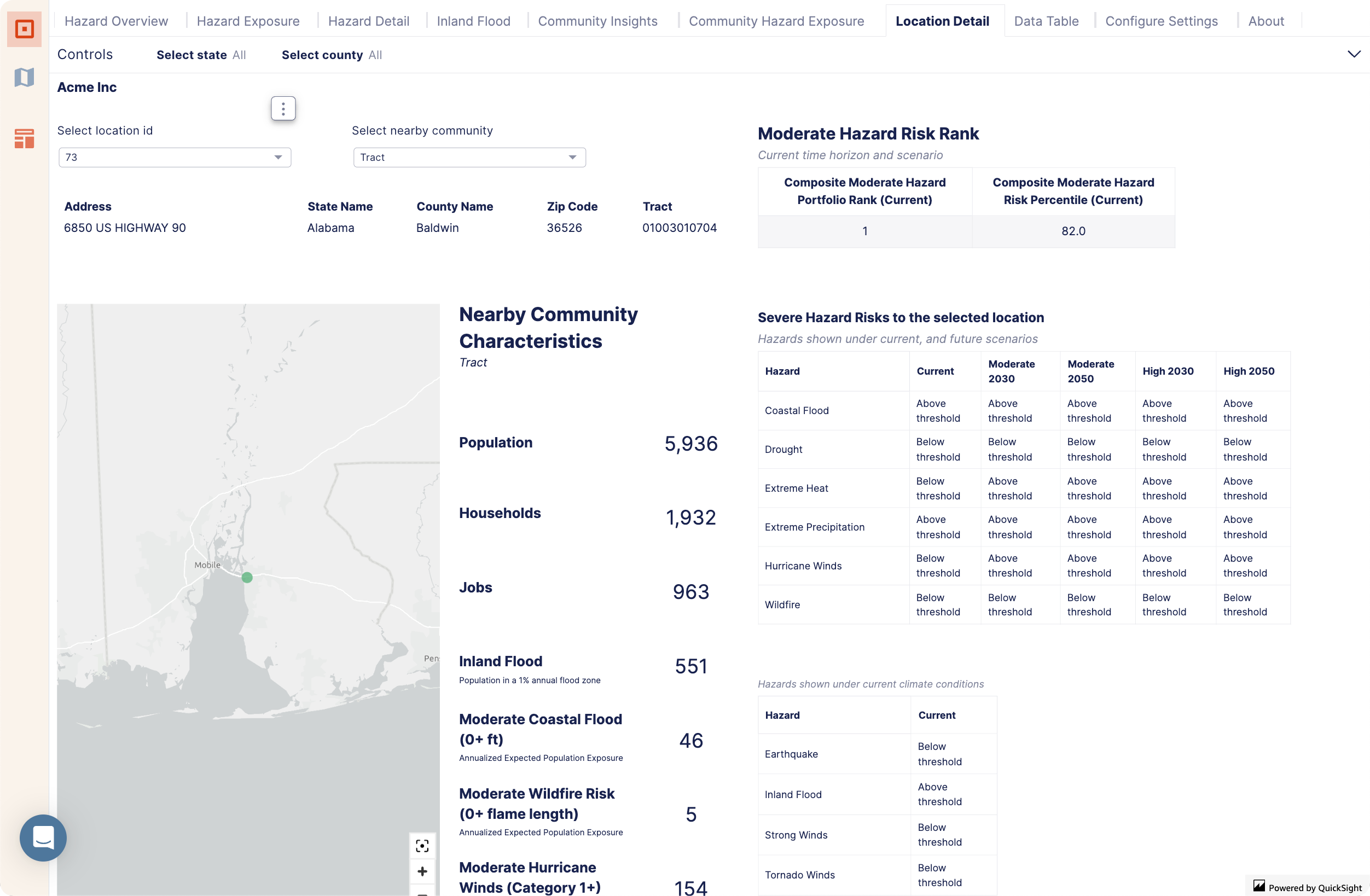
Click on a specific Location ID to review the Location detail for that location. Review the overview of the current and future hazard risks and nearby community.
Select Hazard Exposure and a hazard to compare the current hazard exposure to multiple time horizons and scenarios, showing to what extent this hazard risk will change in the future.
For example, choose Coastal Flood from the hazard selection and choose Moderate 2030 from the Compare to future scenarios drop-down. You can see that in the moderate 2030 scenario, there are additional locations exposed to risk.
To find more information, navigate to the Coastal Flood Hazard tab.
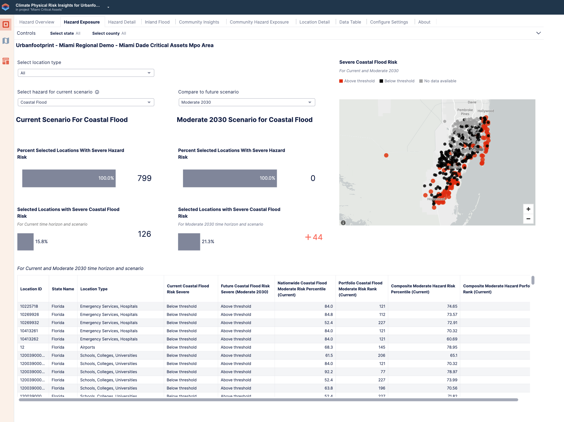
Hazard Exposure with coastal flood moderate 2030 scenario selected
View Community Insights to learn about community characteristics. Choose an option in the Select nearby community drop-down. For example, choose Zip code. You can toggle the slider to compare different populations.
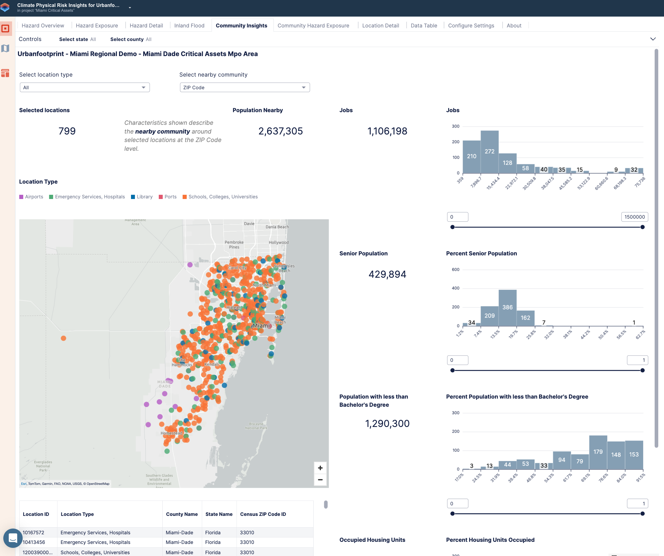
Community Insights with Zip Code attributes selected
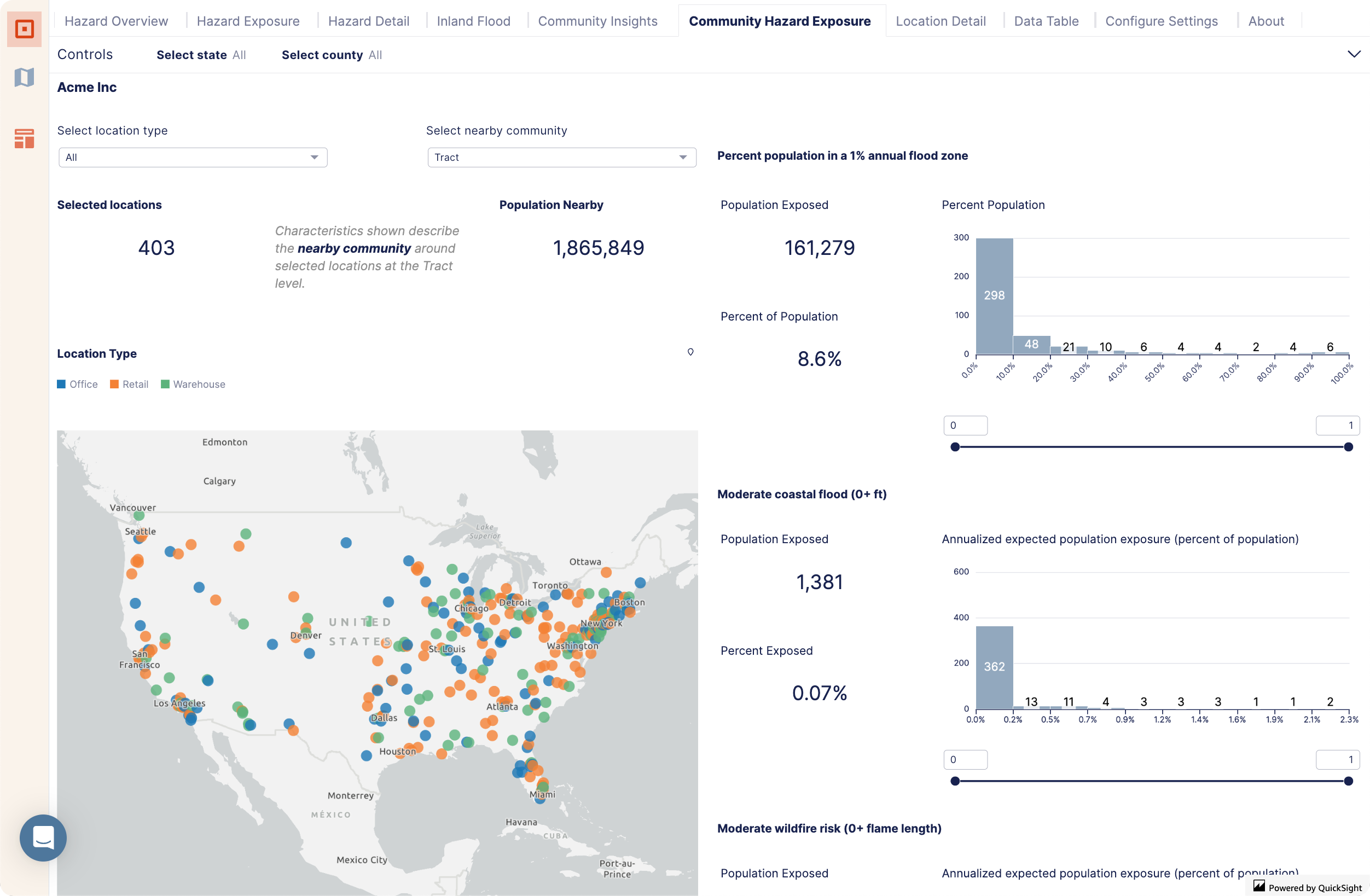
Select Community Hazard Exposure to learn about population exposure to specific hazards throughout the community. Use the sliders to customize exposure thresholds you're interested in and identify tracts or zip codes your locations fall within that meet a certain exposure threshold.
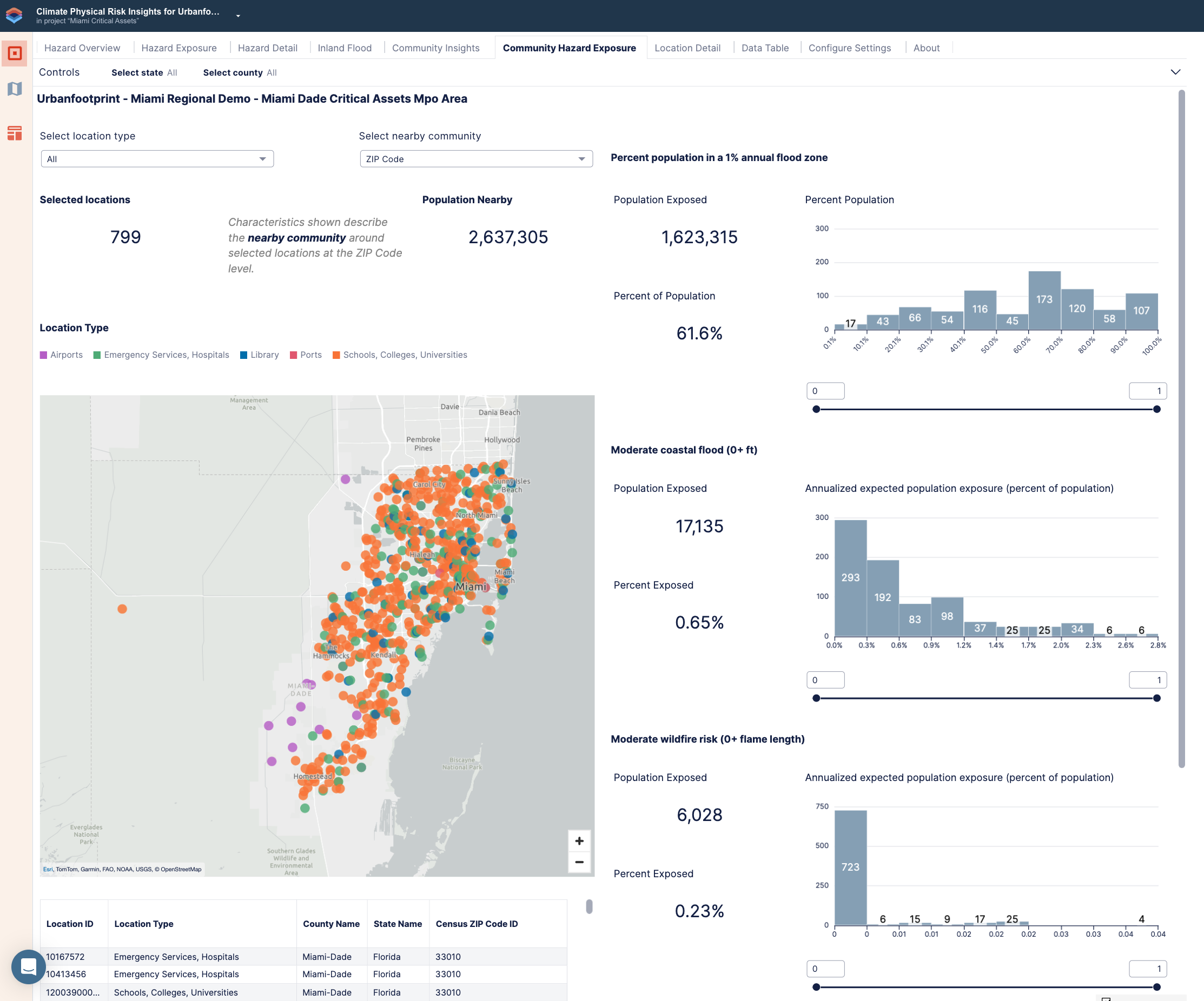
Community Hazard Exposure with thresholds set for the share of the population exposed to inland and coastal flooding
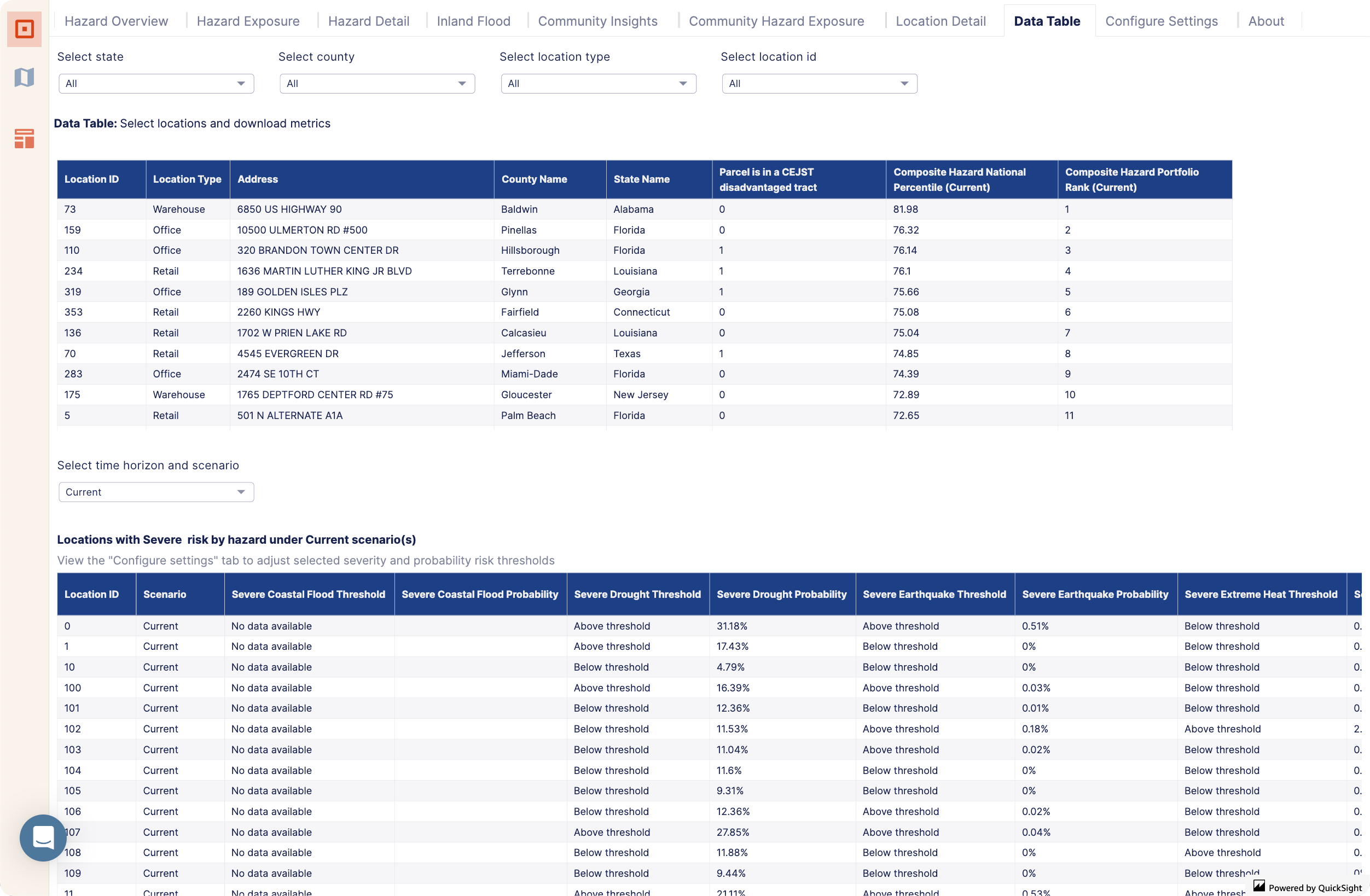
Select Data Table to see more details about your locations, such as which locations are in CEJST disadvantaged areas.
You can continue to explore your locations further in Analyst. For example, you can map the top 10 locations with the highest composite hazard score or create filters based on other attributes in the data table.