Plan Project Proposals
 |
Analyst provides the data and tools needed to help you explore a potential project area and craft a compelling proposal. The tutorials in this section will help familiarize you with features and suggested workflows for creating projects and producing maps in this phase.
Create a Project
Project creation is the starting point for working in Analyst. A project contains scenarios, data, analytics, and reports that allow you to explore existing conditions and growth outcomes for an area. Projects are defined by a project area, which can be an existing jurisdictional boundary or a custom boundary that you upload. The maximum size is 50,000 km² or 350 tracts, whichever is smaller. If the land area or tract coverage of your selected or custom project area boundary exceeds the limits, a message will appear. If you need a larger canvas, contact us for support or create a General Location Analysis project instead.
In this tutorial, we'll walk through the steps of creating a new project. For more information on projects and their parameters, see Projects.
Data used | Features Used |
Project boundary shapefile (if using a custom boundary) |
Click the Create project button in the upper right corner of the screen. The Create New Project window appears.
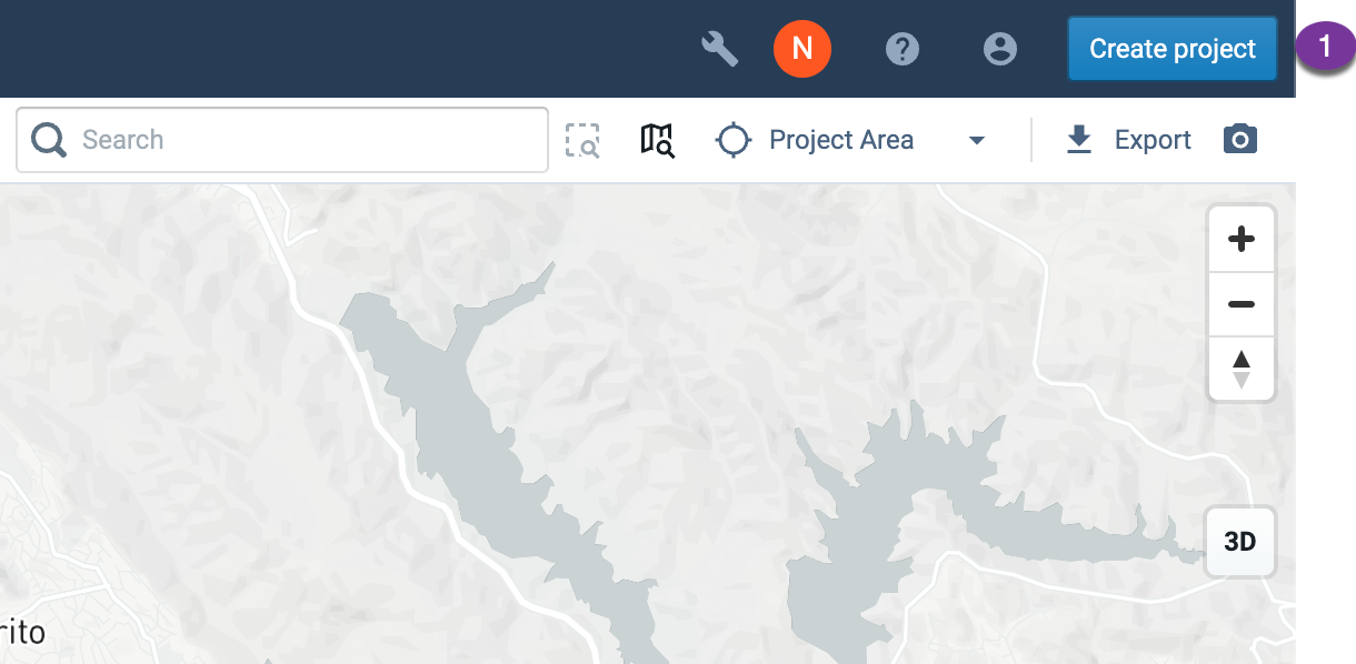
Create project button
Enter project information. Information fields include:
Project Name – Enter a name for your project. (After the project is created, it is possible to change the name via Edit an Organization Name in Organization Settings if you have an Admin or Owner user role.)
Project Description (optional) – Enter a description for your project. This will be displayed in your organization's Projects pages.
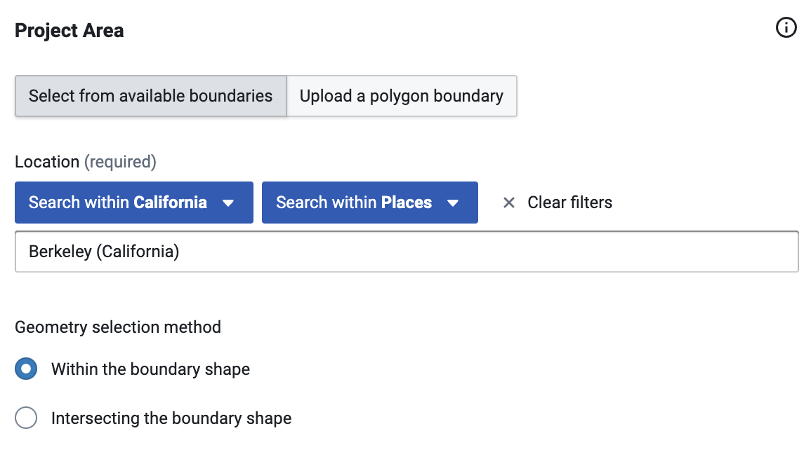
Define your project area. You can select from available boundaries or upload a custom project area boundary. You can't change the project boundary after you create the project. Project area boundaries can consist of multiple polygons.
To select from available boundaries (the default option): Begin typing the name of your location in the Location field. Analyst will list available places (including cities, towns, and other census-designated places), counties, core-based statistical areas (CBSAs), congressional districts, municipal planning organizations (MPOs), school districts, and others, according to what you type.
To filter the list further: use the Search within State and Search within boundary type options to locate the right boundary from each State and each Boundary Type.
Using the "Search within"
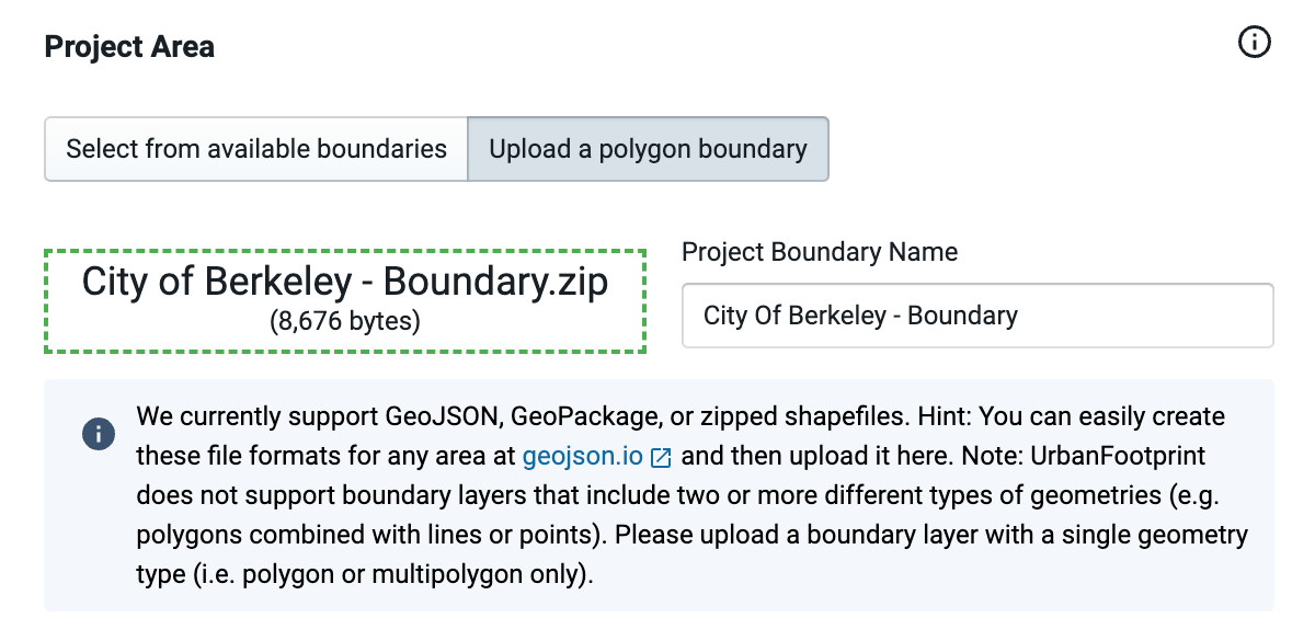
To upload a custom project boundary: Select Upload a polygon boundary. Then, either drag and drop your polygon file into the target area that appears, or click within the target area to open your operating system's file browser and choose your file. Analyst supports GeoJSON, GeoPackage, or zipped shapefile format.
Note
You can easily create a polygon boundary in GeoJSON, GeoPackage, or zipped shapefile format at geojson.io.
For our example, we'll create a project for Berkeley, California, using the city boundary as the project area.
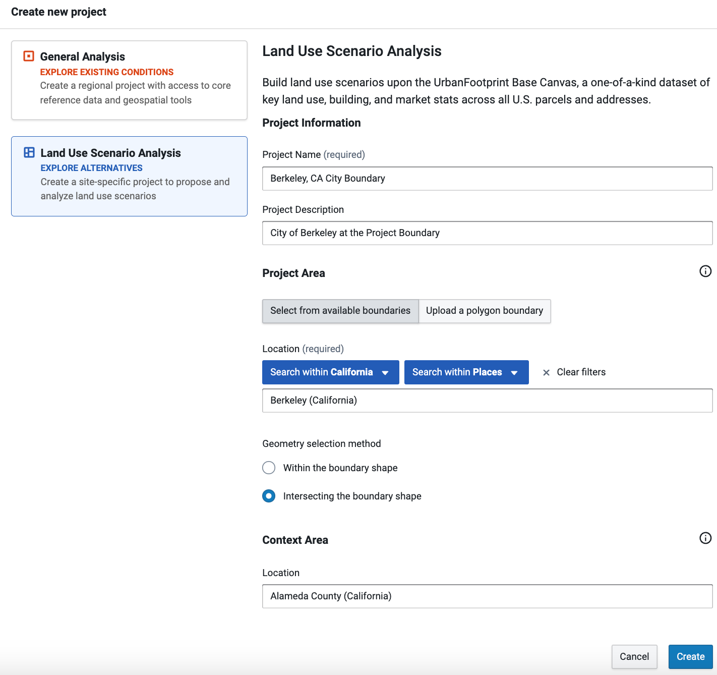
Project information and project area selection
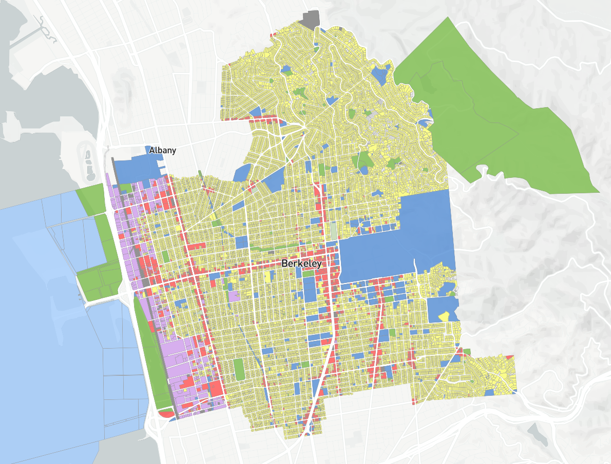
Select a Context Area for your project (optional). Selecting a context area yields a reference layer that depicts existing land use beyond your project area. The Context Area layer contains the same attributes as the Base Canvas, but is static: it cannot be painted and is not included in scenarios or analysis.
You can select from available boundaries. Begin typing the name of your location in the Location field, and Analyst will list available places (including cities, towns, and other census-designated places), counties, and core-based statistical areas (CBSAs) according to what you type.
For our example, we'll use Alameda County, in which Berkeley is located, as the context area.
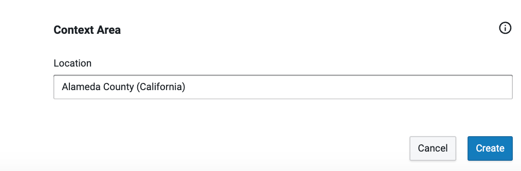
Context area selection
Click Create. Your project will be created. The time it takes will vary with the size of your project.
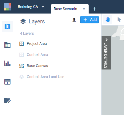
Your newly created project will contain the following layers:
Base Canvas – The layer is comprised of parcel features that describe existing land use and built form in terms of Building or Place types and a number of quantitative attributes. For more information, see the Features documentation for the Base Canvas.
Project Area – A reference layer showing the project area's boundary.
Context Area Canvas – The base canvas for the contextual area for comparison or background. Shown only if a context area is defined.
Context Area – A reference layer showing the context area's boundary. Shown only if a context area is defined.
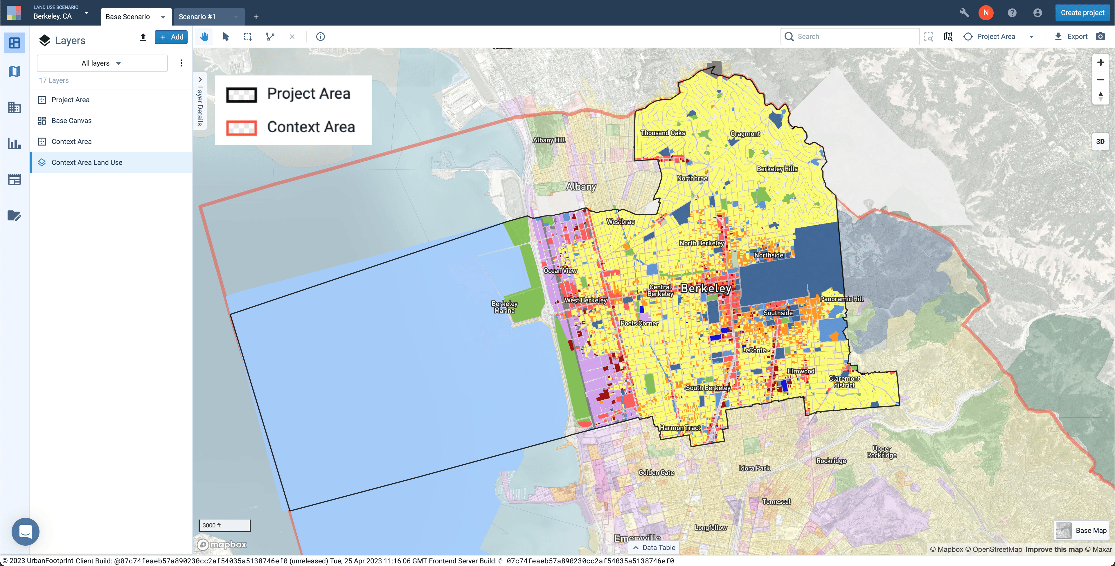
View including the Base Canvas, Context Area Land Use, and project and context area boundaries
Now you're ready to start working in Analyst!
Explore the Base Canvas
Once you've created a project, one of your next steps will be to view the Base Canvas. The Base Canvas reflects existing land use and demographics, and serves as the foundation for future scenarios. In this tutorial we'll explore the land use designations and basic attributes included in the Base Canvas, and along the way orient ourselves to the platform's modes and basic features.
For more information on working with the Base Canvas, see the Features documentation on the Base Canvas, or the Edit the Base Canvas tutorial.
Data used | Features used |
Enter Explore mode. When you open Analyst or first create a project, you will be in Explore mode by default. If you're not in Explore mode already, enter it by clicking the Explore mode icon
 in the Mode bar on the left side of the screen.
Explore – View the map and data table; work with layers.
Build – Build scenarios or edit the Base Canvas.
Analyze – View and run analysis modules; view analysis outputs via charts, the map, and data table.
Report – Compare scenario statistics and analysis outputs.
Manage – Add or edit land use types; set project variables and default values; set analysis module parameters.
Mode bar on the left side of the screen
Later tutorials will take us through the other modes.
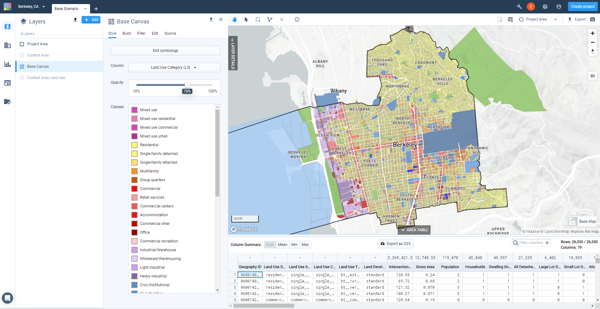
View the Base Canvas. Select the Base Canvas from the Layers list to make it the active layer.
View the Base Canvas layer symbology. From the Layer Details pane, click the Style tab. The Style tab shows the layer symbology for the selected column, and serves as a legend for your map view. In later steps, we'll explore the Base Canvas by mapping different columns.
Base Canvas upon initial project creation
View feature data using the Inspection tool. From the map tools, click the Inspection tool
 , then click on a feature. This brings up a Feature Information window showing the column (attribute) values for the selected feature.
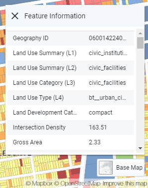
Feature Information window
View the data table. Click the DATA TABLE tab at the bottom of the screen to expand the data table. The data table corresponds to the layer that is currently active in the Layers list. Each row in the table corresponds to a feature; up to 100 rows are shown. If you make a selection of features, the table will show data for the selection only.
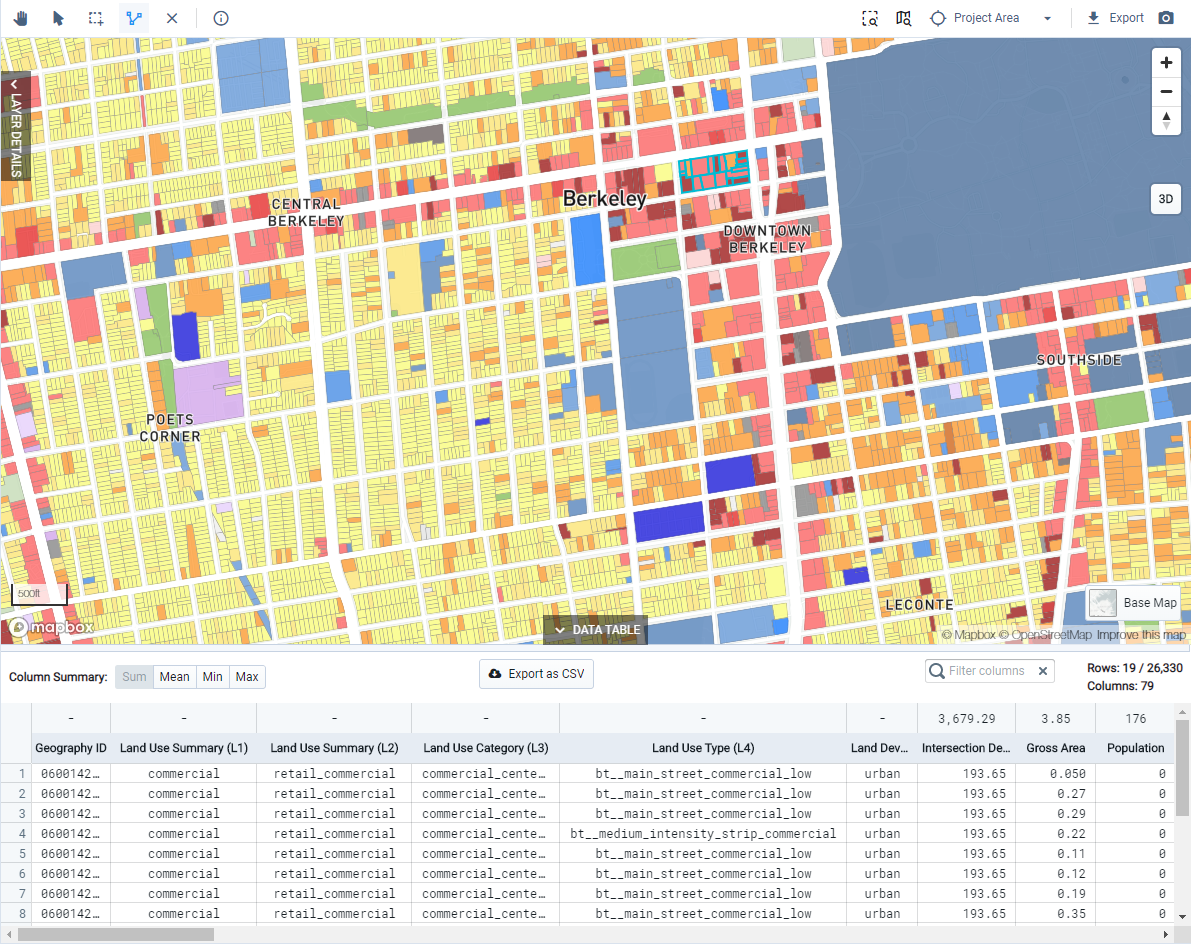
View of Data Table
View summary statistics. The data table includes summary statistics for all columns containing numeric data. Using the Column summary control, make a selection to view the sum, mean, minimum, or maximum values at the top of each column.
Filter column display. Type into the Filter columns box to narrow down the selection of columns displayed.
Export tabular data. Click the Export as CSV button to export layer data as a CSV file for further work in Excel or other spreadsheet applications. If the button is disabled, the layer may be subject to export restrictions. Base Canvas data is restricted for a small number of counties, in accordance with source data restrictions.
Explore the canvas using the different levels of the Analyst land use hierarchy. Analyst allows you to map and assess existing land use for any U.S. location according to the same classification system. The land use system consists of four levels that vary in their specificity. We'll look now at the highest-level category, Land Use Summary (L1). For more about mapping land use levels, you can skip ahead to the Map Existing Land Use tutorial. For more about the system of land use levels, see Land Use Hierarchy.
Select Land Use Summary (L1) from the Column list. The symbology as it appears in the Style tab serves as a legend. The default symbology for the land use levels uses a color scheme common for representing land use.
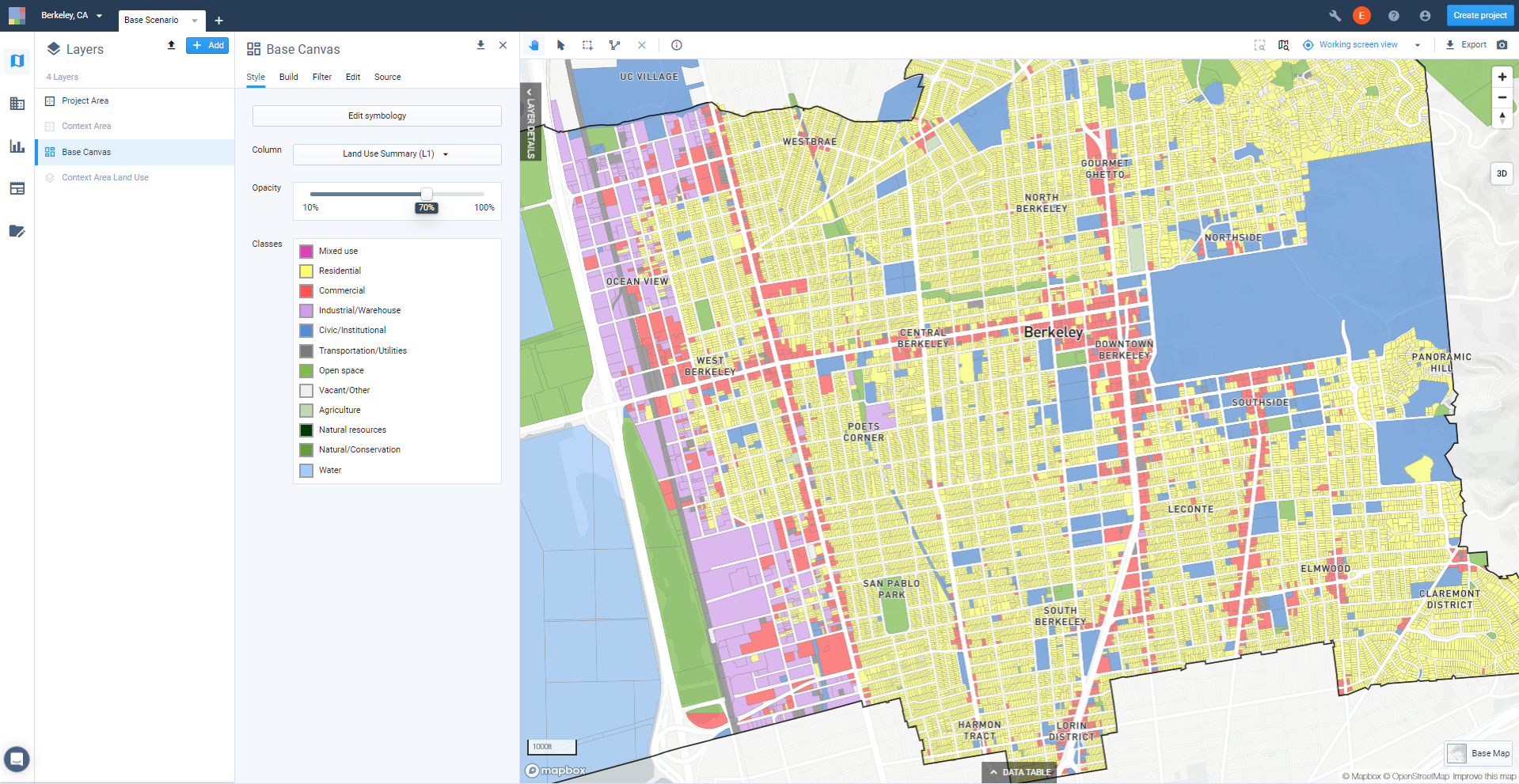
View of Base Canvas symbology section
L1, as mapped below, is suitable for creating high-level maps. Zoom out to see how L1 looks at the project-wide scale, or for a similarly broad area.
Base Canvas mapped using Land Use Summary (L1) column
Design and export map(s). From here you may choose to style and export maps of the Base Canvas. You can click the Map Snapshot button
 at the top right corner above the map view to save a copy of the map as it appears on screen, or use Map Export to set size, resolution, legend, and scale options and export a full map layout. Map layout and export options are covered in later tutorials, or you can see the Features documentation for Export Maps to PNG or SVG.
Explore Reference Data
See what layers are available for your project area.
Analyst provides ready access to a library of curated reference data layers, allowing you to get to work quickly in any area of the United States. In this tutorial we'll use the Layer Manager to browse the data available for your project area, view metadata, and load layers to your project.
Data Used | Features Used |
|
Open the Layer Manager. Click the + Add at the top right of the Layers list.
Browse the available data layers. The Layer Manager organizes reference data by category. Expand the categories to see what data are available in your project and context area. Analyst includes reference data with national coverage, as well as data from state and local or other sources. For example, Analyst includes extensive data used to support the Conservation module (available for projects in California); these layers can be found in the Conservation category.
You can also look up datasets by name using the search box. Any layer names containing the text you enter will be returned.
Clicking on a layer displays its metadata, including a description of the dataset, the data source, scale, last updated date, and a column reference table including column descriptions and data types.
Add data layers to your project. Click the + button for a layer to add it to your project's Layers list. You can add multiple layers at once.
For our example, we'll add a few layers. You can find these under their respective categories, or by using the search box.
Building Footprints, found in Land Use category
Public Transit Stops, found in the Transport & Circulation category
Public Transit Lines, found in the Transport & Circulation category
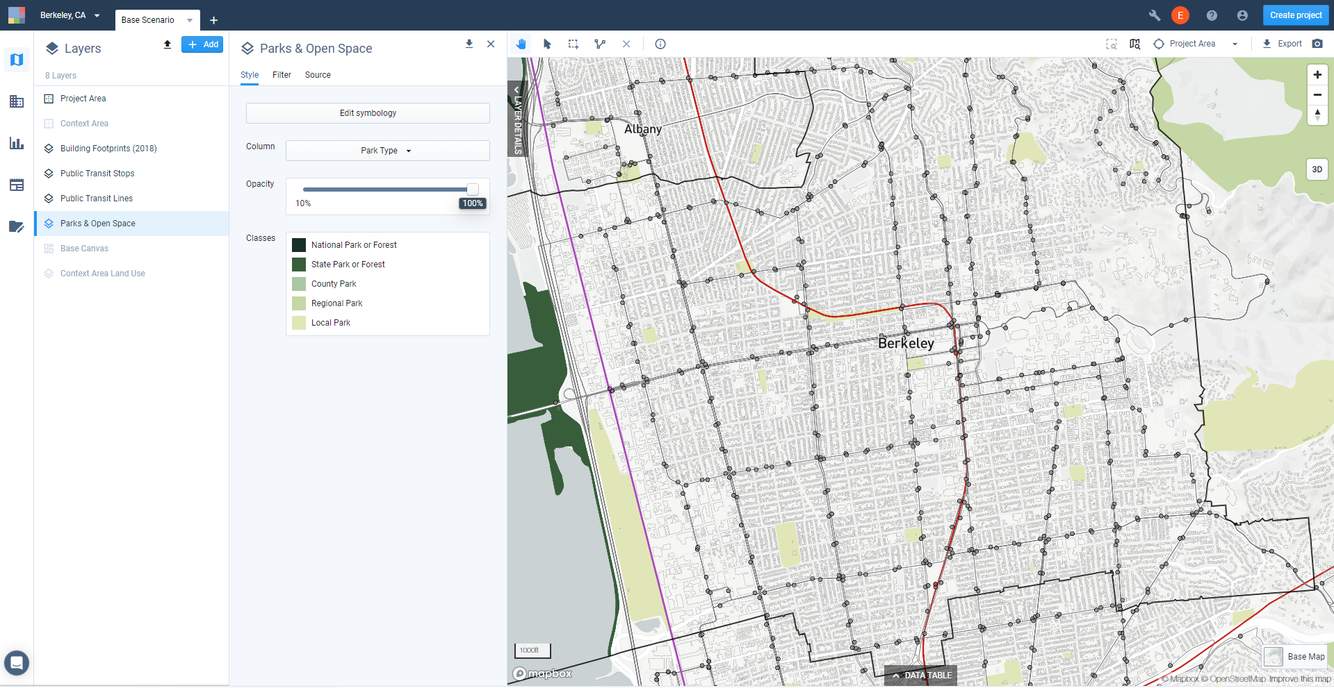
Parks & Open Space, found in the Parks & Open Space category
Click Close to close the Layer Manager.
Explore the data layers on your map. Once loaded to your project, reference data layers will appear at the bottom of your Layers list, and will be hidden by default. Re-order your layers as needed by clicking and dragging them to new positions in the Layers list. Show layers by clicking the Show icon
 .
.Reference data layers generally come loaded with default symbology for a selected column. Be sure to explore other columns. You can view the column descriptions via the Source tab of the Layer Details pane, and explore the data through the map or data table.
To explore data using the map view, use the controls on the Style tab of the Layer Details pane to select the mapped column and view its symbology. We'll edit symbology in the next segment of this tutorial.
Sample of reference data layers in Berkeley, CA
Create a selection of features to explore in the data table. Click the tab at the bottom of the screen to expand the data table. The data table corresponds to the layer that is currently active in the Layers list. Each row in the table corresponds to a feature; up to 100 rows are shown.
If you make a selection of features, the table will show data for the selection only. As an example, we'll apply a filter and a join to the Public Transit Lines reference data layer to narrow down what is shown in the data table.
Click the Filter tab of the Layer Details pane to open the Filter and Join controls.
Click Add filter + and select Operator from the list. A list of all unique values in the Operator column appears. Select AC Transit, which is the bus transit operator serving Alameda County.
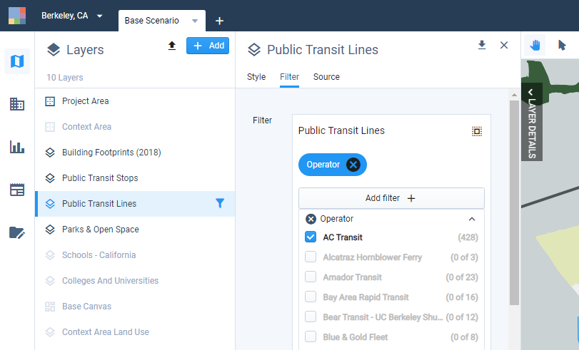
Click Join layer and select Project Area from the list of layers that appears. This will filter your selection of transit lines to include only those that intersect the project area.
You can now see your filtered selection on the map (highlighted in turquoise), and reflected in the data table.
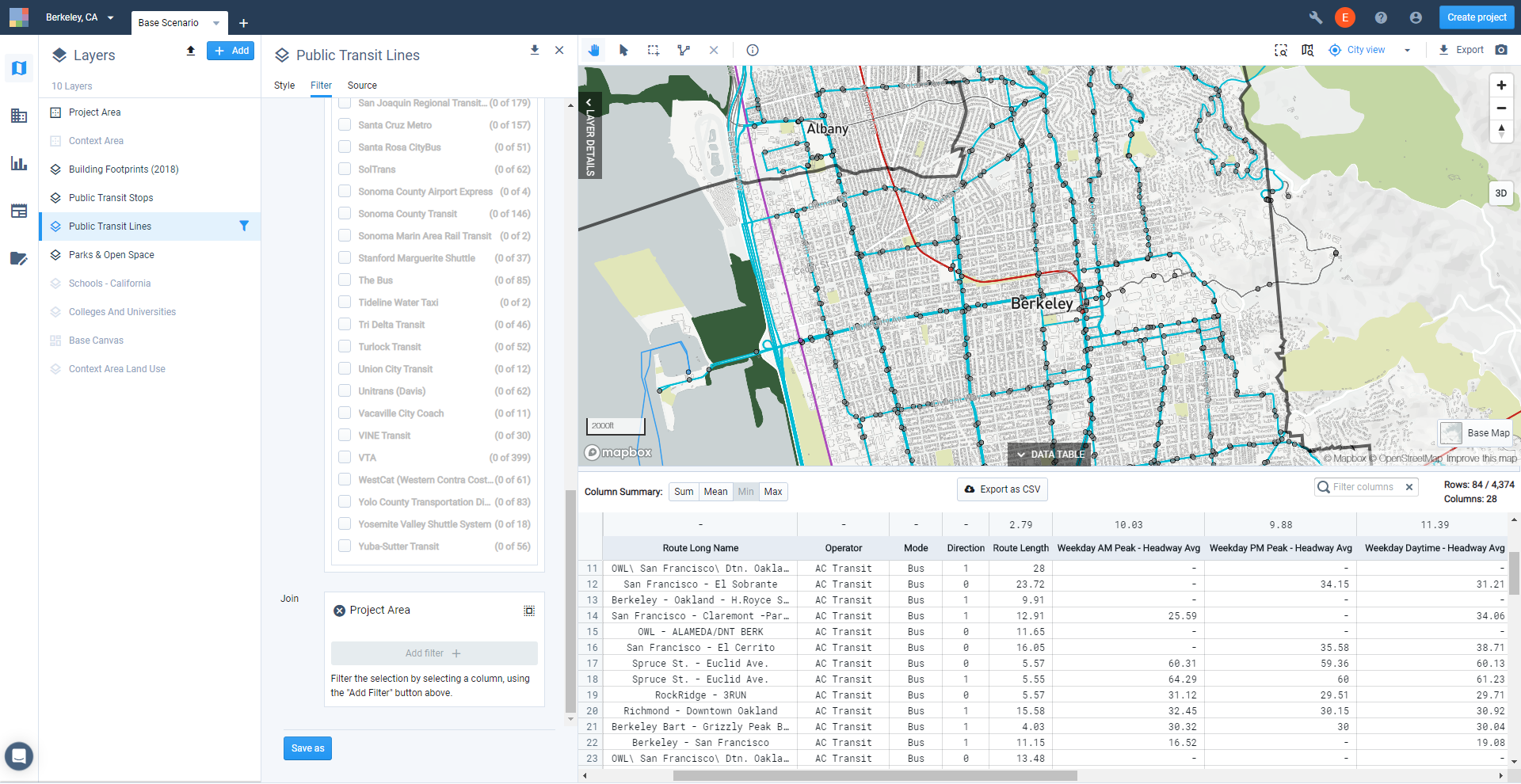
View of data table for a filtered selection of a layer
Explore column summaries in the data table. The data table includes summary statistics for all columns containing numeric data. Using the column summary control, you can view the sum, mean, minimum, or maximum values, located at the top of each column.
From our example above, we can see that the minimum value for the Weekday AM Peak - Headway Avg column is 10 minutes.
Export the data table. You can export layer data as a CSV file for further work in Excel or other spreadsheet applications. For example, you can use exported data to create custom charts, or run detailed analysis using pivot tables. Click the Export to CSV button, and a CSV file will be downloaded to your computer.
Note
If the Export to CSV button is not active, the selected data may be subject to download restrictions.
You also have the options for exporting spatial layers to multiple formats. We'll explore this in later tutorials.
You can continue exploring other reference data in the same manner. In the next tutorial, we'll focus on one of the layers to edit its symbology and create a map.
Report Existing Housing Mix
In this tutorial, we'll report the distribution of dwelling units by type according to the Base Canvas—first for the entire project area, then for a selection of areas near transit stations.
Data Layers | Features |
Base Canvas |
Reporting Project-Wide Housing Mix
Enter Report mode. Click the Report mode button
 in the Mode bar to open Report mode.
View Summary Statistics. Select Summary Statistics from the list on the left side of the screen. The Summary Statistics screen appears, showing charts that allow you to compare scenario metrics across scenarios.
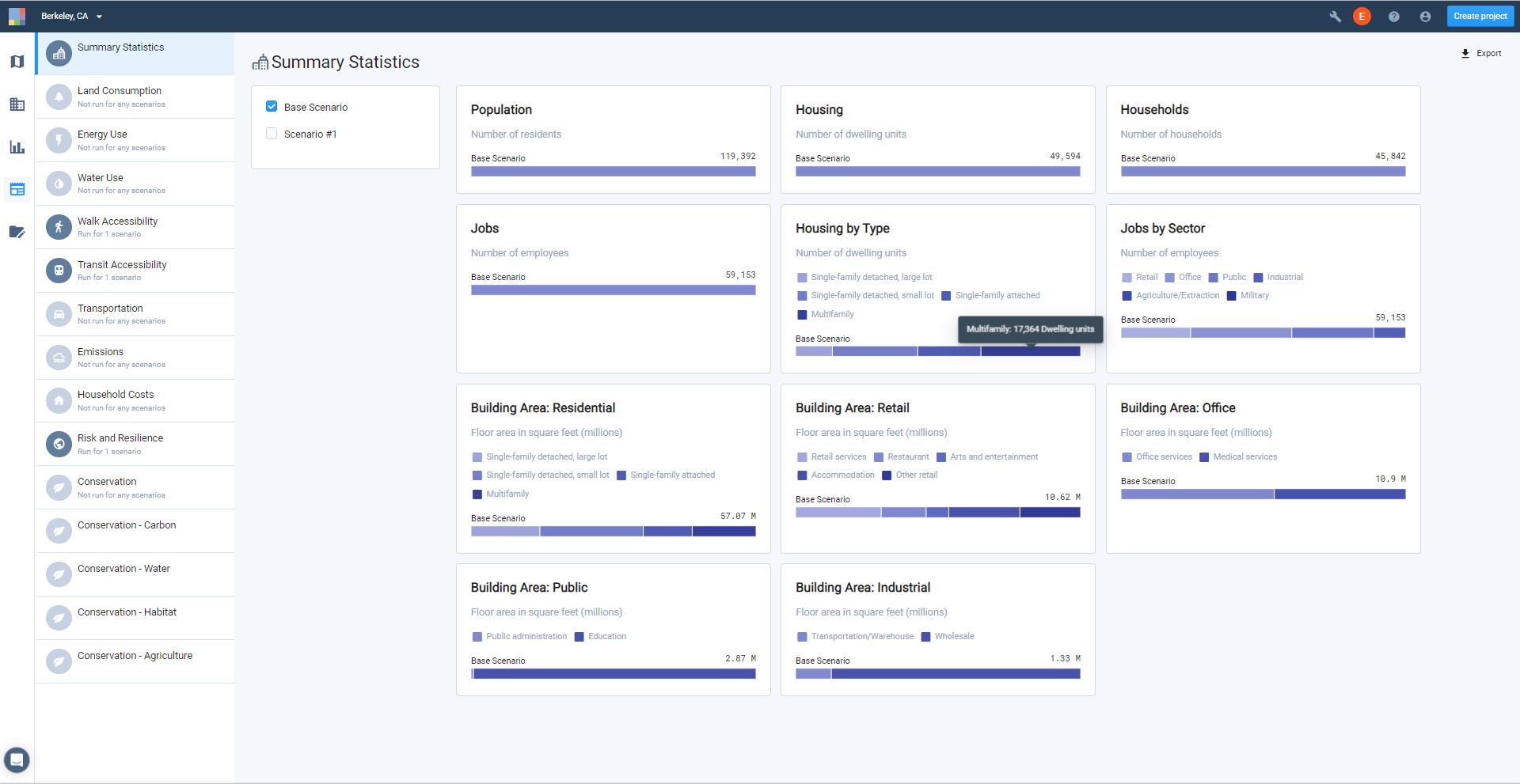
You'll see summary charts for:
Population
Housing
Households
Jobs
Housing by Type
Jobs by Sector
Residential Building Area
Retail Building Area
Office Building Area
Public Building Area
Industrial Building Area
For now, we're interested in Housing by Type. Hovering over individual segments of the stacked bar charts shows their values. In the example shown, we can see that there are 17,364 Multifamily dwelling units in Berkeley out of a total of 49,594. This is helpful to see at a glance. Our next step is to export the data behind the charts to run further calculations for reporting.
Export a Summary Statistics Report. Click the Export button at the top right of the screen. A Summary Statistics Report will be downloaded to your computer in Excel spreadsheet format. The report contains all the data represented in the summary charts.
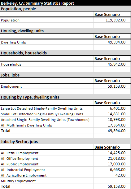
Partial view of exported Summary Statistics report
Calculate the percentage distribution of housing by type. You can use Excel (or another spreadsheet program) to calculate the housing mix. In our example, the existing housing mix is 35% Multifamily, 22% Townhome, 30% Small Lot Detached Single-Family, and 13% Large Lot Single-Family. Or, we could say that the housing mix is 37% attached, and 43% detached.
You can use the report data for any other project-wide calculations or analysis that you need. The data can also be used in creating charts.
To summarize data for subareas within your project—for example, to quantify housing around transit stops—you'll need to select features from your Base Canvas and access the corresponding data using the data table.
Summarize Existing Housing Mix for Selected Areas
You can use filters and/or manual selection tools (link) to create your selection. For our example, we'll use a join to a filtered selection from the Public Transit Stops reference layer to select parcels within half a mile of BART stations.
Use the Layer Manager to add the Public Transit Stops reference data layer to your project. (See Use Reference Data.)
Create a filtered selection from the Public Transit Stops layer to save as a new filtered layer. In this case, we'll filter for metro stations within the project area. Saving the selection as a new layer will allow you to show the selected stations in a map. To create and save the selection:
From the Filter tab of the Layer Details pane for the Public Transit Stops layer, click and select Mode from the list. Select Subway/Metro from the list of values that appears.
To narrow the selection down to stops within your project area, click Join layer and select Project Area from the list of layers that appears. Now all the BART stops in Berkeley are selected.
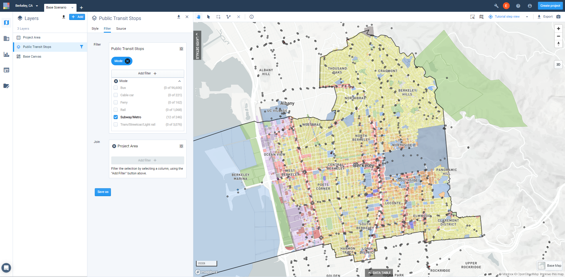
Click Save as to save as a new filtered layer. We'll call ours "Filtered: Public Transit Stops: BART."
Apply a join filter and buffer to the Base Canvas using the new filtered transit stops layer. We'll add a buffer to capture all parcels within half a mile from the BART stations.
From the Filter tab of the Layer Details pane for the Base Canvas, click the Join Layer button.
Select Filtered: Public Transit Stops: BART from the list of layers that appears.
Click the Buffer icon
 in the Join control to add a buffer. Specify a distance of 0.5 miles. All Base Canvas features that are within half a mile of the selected BART stations are selected.
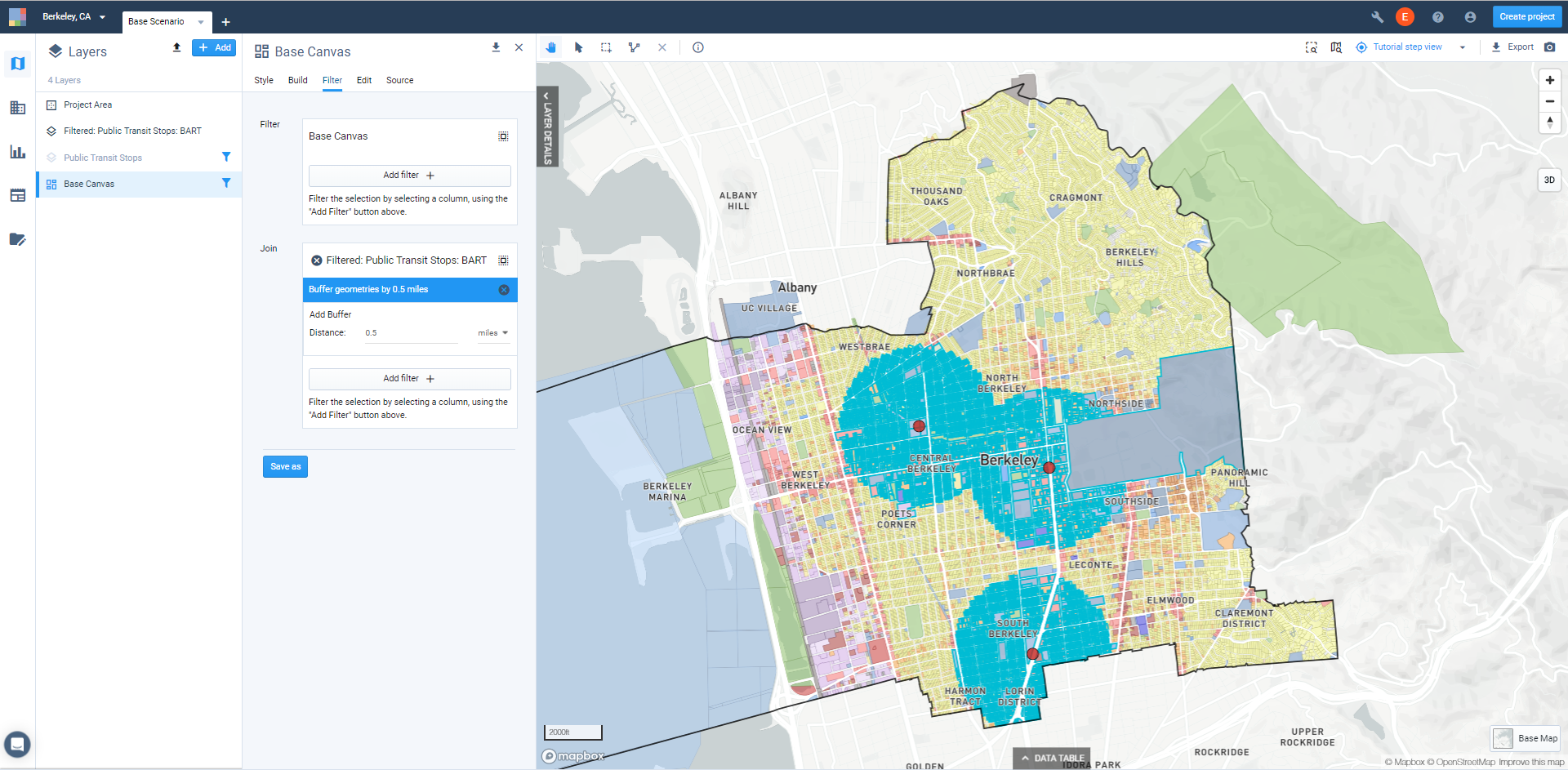
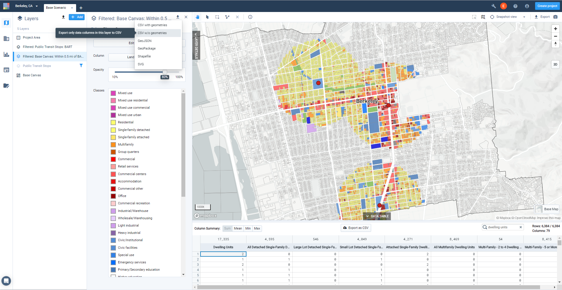
Click the Save as button to save the selection of Base Canvas features as a new filtered layer. We'll call ours “Filtered: Base Canvas: Within 0.5 mi of BART.” By saving the selection of parcels as a layer, you can easily return to it, or export to CSV and other formats. You can also show the filtered layer separately in maps.
Note
Note that filtered layers created from the Base Canvas (or scenario canvases) are dynamic layers. If you make changes to the Base Canvas or scenarios, the content of the filtered layers will be updated to match.
Use the data table to view and export data for the selected features. Expand the data table. You'll see that the row count at the top right of the data table pane indicates the number of selected features—in this case, 6,384 parcels selected from a total of 26,330 in the entire project area.
Use the search box to filter the columns shown in the data table. Here, we've entered "dwelling units" to see only those columns with dwelling unit counts.
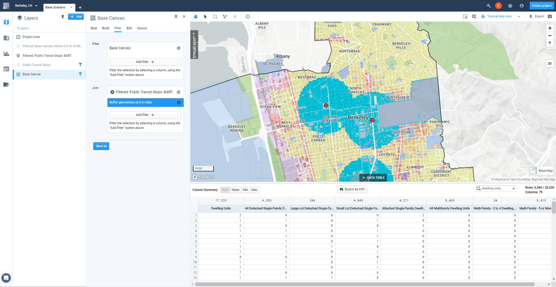
View the column summaries. With the Column Summary: Sum option selected, you can see the totals for each housing type at the top of each column. This may provide all the information you need, or you might opt to export the data for use outside Analyst.
Export the data for the selected Base Canvas features. You can export CSV data from the data table, or to other formats using layer export.
To export the CSV data, click the Export as CSV button above the data table for either the active Base Canvas selection, or the filtered layer that you saved. When your export is ready, click the notification to download to your computer.
To export the saved filtered layer to CSV, CSV with geometries, GeoJSON, GeoPackage, shapefile, or SVG formats, use the Layer Export control at the top right of the Layer Details pane. See Export Layer Data for more details.
Now you can work with your exported data using Excel or other tools to summarize information as needed. You can also use the new filtered data layers for highlighting features and areas in maps.
Measure Walk and Transit Accessibility
Running existing conditions analysis in Analyst is quick and easy, and can provide useful insights and compelling exhibits for your proposals. In this tutorial, we'll run the Walk and Transit Accessibility modules for the Base Scenario to measure and map accessibility to employment, schools, hospitals, parks, and transit stops.
With the exception of the Land Consumption module (which measures change with respect to land use development in scenarios), all analysis modules can be run on the Base Scenario to reflect existing conditions, with results that serve as a comparison point for future scenarios.
Data Layers | Features |
|
Click on the Base Scenario tab. Modules are run for individual scenarios. The Base Scenario, which consists of the Base Canvas, is generated upon project creation to reflect existing conditions.
Enter Analyze mode by clicking the Analyze mode button
 in the Mode bar. The Analysis Modules pane appears. All available modules are listed, and the current state of each is indicated.
"Ready to run" Indicates that analysis has not yet been run.
"Analysis complete" indicates that a module has been run and the results are up to date.
"Analysis out of date" alerts you that a module has been run, but changes have since been made to the scenario's land use or analysis parameters; in this case, analysis needs to be re-run to update the results. Updating the Base Canvas will render all modules in all scenarios out of date.
Run the analysis modules. Hover over the Walk Accessibility module and click the Run analysis button
 . The module will start running. Do the same for the Transit Accessibility module, which can be run at the same time. As the modules run, you will see an in-progress indicator. When complete, a checkmark will appear. You can then view your results.
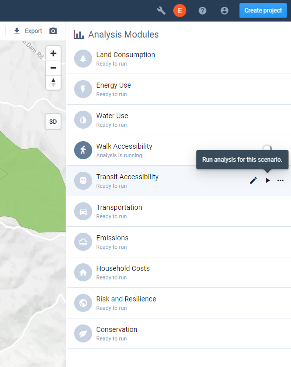
Running an analysis module
Note
Analysis run times vary according to the size of your project and the complexity of the modules, with some requiring a few minutes or more. While you wait, you can run other modules, continue using other features in the platform, switch to another project, or even close Analyst.
View the module results in Analyze mode. Analysis results can be viewed on the map and data table, via charts for the current scenario, or via charts in Report mode that compare results across multiple scenarios. We'll first look at the results in the Analysis pane.
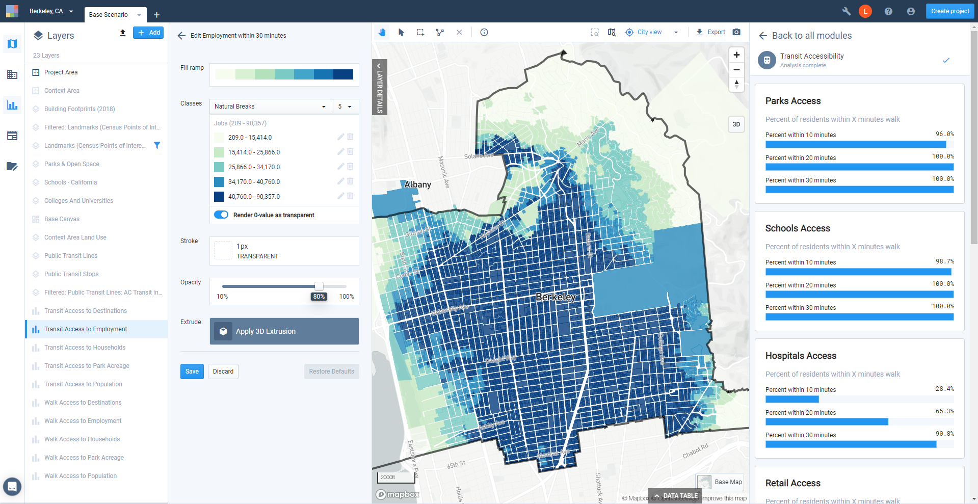
Select the Walk Accessibility module in the Analysis pane. The charts that appear depict a range of summary results including access to parks, schools, hospitals, transit stops, and retail destinations in terms of the percentage of residents in the project area that can reach them within 5, 10, 15, and 20 minutes. You can also measure accessibility to any other destinations defined as custom points of interest; we won't cover that here, but see Measuring Walk and Transit Access to Custom Points of Interest for details.
Walk Accessibility module results as seen in Analyze mode
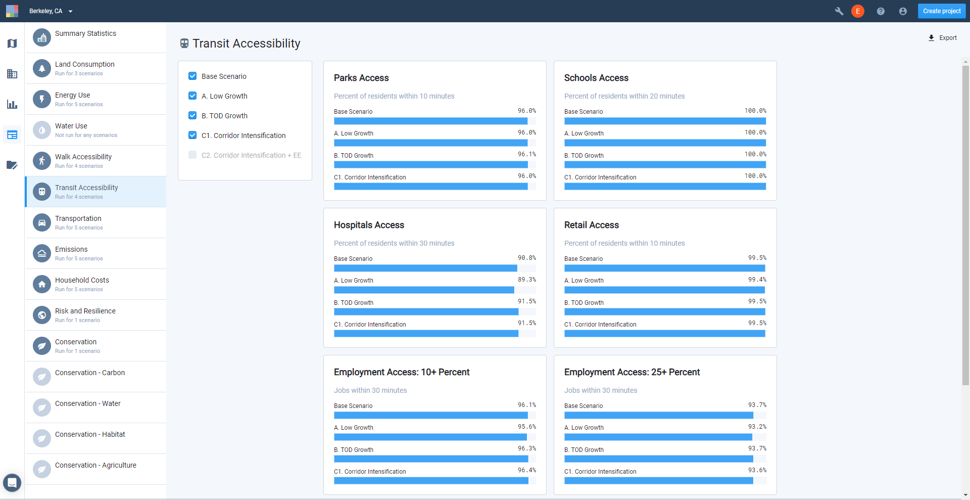
Next, select the Transit Accessibility module. The charts that appear depict a range of summary results including access to parks, schools, hospitals, and retail destinations in terms of the percentage of residents in the project area that can reach them within 10, 20, and 30 minutes. Access to employment is summarized in terms of the percentage of residents that can reach at least 10, 25, and 50 percent or more jobs within 15, 30, 45, and 60 minutes. As with the Walk Accessibility module, you can also measure accessibility to any other destinations defined as custom points of interest.
Transit Accessibility module results as seen in Analyze mode
View the Walk and Transit Accessibility module results in Report mode. Enter Report mode by clicking the Report mode button
 in the Mode bar, then select the Walk Accessibility module. Report mode allows you to compare the results for the Base Scenario with other scenarios. Until you've developed scenarios or run analysis on them, only the Base Scenario results will be shown.
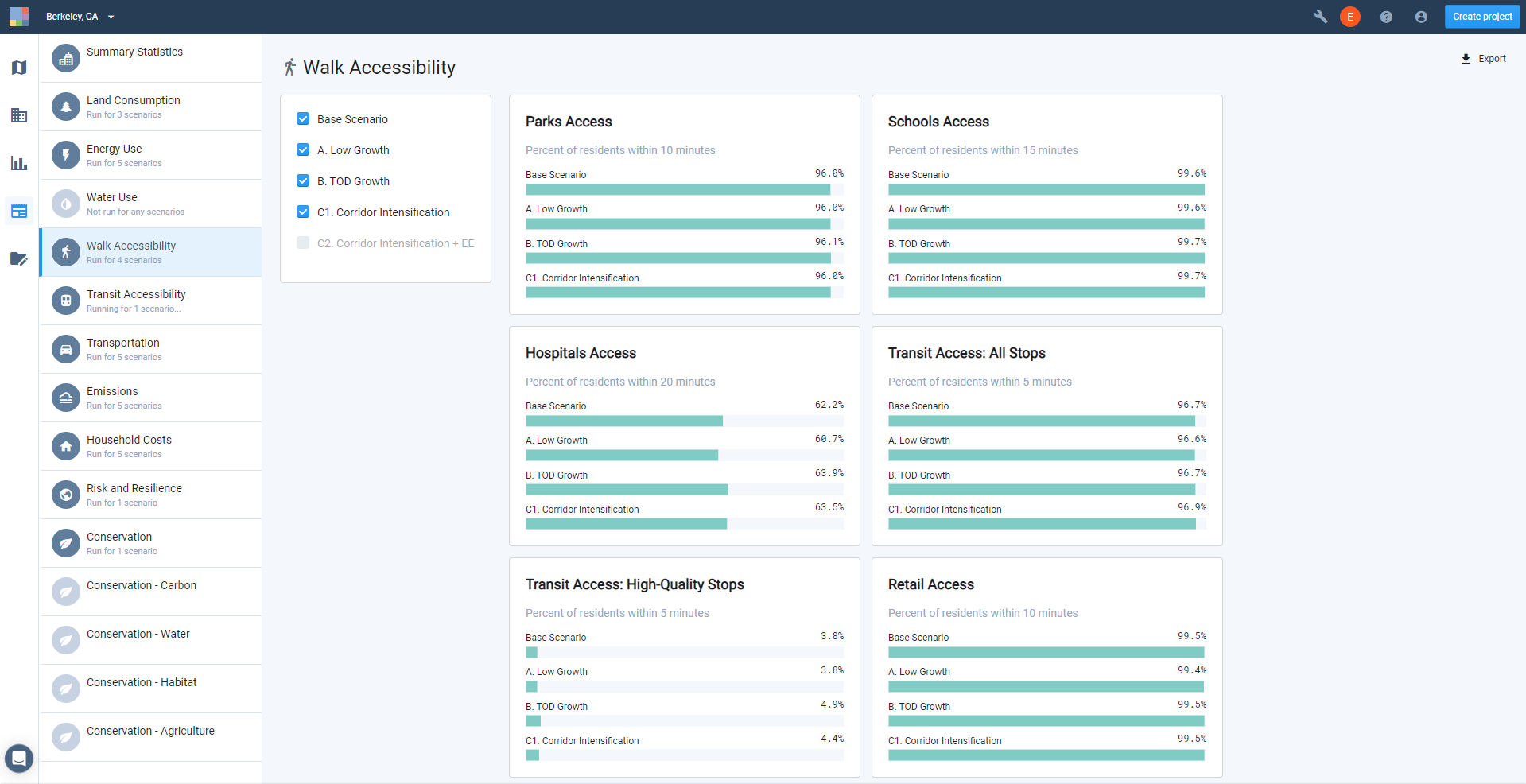
Walk Accessibility module results in Report mode
Transit Accessibility module results in Report mode
Export summaries of the module results. Click the Export
 button to export the results for each module. For each, an Excel report containing all data as represented by the summary charts will be downloaded to your computer. You will also have the option of exporting the output layers or their data tables to work more closely with the results.
View the Walk and Transit Accessibility module output layers. Once an analysis run is completed, one or more output layers for the module appear in your Layers list. The Walk Accessibility module produces five output layers, all at the resolution of the Base Canvas:
Walk Access to Destinations – a composite layer that brings together results for minutes to the nearest school, hospital, nth nearest retail destination, park, transit stop, and high quality transit stop as separate columns. The layer also includes columns for population, households, and employment.
Walk Access to Employment – a layer that includes employment counts within 5, 10, 15, 20, 30, 45, and 60 minutes' walk of the given feature, along with columns for population, households, and employment in the feature.
Walk Access to Households – a layer that includes counts of households within 5, 10, 15, 20, 30, 45, and 60 minutes' walk of the given feature, along with columns for population, households, and employment in the feature.
Walk Access to Park Acreage – a layer that includes amounts of park area (in acres) within 5, 10, 15, 20, 30, 45, and 60 minutes' walk of the given feature, along with columns for population, households, and employment in the feature.
Walk Access to Population – a layer that includes counts of population within 5, 10, 15, 20, 30, 45, and 60 minutes' walk of the given feature, along with columns for population, households, and employment in the feature.
The Transit Accessibility module produces five output layers, all at the resolution of the Base Canvas:
Transit Access to Destinations – a composite layer that brings together results for minutes to the nearest school, hospital, nth nearest retail destination, and park. The layer also includes columns for population, households, and employment.
Transit Access to Employment – a layer that includes employment counts within a combined transit and walk trip of 5, 10, 15, 20, 30, 45, and 60 minutes from the given feature, along with columns for population, households, and employment in the feature.
Transit Access to Households – a layer that includes counts of households within a combined transit and walk trip of 5, 10, 15, 20, 30, 45, and 60 minutes from the given feature, along with columns for population, households, and employment in the feature.
Transit Access to Park Acreage – a layer that includes amounts of park area (in acres) within a combined transit and walk trip of 5, 10, 15, 20, 30, 45, and 60 minutes from the given feature, along with columns for population, households, and employment in the feature.
Transit Access to Population – a layer that includes counts of population within a combined transit and walk trip of 5, 10, 15, 20, 30, 45, and 60 minutes from the given feature, along with columns for population, households, and employment in the feature.
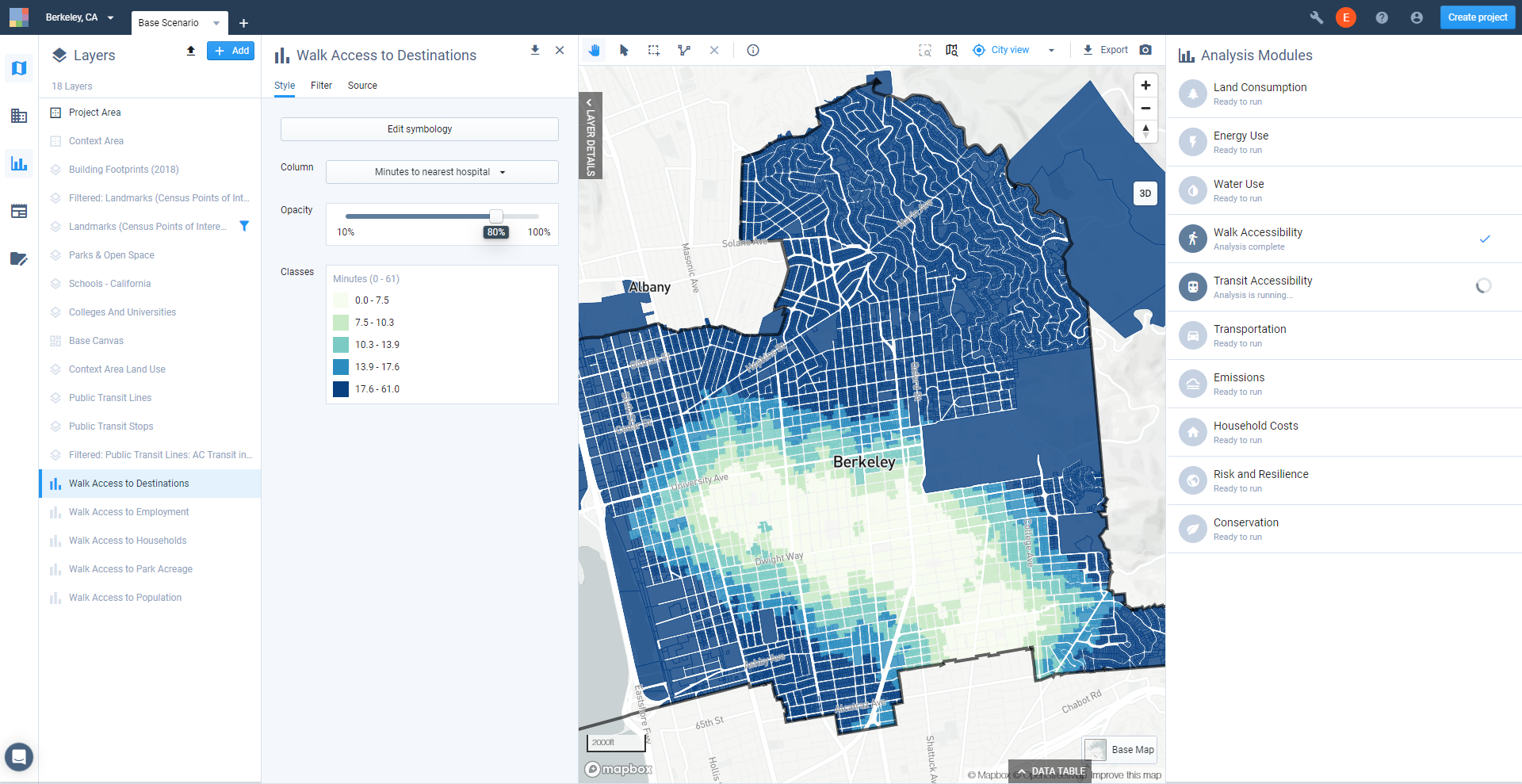
Explore the Walk and Transit Accessibility output layers. Each layer comes loaded with default symbology and data classification settings.
Activate the Walk Access to Destinations output layer. Symbolize the layer on the Minutes to nearest park column by selecting it on the Style tab of the Layer Details pane. The column is mapped with its default symbology, as shown below.
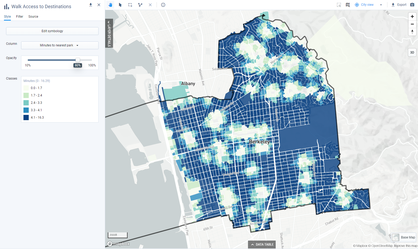
Default symbology for Walk Access to Destinations: Minutes to nearest park
Analyst uses the Natural Breaks data classification method as a default. It appears that walk access to parks is already good in Berkeley, as reflected by the ranges of walk times. We can manually edit the classes to differentiate more in the areas originally classified as having walk times between 4.1 and 16.3 minutes. (See Classify Data for details on editing data classes.) An adjusted map is shown below.
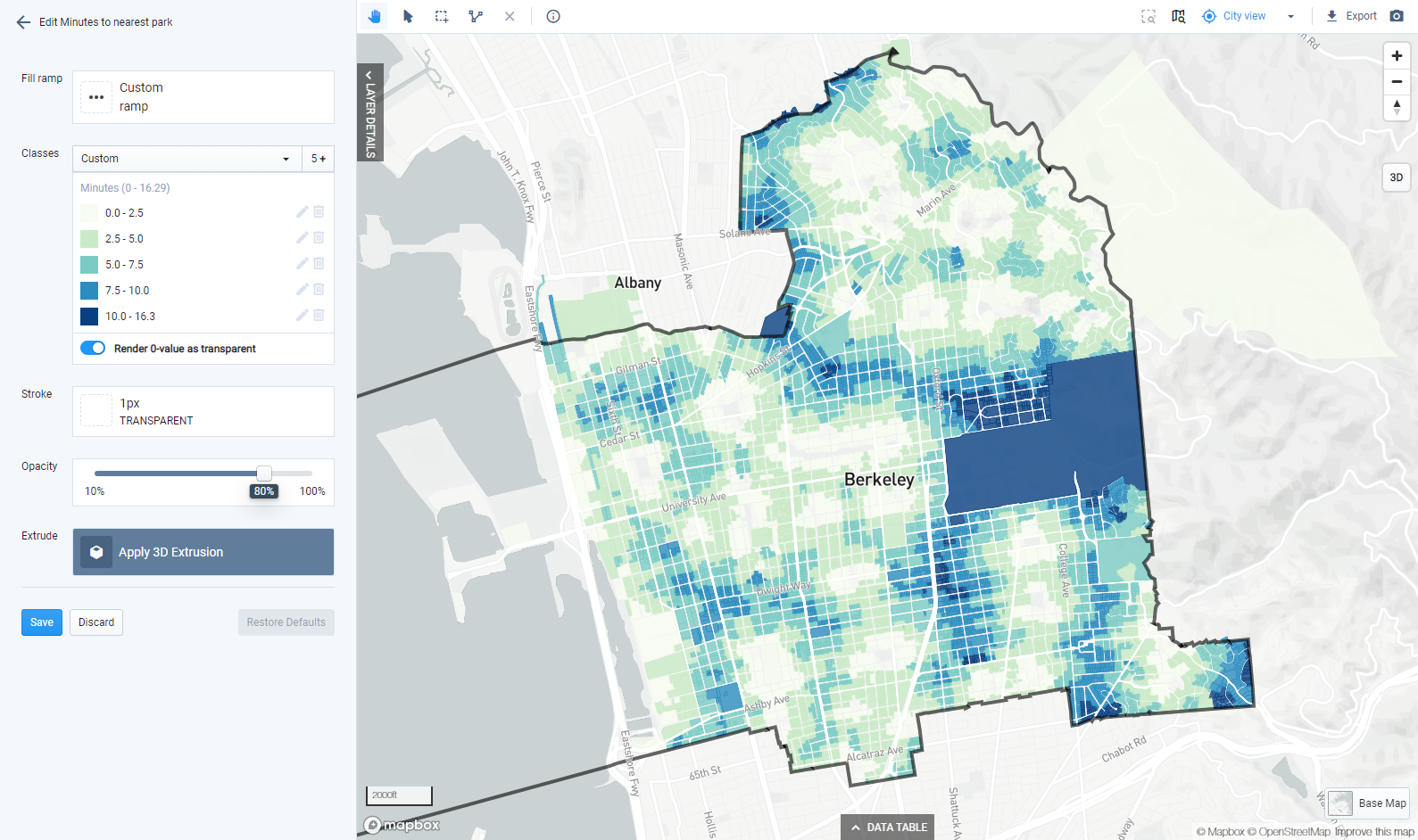
Modified symbology for Walk Access to Destinations: Minutes to nearest park
Next, activate the Transit Access to Employment output layer. Symbolize the layer on the Employment within 30 minutes column by selecting it on the Style tab of the Layer Details pane. The column is mapped with its default symbology.
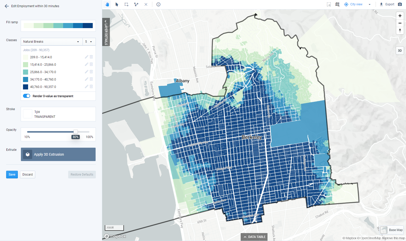
Default symbology for Transit Access to Employment: Employment within 30 minutes
Again, we'll change the data classification to better identify spatial patterns. This time, select the Quantiles classification method, which defines classes to contain the same number of features per class. Using quantiles, we see stronger spatial patterns.
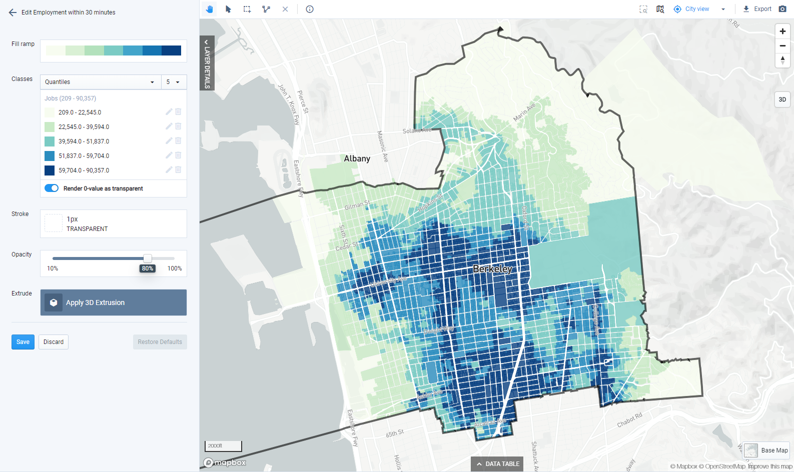
Modified symbology for Transit Access to Employment: Employment within 30 minutes
Mapping bus, metro, and rail transit using the Public Transit Stops and Public Transit Lines reference data layers illuminates the relationship between transit service and the numbers of jobs that can be reached.
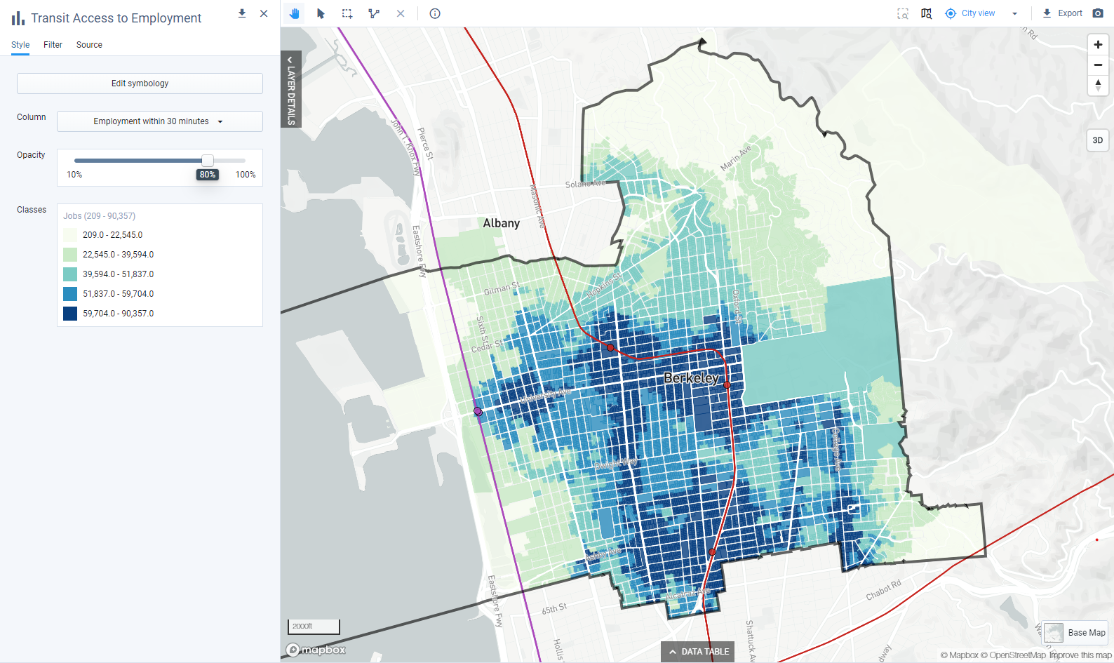
Transit Access to Employment: Employment within 30 minutes shown with metro and rail transit

Transit Access to Employment: Employment within 30 minutes shown with bus, metro, and rail transit
Design and export map(s). From here you can use the accessibility output layers in maps as needed. For guidance on styling layers, refer to previous tutorials or see Symbolize Data Layers. For more information on map layout and export options, refer to previous tutorials or see Export Maps to PNG or SVG.
An export of the Transit Access to Employment map that we created is shown below.
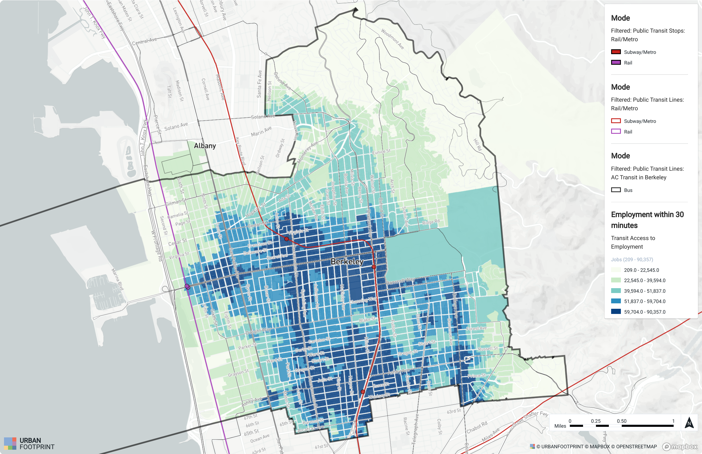 |
Transit Access to Employment within 30 minutes
For information on measuring access to other destinations, see Measure Walk and Transit Access to Custom Points of Interest.