Symbolize Data Layers
Layer symbology refers to the properties of how data is represented graphically. Using the symbology controls, you can adjust the point sizes, line weights, and colors of point, line, and polygon features. You can also classify numeric data according to standard methods—including equal interval, logarithmic, natural breaks, and quantiles—to identify and visually communicate patterns.
Layer Style Tab
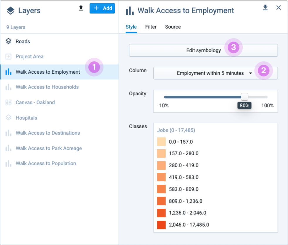
Layer symbology details are shown in the Style tab of the Layer Details pane. To view layer symbology, select a layer (highlighting it as the active layer) in the Layers list. If not already selected, click on the Style tab.
The Style tab includes the following controls:
Edit symbology – Opens the symbology editor for the currently selected column.
Column – A list of all columns in the currently selected layer. Choose which column to display on the map.
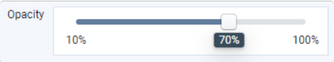
Opacity – Controls the opacity of the currently selected layer.
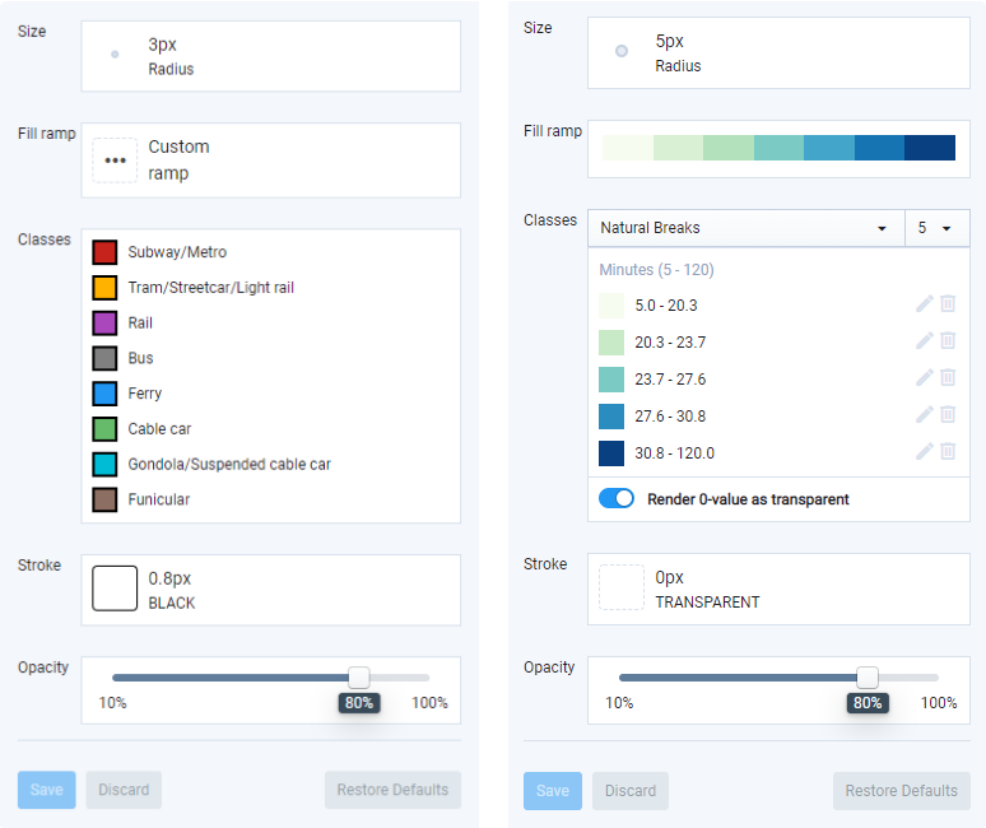
Classes – Serves as a legend, displaying the data classes and symbology for the currently selected column.
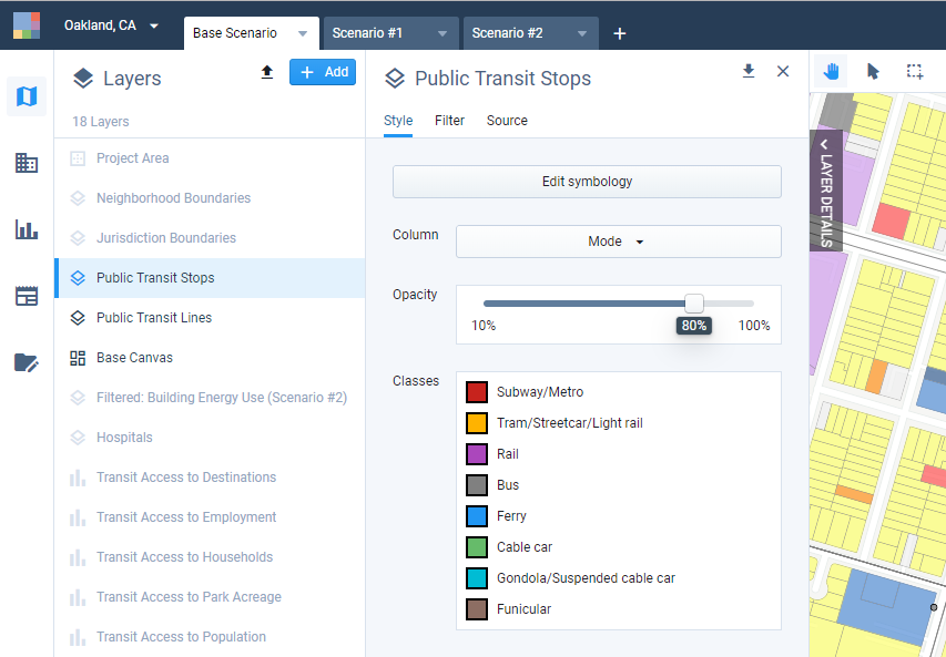
Style tab controls
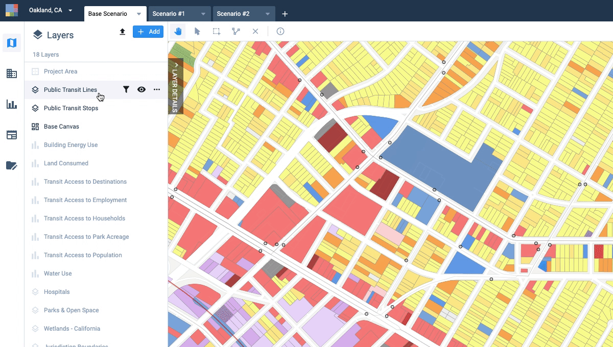
Increasing the opacity of the Public Transit Lines layer from the Style tab
Symbology Editor
The Symbology Editor contains the controls to adjust layer symbology. To open it, click Edit symbology in the Style tab. The options you see will vary depending on the feature type (point, line, or polygon) of the layer and the data type of the column you selected (categorical or numeric). The map will update dynamically as you make changes. Changes will be only be saved if you choose to save your settings.
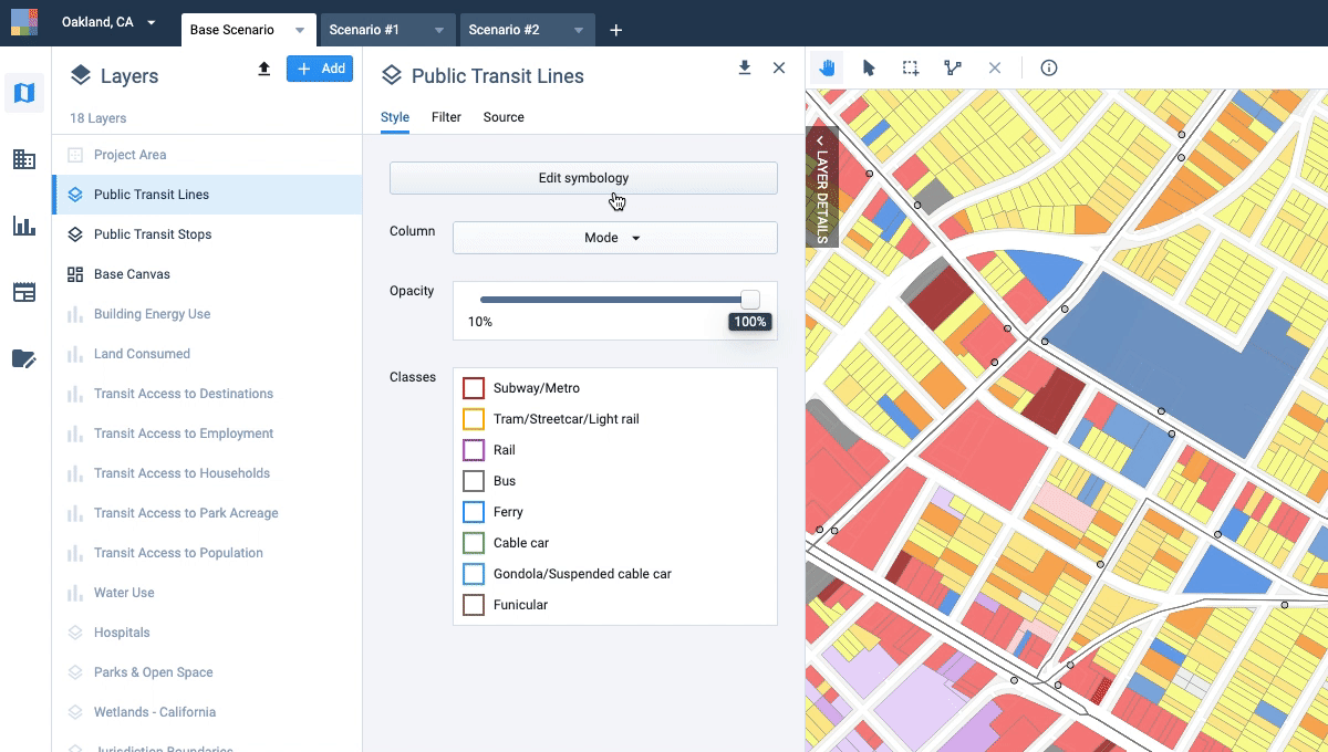 |
Increasing stroke width of Public Transit Lines from the ‘Edit Symbology’ mode
Edit Layer Symbology
Click on the layer in the Layers list to activate it. The Layer Details pane will expand.
Select the column that you want to symbolize by selecting it from the Column list. If you want to symbolize all features using a single symbol, select the No column (single symbol) option.
Click Edit symbology. The symbology editor controls appear in the Layer Details pane. The options vary depending on the feature type (point, line, or polygon) and the data type of the column you selected.
Define data classes for categorical or numeric data. See Classify Data for details.
Select layer style options.
For point features, see Style Point Data. You can adjust dot size, fill color, stroke width, stroke color, and opacity.
For line features, see Style Line Data. You can adjust stroke width, stroke color, and opacity.
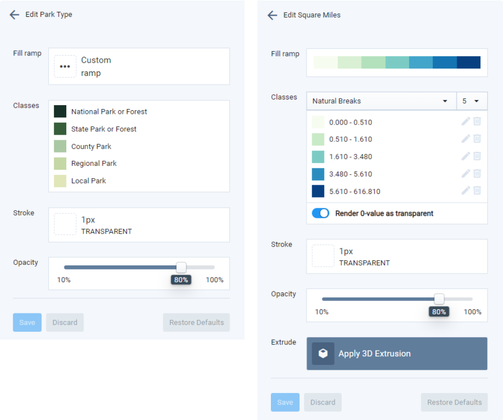
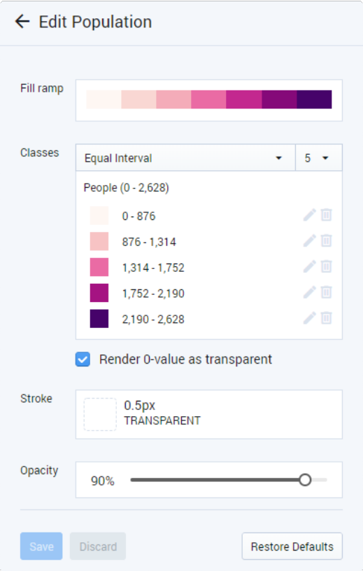
For polygon features, see Style Polygon Data. You can adjust fill, stroke width, stroke color, and opacity, and extrude features in 3D.
Click Save to save your new symbology. Alternatively, you can click Discard to discard your changes or click Restore Defaults to restore the default settings for the column (if any).
Symbology settings for individual columns within a single layer are saved so that you can switch between mapped columns without losing your data classifications and style settings. All layer symbology is linked to individual users, so you can maintain unique settings.
Style Point Data
Point features can be styled to adjust point size, fill color, outline stroke width, outline stroke color, and opacity. Point size and stroke properties are shared across all values, while colors can be varied by value or value class. (If you want all features in your layer to appear the same, select the No Column (single symbol) option from the Column menu on the Layer Style Tab.)
Point Data Styling Options
Size – Click Size to set the point size. Options include 1, 2, 3, 5, 8, and 10 pixels (px). Point sizes remain constant; they do not change relative to map scale.
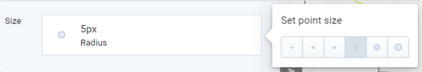
Point size options
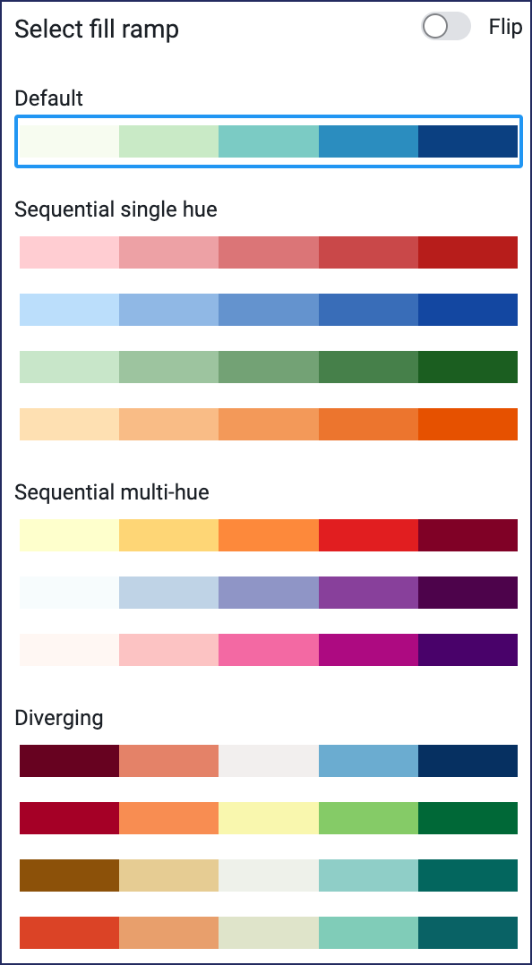
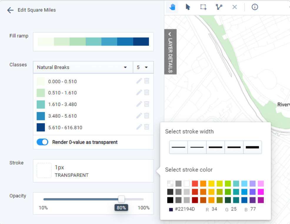
Fill ramp – Select a color ramp to apply a range of colors to the value classes. Colors for individual classes can be modified after a ramp is selected. If the layer comes loaded with default symbology, or if you modify colors after a ramp is selected, the fill ramp control will read Custom ramp.
The available color ramps vary for categorical and numeric data types. The options for numeric ramps are shown below. The Flip toggle reverses the application of the ramp colors — for example to move from dark to light colors, rather than light to dark, as values ascend.
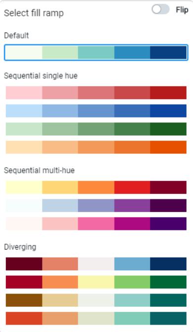
Fill ramp options
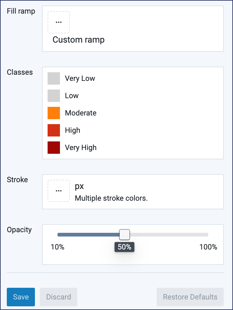
Classes – For categorical columns, this simply lists the unique values as represented in the data, not including null values. For numeric columns, this also includes the controls to classify data. See Classify Data for details on classifying numeric data.
You can vary the colors for each value or value class using the Fill ramp, and/or set them individually. The Classes options for categorical and numeric data are shown below.
Styling options for categorical (left) and numeric (right) data
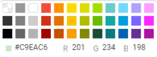
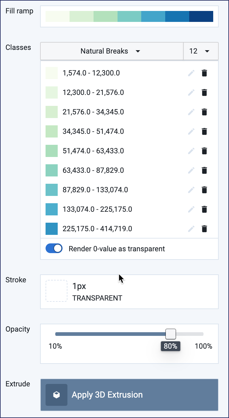
Select the color swatches to edit the colors for individual values or value classes. A color selection panel appears when you click on a swatch. You can choose from the available colors, or enter a hex code or RGB values for a custom color. Use the Render 0-value as transparent toggle to control the display of zero values.
Fill – Appears as a separate control when using a single symbol for all features. You can choose from the available colors, or enter a hex code or RGB value for a custom color.
Fill options
Stroke – Stroke applies to the outline of the point. The same style is used for all values or value classes. Stroke width options include 0.5, 1, 2, 4, or 6 pixels. For stroke color, you can choose from the available options, or enter a hex code or RGB value for a custom color. To omit a point outline, select the transparent option in the upper left of the palette.
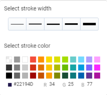
Stroke options
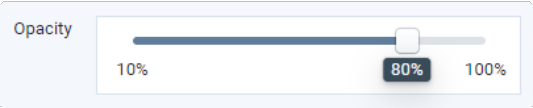
Opacity – Opacity applies to the point and its outline. Drag the slider or click along the line to choose an opacity level.
Opacity control
Save – Click Save to save any edits you have made. The button will be inactive if you have not made edits.
Note
If you navigate away from the Symbology Editor without saving (for instance, by selecting another layer), you will lose your active settings.
Discard – Click Discard to abandon any edits you have made. The button will be inactive if you have not made edits.
Restore Defaults – Click Restore Defaults to revert to default symbology settings, if they exist. The Base Canvas, scenario layers, analysis layers, and many reference datasets come loaded with default settings for commonly used columns. User-uploaded layers do not have associated default settings.
Style Line Data
Line features can be styled to adjust width, color, and opacity. Line width is shared across all values, while colors can be varied by value or value class.
Line Data Styling Options
Fill ramp – Select a color ramp to apply a range of colors to the value classes. Colors for individual classes can be modified after a ramp is selected. If the layer comes loaded with default symbology, or if you modify colors after a ramp is selected, the stroke ramp control will read Custom ramp.
The available color ramps vary for categorical and numeric data types. The options are the same as those shown previously for point fills. The Flip toggle reverses the application of the ramp colors—for example to move from dark to light colors, rather than light to dark, as values ascend.
Classes – For categorical columns, unique values are simply listed, not including null values. For numeric columns, this also includes the controls to classify data. See Classify Data for details on classifying numeric data.
You can vary the colors for each value or value class using the Fill ramp, and/or set them individually. The Classes options for categorical and numeric data are shown below.
Select the color swatches to edit the colors for individual values. When you click on a stroke color swatch, a color selection panel appears. You can choose from the available colors, or enter a hex code or RGB value for a custom color.
Stroke – Appears as a combined color and width control when symbolizing classes. The same width and color settings are applied to all classes. Stroke width options include 0.5, 1, 2, 4, or 6 pixels. You can choose from the available colors, or enter a hex code or RGB value for a custom color.
Stroke color – Appears as a separate control when using a single symbol for all features. You can choose from the available colors, or enter a hex code or RGB value for a custom color.
Stroke width – Appears as a separate control when using a single symbol for all features. Stroke width options include 0.5, 1, 2, 4, or 6 pixels.
Opacity – Opacity applies to the point and its outline. Drag the slider or click along the line to choose an opacity level.
Opacity control
Save – Click Save to save any edits you have made. The button will be inactive if you have not made edits.
Note
If you navigate away from the Symbology Editor without saving (for instance, by selecting another layer), you will lose your active settings.
Discard – Click Discard to abandon any edits you have made. The button will be inactive if you have not made edits.
Restore Defaults – Click Restore Defaults to revert to default symbology settings, if they exist. The Base Canvas, scenario layers, analysis layers, and many reference datasets come loaded with default settings for commonly used columns. User-uploaded layers do not have associated default settings.
Style Polygon Data
Polygon features can be styled to adjust fill color, outline stroke width and color, and opacity. Symbology for polygons also includes controls to normalize numeric data by acre and apply 3D extrusion; for details on using these controls, see Extrude Polygon Features for 3D Mapping.
Polygon Data Styling Options
Fill ramp – Select a color ramp to apply a range of colors to the value classes. Colors for individual classes can be modified after a ramp is selected. If the layer comes loaded with default symbology, or if you modify colors after a ramp is selected, the stroke ramp control will read Custom ramp.
The available color ramps vary for categorical and numeric data types. The options are the same as those shown previously for point fills. The Flip toggle reverses the application of the ramp colors—for example to move from dark to light colors, rather than light to dark, as values ascend.
Fill ramp options
Classes – For categorical columns, this simply lists the unique values as represented in the data, not including null values. For numeric columns, this also includes the controls to classify data. See Classify Data for details on classifying numeric data.
You can vary the colors for each value or value class using the Fill ramp, and/or set them individually. The Classes options for categorical and numeric data are shown below.
Styling options for categorical (left) and numeric (right) data
Select the color swatches to edit the colors for individual values. When you click on a fill color swatch, a color selection panel appears. You can choose from the available colors, or enter a hex code or RGB value for a custom color.
Stroke – Appears as a combined color and width control when symbolizing classes. The same width and color settings are applied to all classes. Stroke width options include 0.5, 1, 2, 4, or 6 pixels. You can choose from the available colors, or enter a hex code or RGB value for a custom color.
Stroke options
Stroke color – Appears as a separate control when using a single symbol for all features. You can choose from the available colors, or enter a hex code or RGB value for a custom color.
Stroke width – Appears as a separate control when using a single symbol for all features. Stroke width options include 0.5, 1, 2, 4, or 6 pixels.
Opacity – Opacity applies to the point and its outline. Drag the slider or click along the line to choose an opacity level.
Opacity control
Save – Click Save to save any edits you have made. The button will be inactive if you have not made edits.
Note
If you navigate away from the Symbology Editor without saving (for instance, by selecting another layer), you will lose your active settings.
Discard – Click Discard to abandon any edits you have made. The button will be inactive if you have not made edits.
Restore Defaults – Click Restore Defaults to revert to default symbology settings, if they exist. The Base Canvas, scenario layers, analysis layers, and many reference datasets come loaded with default settings for commonly used columns. User-uploaded layers do not have associated default settings.
Classify Data
How you classify quantitative data is key to effectively identifying and communicating spatial patterns. Analyst allows you to work with standard classification methods—equal interval, logarithmic, natural breaks, and quantiles—or manually classify your data using the Classes control of the Symbology Editor.
Classification Methods
You can select from the equal interval, logarithmic, natural breaks, and quantile methods. All methods can include 3 to 12 classes.
Equal interval – Equal interval classes are of equal size, suitable for representing familiar data ranges, or data that is distributed across a linear range without many outliers.
Logarithmic – Logarithmic classes are based on orders of magnitude, suitable for representing data that skews towards large values.
Natural Breaks – Natural breaks classes minimize variance within classes, and maximize difference between classes. Natural breaks classification is best applied to understand individual datasets, and is generally not suitable for comparing data between maps.
Quantiles – Quantile classes contain the same number of features per class, suitable for representing data that is distributed across a linear range.
Classify Numeric Data
Click on the layer in the Layers list to activate it. The Layer Details pane will expand.
Select the column that you want to classify and symbolize by selecting it from the Column list. The column must contain data in numeric format in order to be classified.
Click Edit symbology. The symbology editor controls appear in the Layer Details pane. The options vary depending on feature type (point, line, or polygon) and the data type of the column you selected.
Select a data classification method from the list in the Classes control. Options include Default, Natural Breaks, Equal Interval, Logarithmic, and Quantiles (see the previous section for definitions). Default refers to classification schemes that have been defined by Analyst as defaults for reference data or analysis module output layers; not all layers of these types will have Default classification settings.
Numeric data classes
Select the number of classes you would like to use from the list up to the right of the classification method list. You can include from 3 to 12 classes. The map will be updated dynamically as you adjust classes, so you can actively explore your data. Use the classification controls to try different classification methods, numbers of classes, and class colors.
Note
Classification settings, along with all other symbology options, must be saved before you navigate away. Remember this if you are comparing mapped data across multiple scenarios or layers.
To edit class bounds, click the Edit icon
 . The Edit class bounds window appears. You can edit the lower and/or upper bounds of a class. The bounds of adjacent classes will be adjusted automatically to eliminate gaps between classes. Editing class bounds puts you into Custom classification mode. You can add or delete classes to manually define specific class ranges.
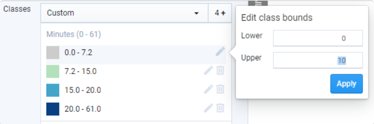
Editing class bounds
To delete a class, click the Trash icon
 . The class will be deleted and the bounds of an adjacent class (the next higher class if there is one, or the next lowest class if you are deleting the highest class) will be adjusted automatically to eliminate gaps between classes.
 Deleting a class also puts you into Custom classification mode. If you select another classification method from the menu, the classes will be reset and your manual settings will be lost.
To add a class, click the class number. The Add new class window will appear. You can add classes if you have previously edited class bounds or deleted a class. The bounds of existing classes will be adjusted automatically to accommodate the new class. You will receive warnings if the bounds of the new class eliminates existing classes (by completely overlapping them) or are otherwise invalid.
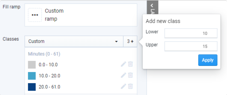
Adding a new class
To restore classes to their default values (if applicable), click Restore Defaults. The class value will be reset.
Note
Selecting a classification method from the menu at any point automatically resets the classes and overrides manual settings.
Use the Render 0-value as transparent toggle to show or hide zero values.
To save your classes, click Save. If you navigate away from the Symbology Editor without saving, your settings will be lost.
Style your data as needed. You can apply color ramps to your data classes, and/or manually select colors for individual classes. See Style Point Data, Style Line Data, and Style Polygon Data for guidance on setting color, stroke, and opacity.
To save your symbology settings for the layer, click Save. Alternatively, you can discard your edits by clicking Discard.
Remember that all symbology settings, including data classes, are linked to individual users.
Extrude Polygon Features for 3D Mapping
3D extrusion adds another dimension to layer symbology. Symbolizing numeric data using feature height can be powerful for highlighting spatial patterns and contrasts. Any polygon layer can be extruded according to numeric attributes. Extrusion can be applied along with data classification and other layer styling options—exploring is key to finding what works.
Extrude Data in 3D
Click on a polygon layer in the Layers list to activate it. The Layer Details pane will expand.
Select the column that you want to extrude by selecting it from the Column list. The column must contain numeric values.
Click Edit symbology. The symbology editor controls appear in the Layer Details pane.
If you are not already in 3D mode, click the 3D button located at the upper right of the map view.
Click Apply 3D Extrusion. The Extrude window appears.
Use the Extrude column values toggle to turn extrusion on.
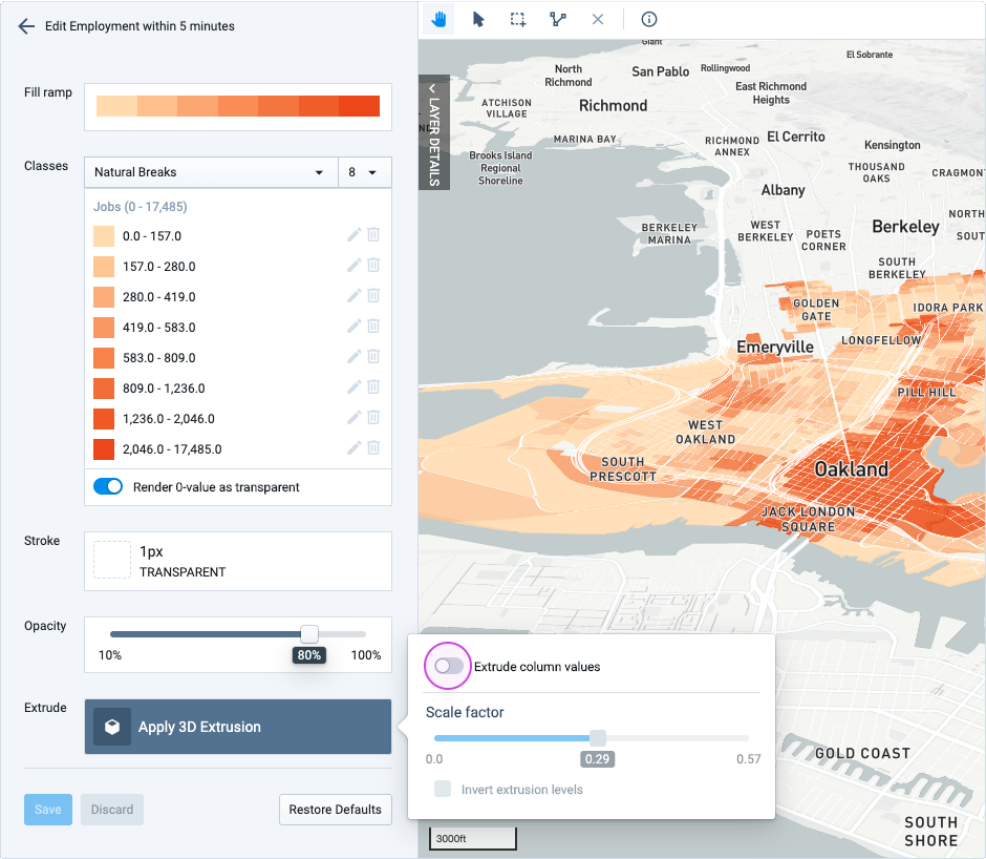
Use the Scale factor slider to adjust extrusion height. The scale factor adjusts the height of all features relative to their values. By default, the scale factor is set to 1. Use the map view to find the right scale factor, which will depend on the value range of your data and the amount of extrusion you want to show. You can also use the scale factor to ensure that you symbolize the same data consistently across multiple scenarios or projects. The map dynamically updates to reflect your selection.
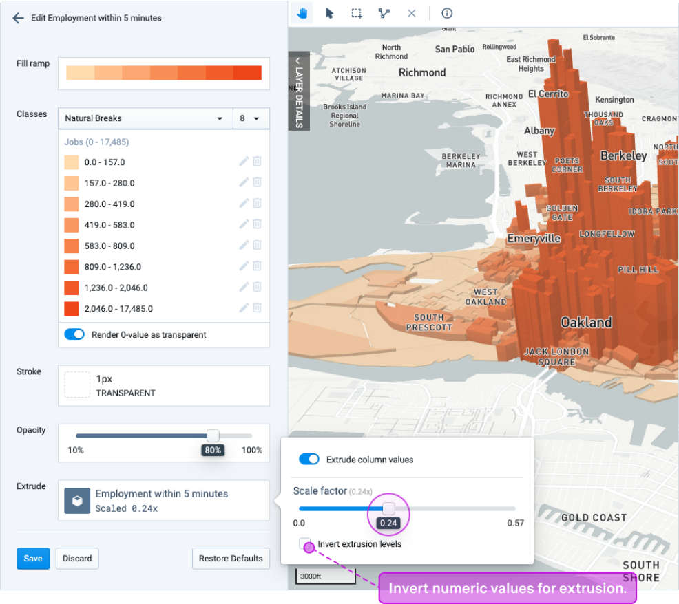
If appropriate, turn on Invert extrusion levels. This inverts the relationship between data values and height, giving the smallest values the tallest extrusion.
Click anywhere outside the Extrude window to close it.
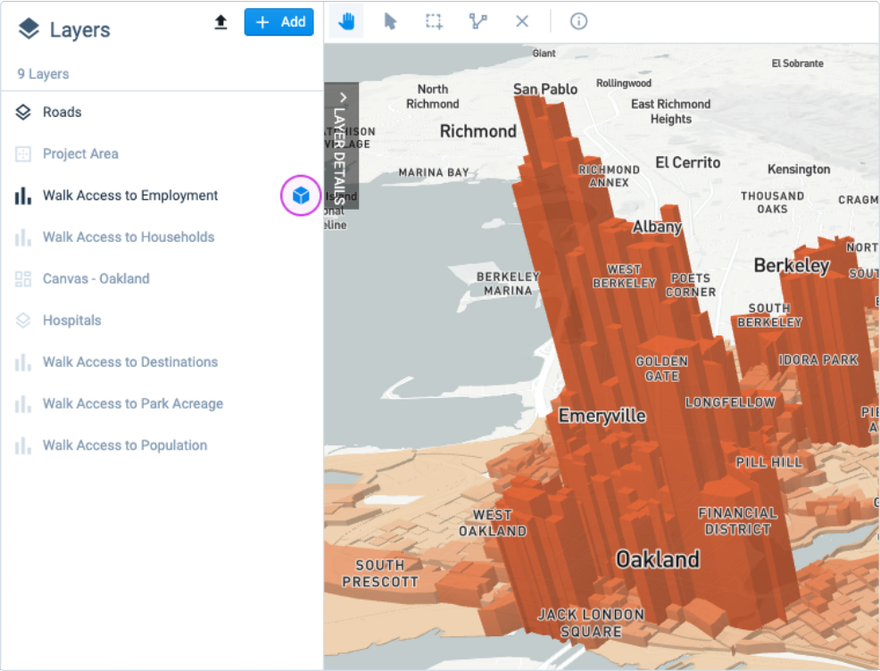
When extrusion is turned on for a layer, you will see an icon in the Layers list indicating that extrusion is active. You can click on the icon to turn extrusion off. To turn extrusion on again, return to the Symbology Editor; your scale factor will be saved.
Click Save. This saves your extrusion and other symbology settings. Alternatively, you can click Discard to discard your changes or click Restore Defaults to restore the default settings for the column (if any).
Settings for individual columns within a single layer are saved so that you can switch between mapped columns without losing your data classifications and style settings. All layer symbology is linked to individual users so you can maintain unique settings.