General Location Analysis
Apply a General Location Analysis to connect Insights to a set of locations in a portfolio, such as:
Retail – Retail locations operated by a business.
Offices – Office locations for a company.
Grocery – Grocery stores or warehouses for one brand or a competitor.
Restaurants – Restaurant locations for one brand or a competitor.
Commercial Real Estate – Portfolio of multifamily, single-family, or commercial properties for rental.
Use Case
Template
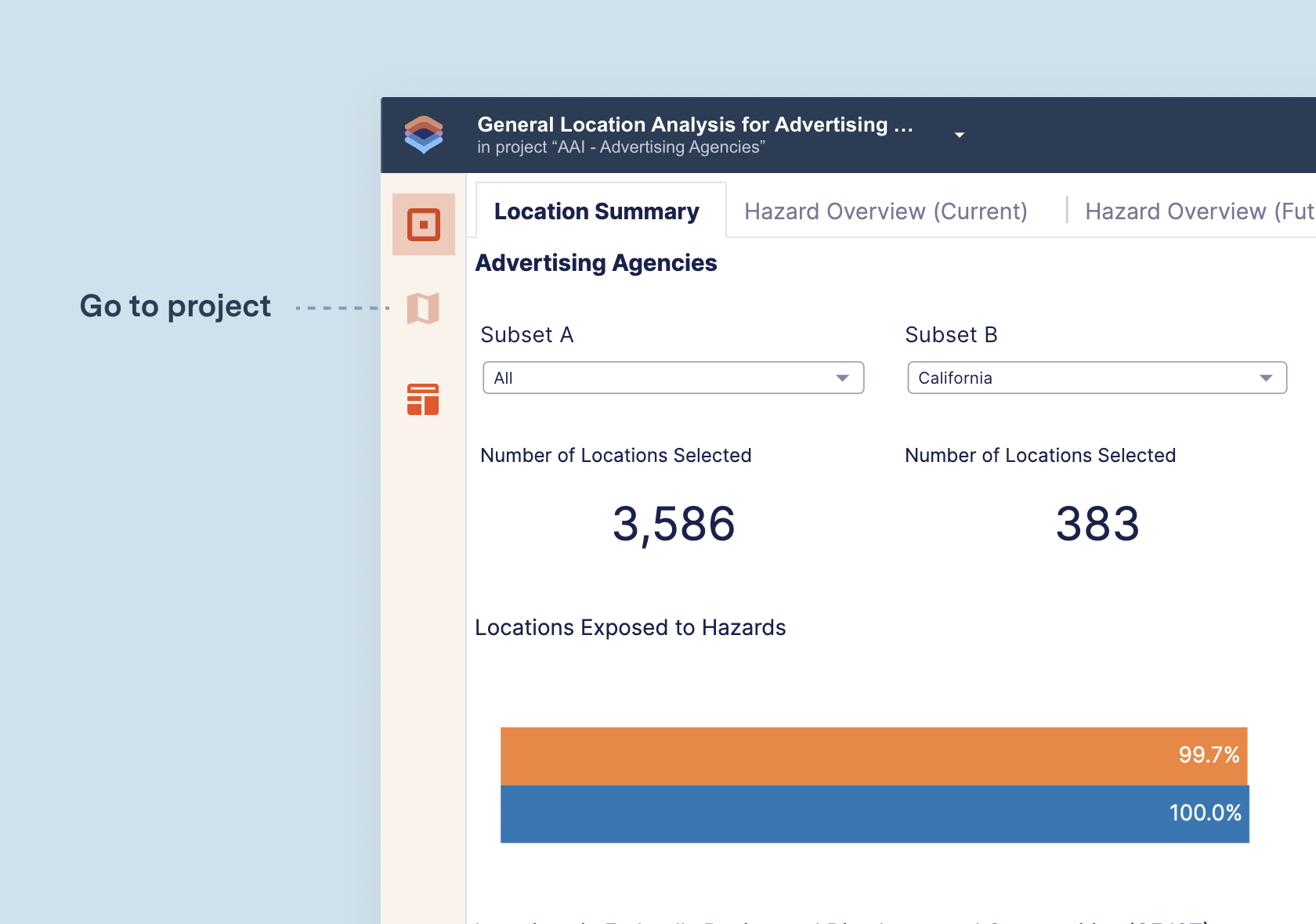
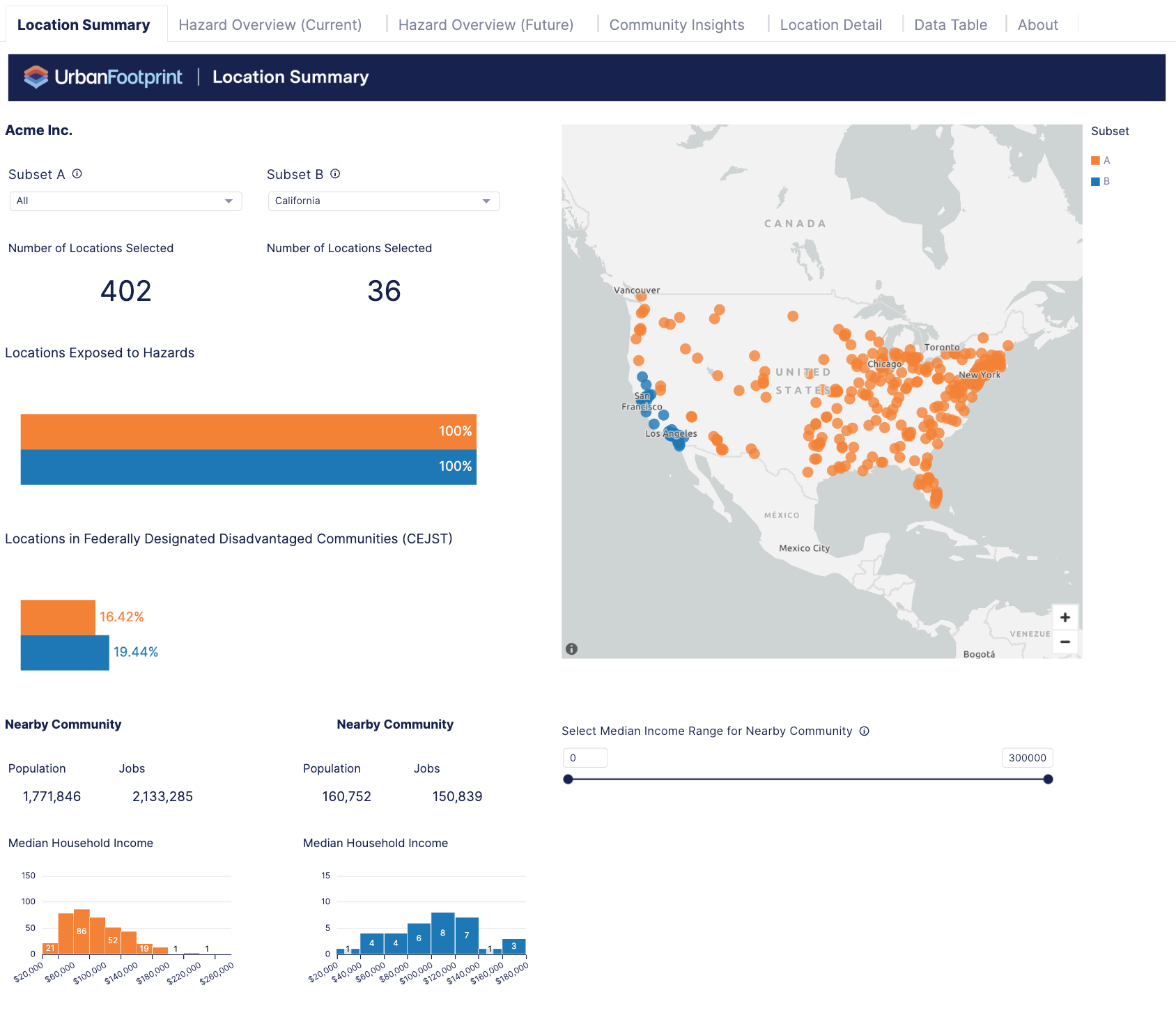 | Location Summary – provides a portfolio overview and summary of the most important high-level metrics across locations and nearby communities. Use this summary to quickly assess portfolio scale geographically and across communities and hazard risk exposure. Use the selections to view an overall summary, a subset summary, or compare subsets. |
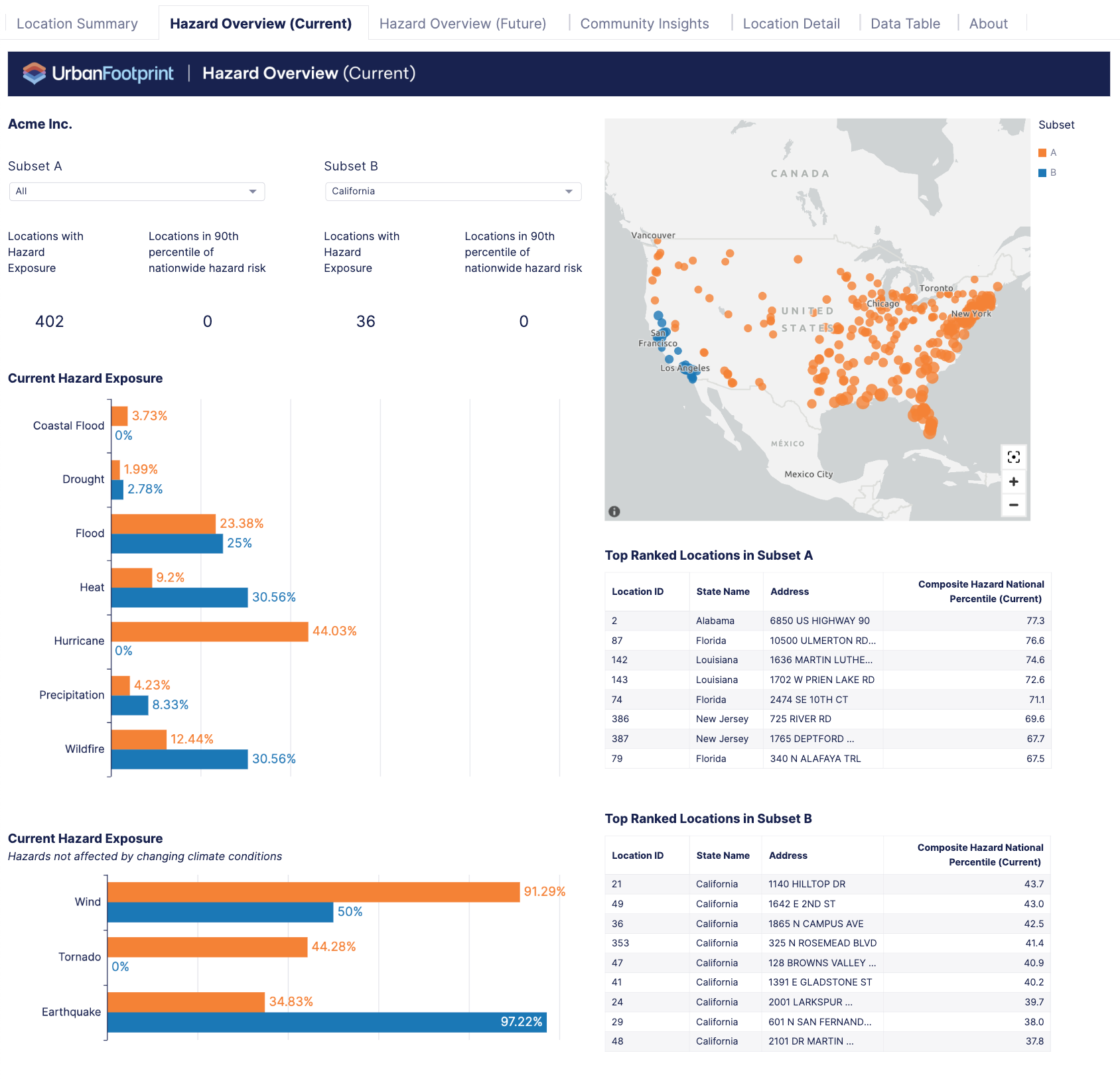 | Hazard Overview (Current) – summarizes the hazard risk to all locations in their current state. It shows which locations are at risk of climate hazards and helps you determine which hazards are the biggest concern for the business. |
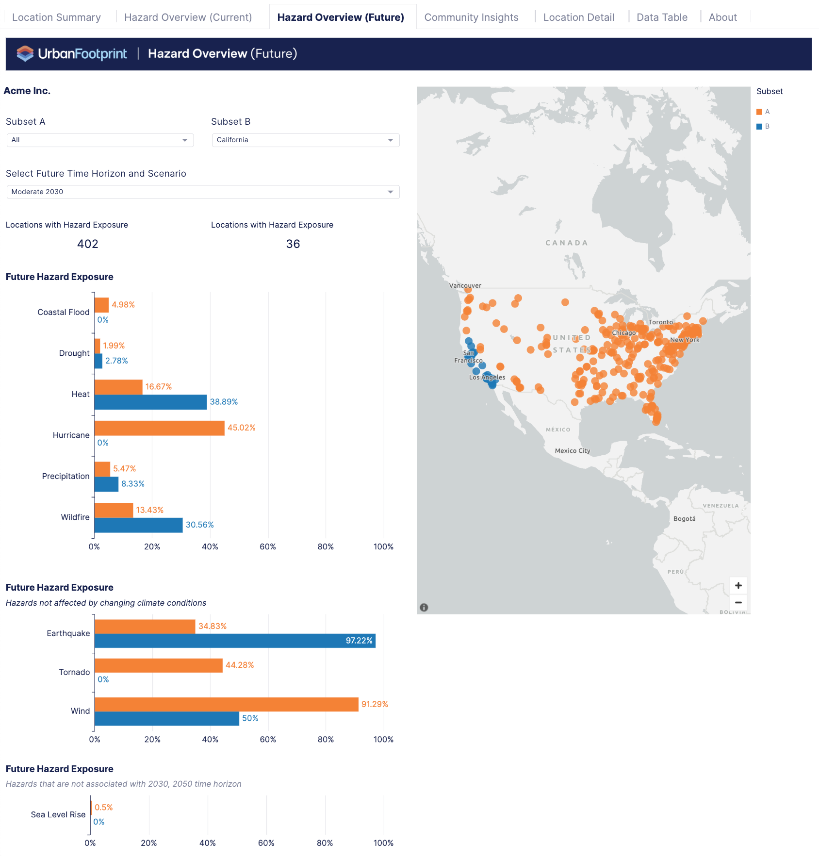 | Hazard Overview (Future) – summarizes the hazard risk to all locations under a choice of future time horizons and scenarios. It shows which locations are at risk of climate hazards and helps you determine which hazards are the biggest concern for the business. |
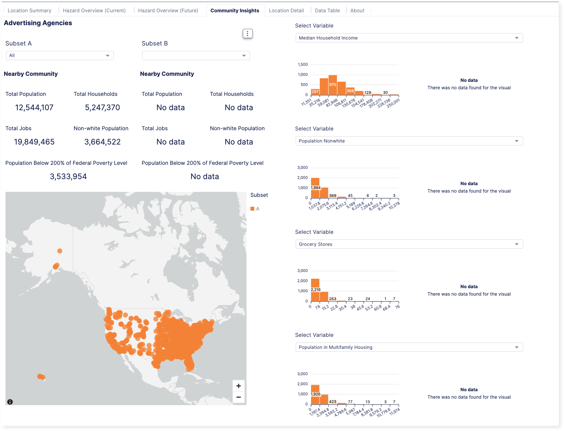
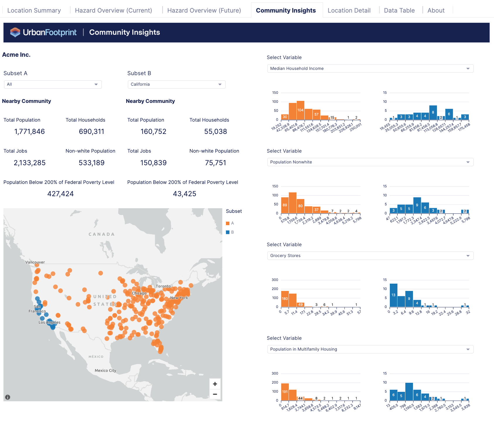 | Community Insights – builds awareness of community characteristics (Census Tract around locations) to support compliance with fair lending laws and other corporate social responsibility goals. Based on a selection of community metrics, you can view locations in communities that meet the criteria for an investment or need. |
 | Location Detail – provides details about a single location. You can navigate from tables in other sections directly to a specific location to view its details. You can also search for a specific location using its ID. |
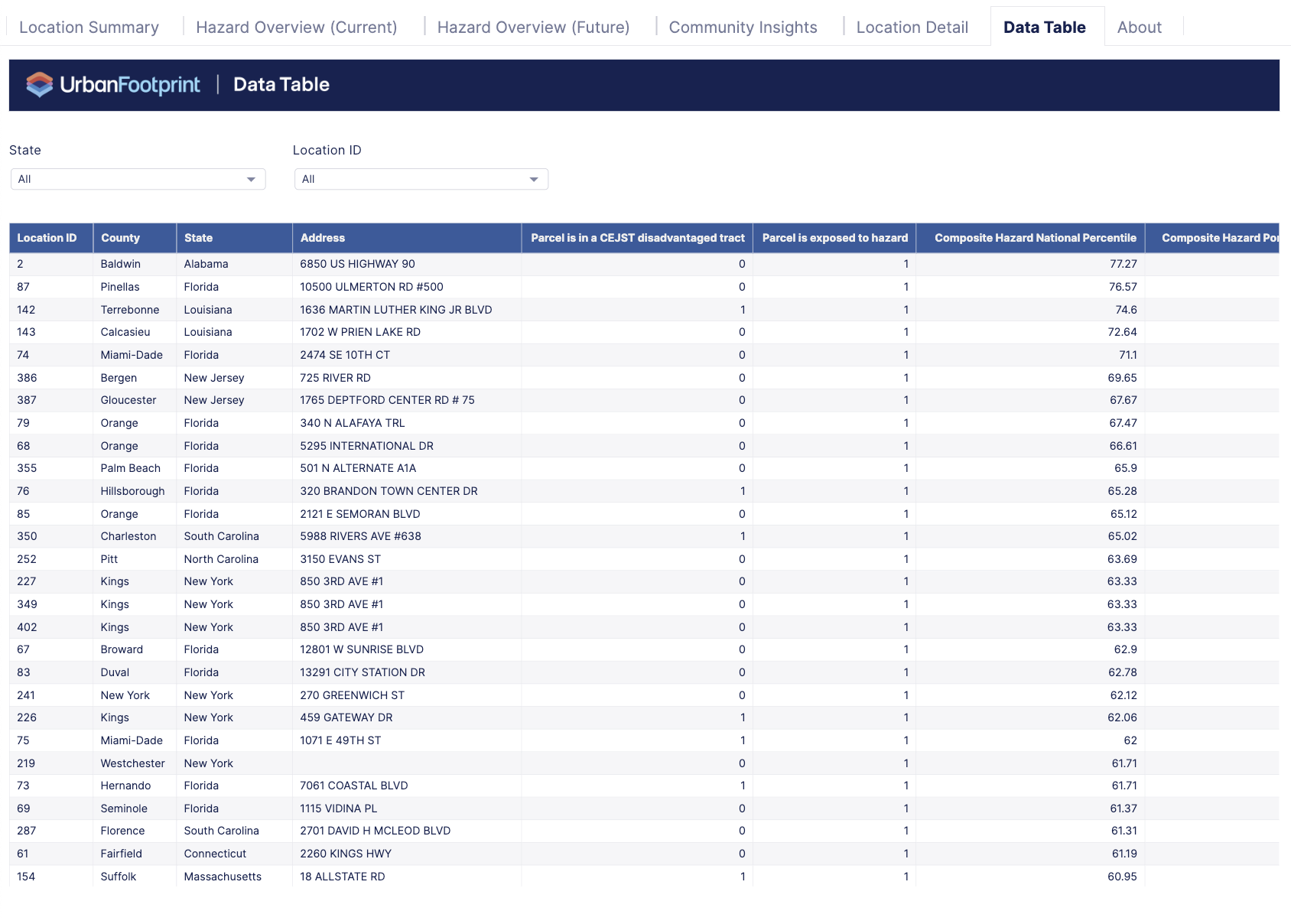 | Data Table – provides a high-level summary of key metrics and rankings. You can export this table, but the complete dataset (available in the project) includes more than what's shown in the dashboard. |
 | About – provides tips about how to work with and understand the dashboards. |
Process
General Location Analysis Workflow
A General Location Analysis dashboard is a good way to evaluate a set of locations in a portfolio. In this example, you can see how to search for a broad category of business types to create a set of locations. Then, use those locations to create a dashboard and review the resulting analysis.
Find Locations
You can search for businesses to add to your project by searching by specific brands, business categories, or names.
For this example, create a General Location Analysis project so you can include the full set of locations across the U.S.
Search for the type of business you want to analyze. For example, you can search for advertising agencies by entering and selecting that business category.
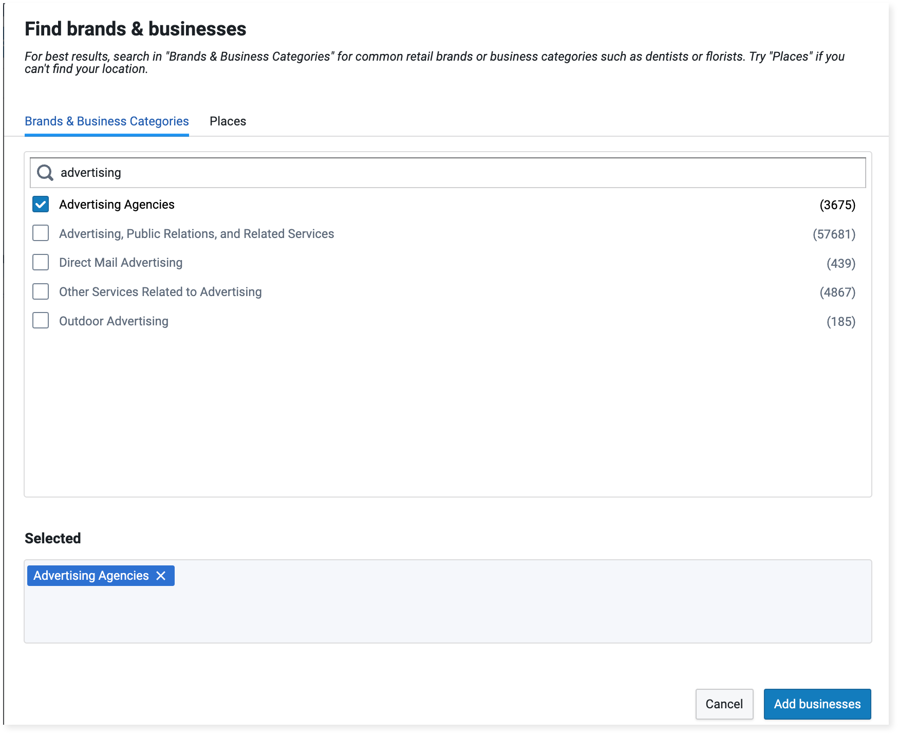
Brands & businesses selection
Connect Locations
After adding the advertising agencies to your project, you can choose an Insight with Dashboards to connect to those locations. The General Location Analysis is a versatile option that creates a dashboard summarizing the entire portfolio and enables you to further evaluate and visualize specific locations.
To run the General Location Analysis, select the Advertising Agencies layer.
Select Insights > General Location Analysis, and click Run analysis.
The analysis can take up to several hours to run, but the time will vary depending on the number of locations.
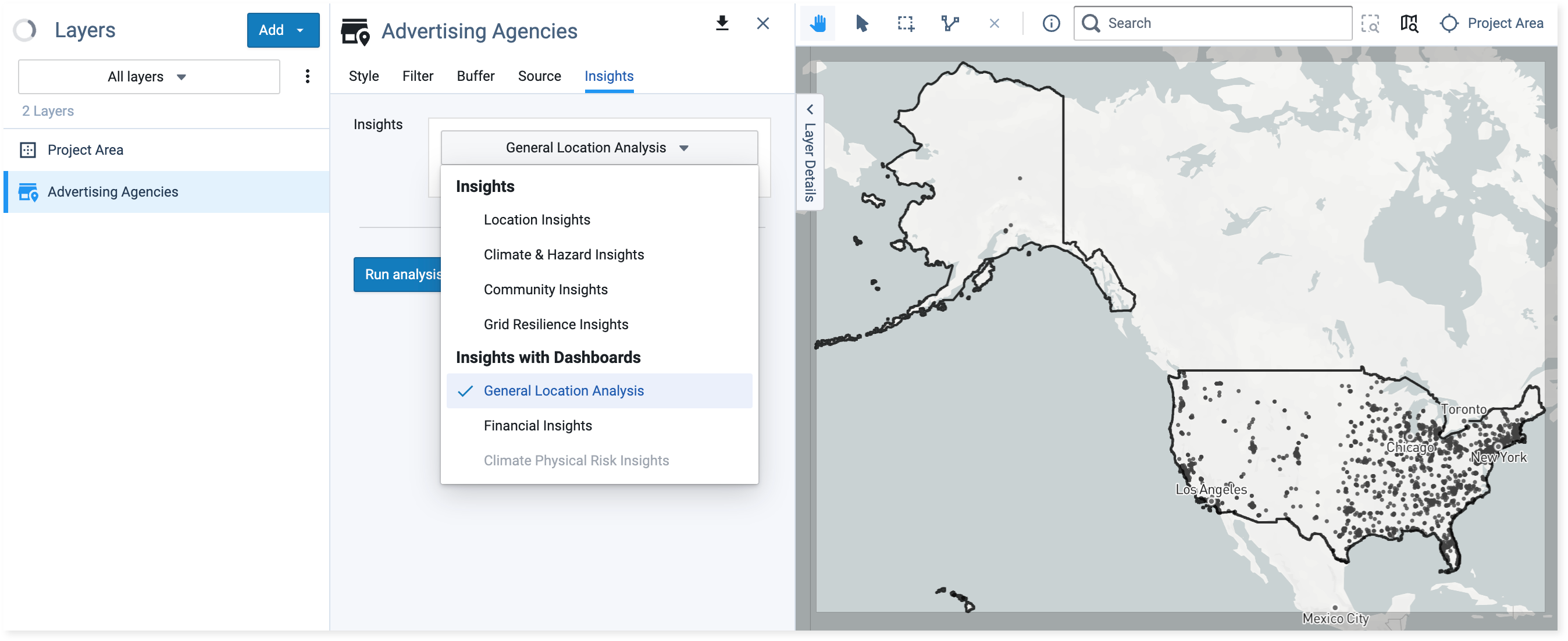
Selecting a dashboard to run
Explore Locations
You can start by exploring the set of locations in the dashboard for a preliminary view, comparing locations, and viewing their overall rankings. Then, you can further analyze and visualize specific locations.
Compare Locations and View Rankings
Start with the dashboard to get a general understanding of the surrounding community and any potential hazard risks to the set of locations. This will enable you to compare and view their rankings within the set and nationally.
In this example, you can quickly review the information on the available tabs before focusing on the locations with the top hazard risks.
Once the analysis is complete, you can review the dashboard.
Click Location Summary to review your entire portfolio of locations. It provides an overall summary or allows you to compare subsets by state.
Choose Community Insights and select community characteristics in the drop-down selections.
View Hazard Overview (Current) to see a summary of locations and compare their current risk.
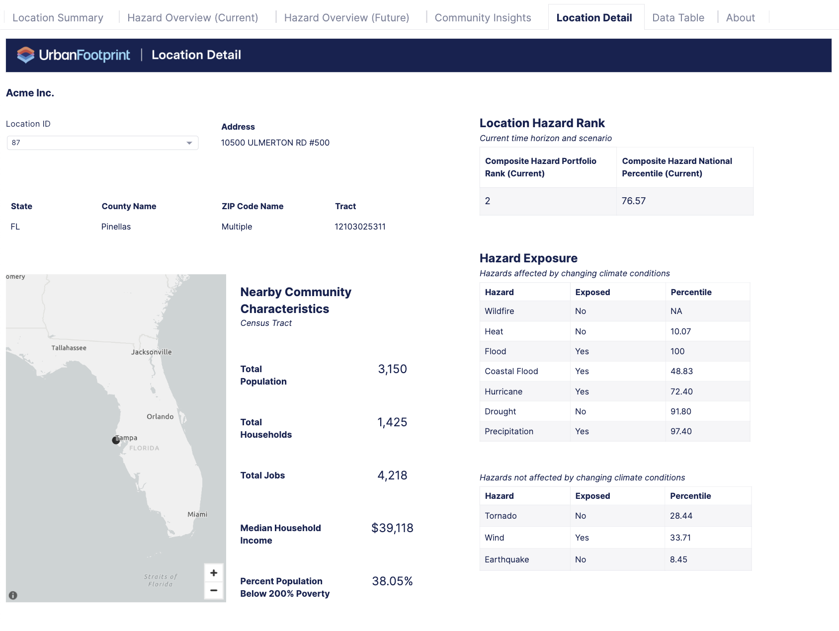
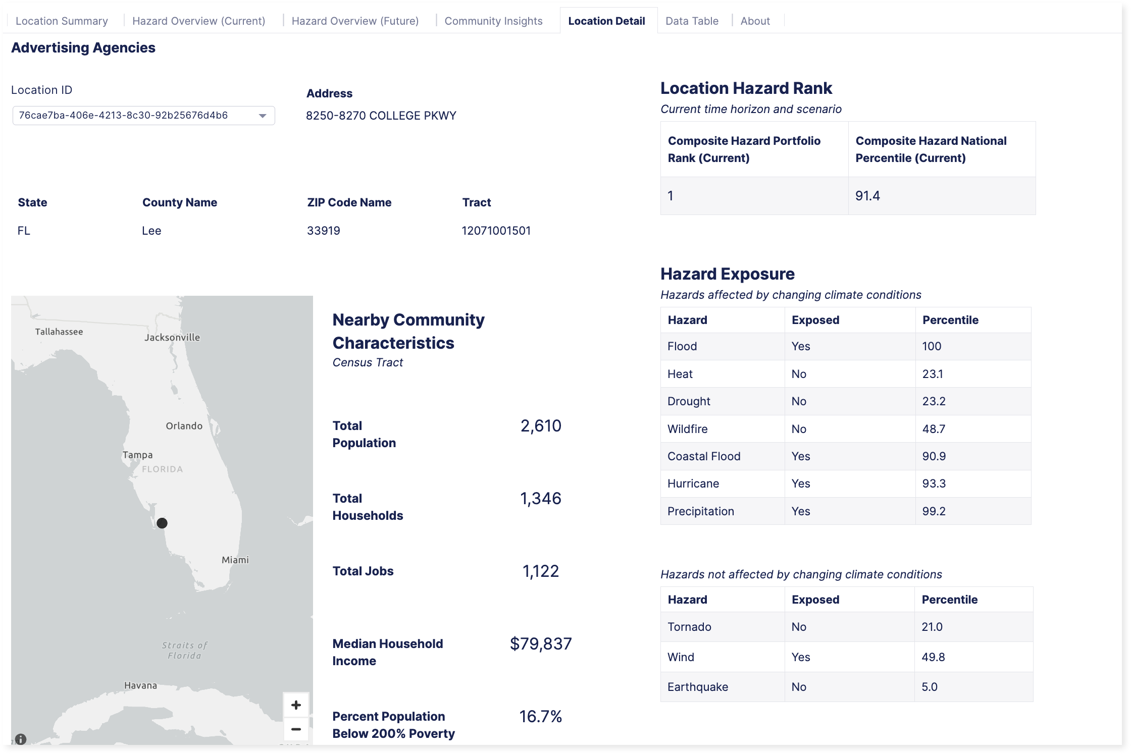
Click on a location, such as the first location shown in Location Detail Selection on the Location ID with the highest ranking hazard risk, to view the Location Detail tab. Location Detail focuses on the specific location ID you select.
Figure 1. Location Detail Selection on the Location ID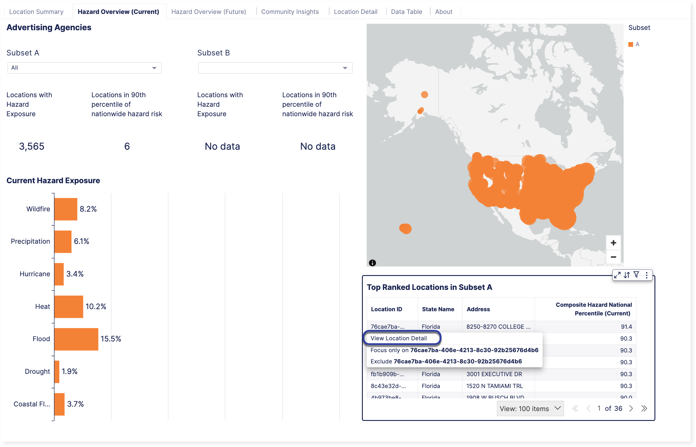
Review the information in Location Detail.
In this example, the selected location is primarily exposed to flood, precipitation, and hurricane hazards, as well as their respective percentiles.
If you find an interesting location that you'd like to explore further, switch to the project. From there, you'll be able to compare multiple top hazard locations or view other types of geography levels, not just tracts. For example, you might be interested in viewing the top ten Advertising Agency locations ranked by Composite Hazard.
 |
Switch to the project associated with the dashboard
Analyze and Visualize Specific Locations
If you identify information in the Dashboard that you'd like to visualize or learn more about, analyze the data further in Analyst. You can view additional context, see the full data table, and bring in other layers.
This specific example shows how to use Analyst to visualize the top 10 Advertising Agency locations with the highest-ranked Composite Hazard score in the General Location Analysis dashboard.
Switch to the project from its dashboard or open it directly in Analyst.
Convert the portfolio locations to points to make the entire portfolio visible on a national scale.
Select the ellipsis
 next to the General Location Analysis - Parcel for Advertising Agencies layer to convert it to a point layer.
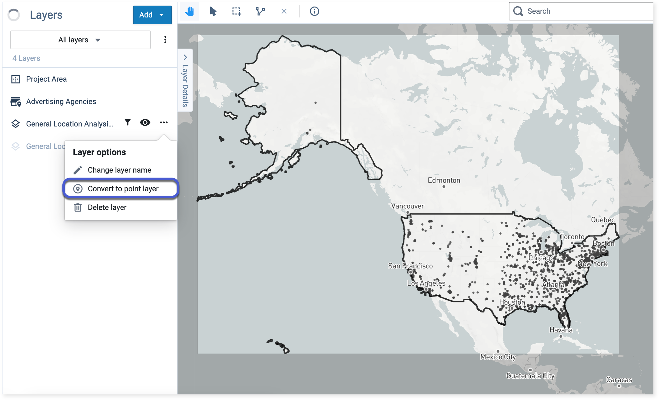
Converting to point layer option
Filter the portfolio to focus on the top 10 advertising agency locations with the highest Composite Hazard score.
Select your new point layer and navigate to Filter in the Layer Details pane. Click the Add filter button and choose Composite Hazard Portfolio Rank (Current) from the drop-down. Then, enter 1 and 10 into the input fields as shown in Filter by Composite Hazard Portfolio Rank (Current).
Figure 1. Filter by Composite Hazard Portfolio Rank (Current)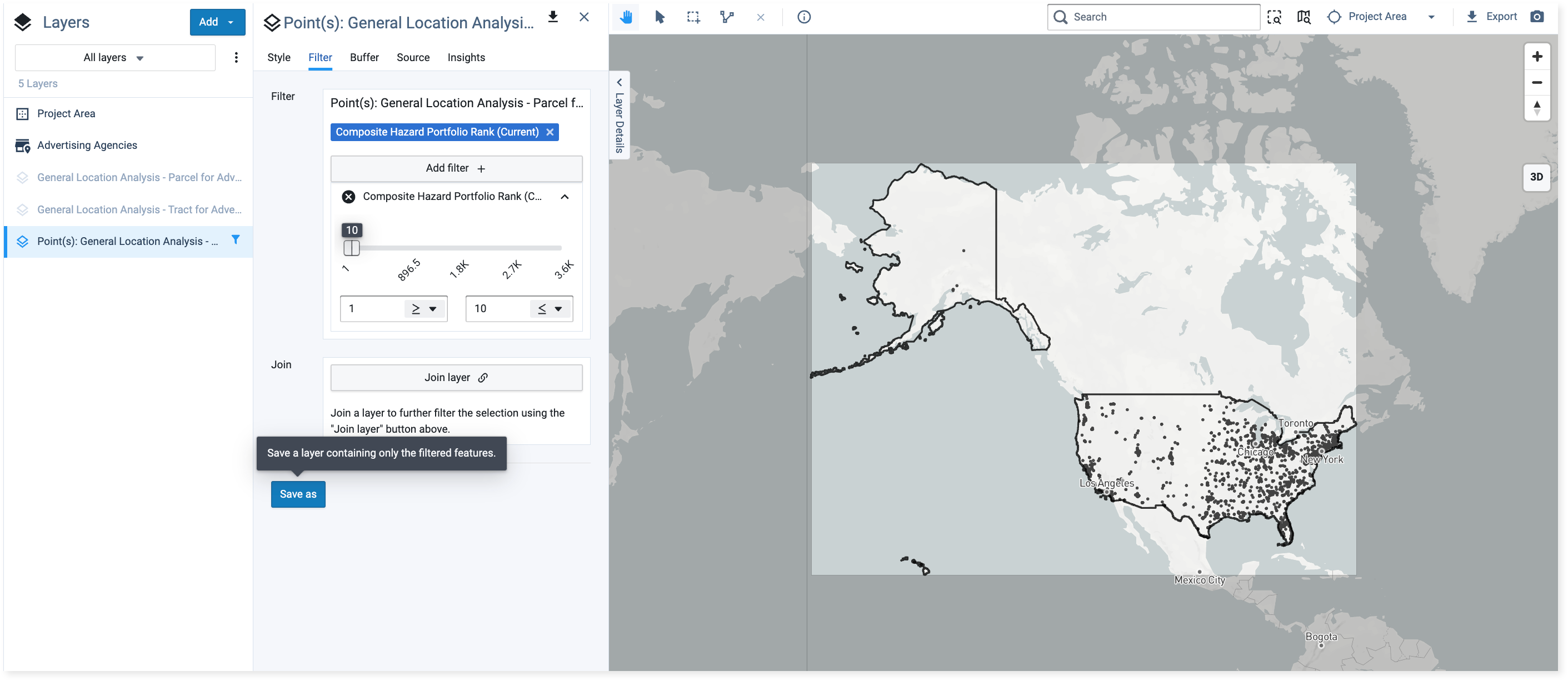
Changing the fields to 1 through 10 so the map only shows the top 10 locations with the highest composite hazard ranking in the portfolio
Click the Save as button to save the filtered locations as a new layer. Name the layer and click Ok.
Change the symbology in the new layer for better visibility. Click Edit symbology to change the color and stroke of the points.
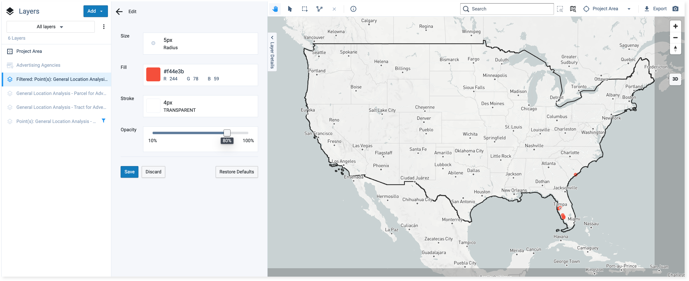
View of top 10 locations with point symbology (size and fill) changed for better visibility
Continue to explore the portfolio. Depending on your analysis goals, you can add other data layers, add filters, or review the data table.
For example, you may want to look at the top 10 Advertising Agency hazard locations that also fall within the CEJST-disadvantaged tract and have over 50 employees, like in CEJST Disadvantaged Tract and Employee Filters. If you enable these two filters, only the locations that meet the filter criteria will be shown in the data table.
Figure 2. CEJST Disadvantaged Tract and Employee Filters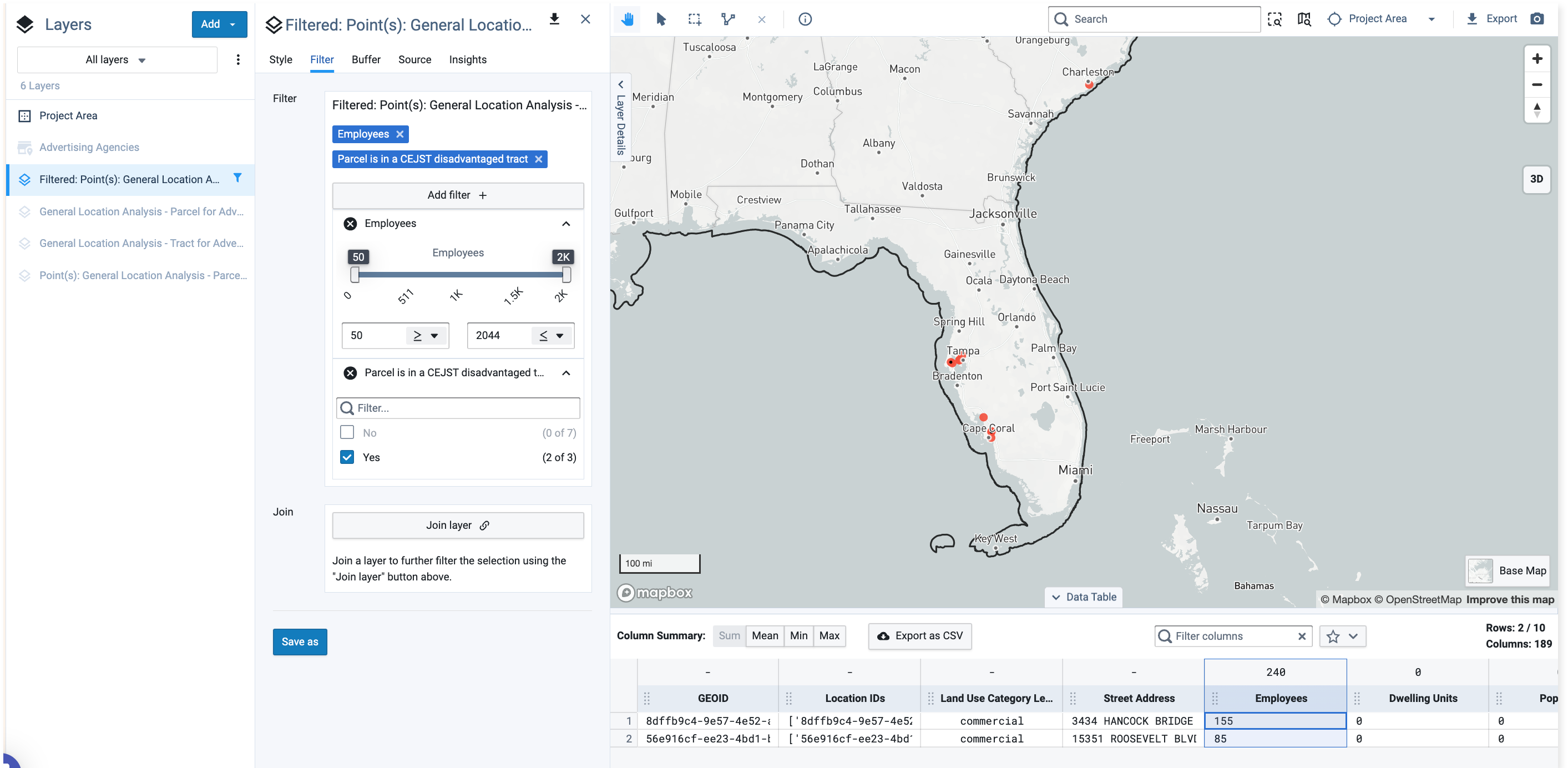
View of applied CEJST and employee filters with data table showing the two locations that meet the filter criteria