Existing Conditions Assessment
 |
Analyst provides a robust foundation of reference data and analysis capacity to support a comprehensive assessment of existing conditions. The tutorials in this section guide you through sample workflows that cover core features for working with data layers, mapping, and analysis.
Map Existing Land Use
In this tutorial, we'll explore ways of depicting existing land use using the Base Canvas layer. For further context, the reference data library includes zoning data from the US City Open Data Census. You can also upload local land use data to explore and map in Analyst.
Data used | Features Used |
Explore Land Use Levels
View the Base Canvas in Explore mode. Select the Base Canvas from the Layers list to make it the active layer. Hide any other layers that may be shown by clicking the Hide icon
 .
.View the Base Canvas layer symbology. From the Layer Details pane, click the Style tab. The Style tab shows the symbology for the selected column.
Explore the canvas using the different levels of the Analyst land use hierarchy. Analyst allows you to map and assess existing land use for any U.S. location according to the same classification system. The land use system consists of four levels that vary in their specificity, as you'll see in the next steps. Building Types and Place Types, which are used to represent new development in land use scenarios, sit at the bottom of the nested hierarchy as L4 types. (For more detailed information about the land use hierarchy, including the classes included at each level, see Land Use Hierarchy.)
First, select Land Use Summary (L1) from the Column list. The symbology as it appears in the Style tab serves as a legend. The default symbology for the land use levels uses a color scheme common for representing land use.
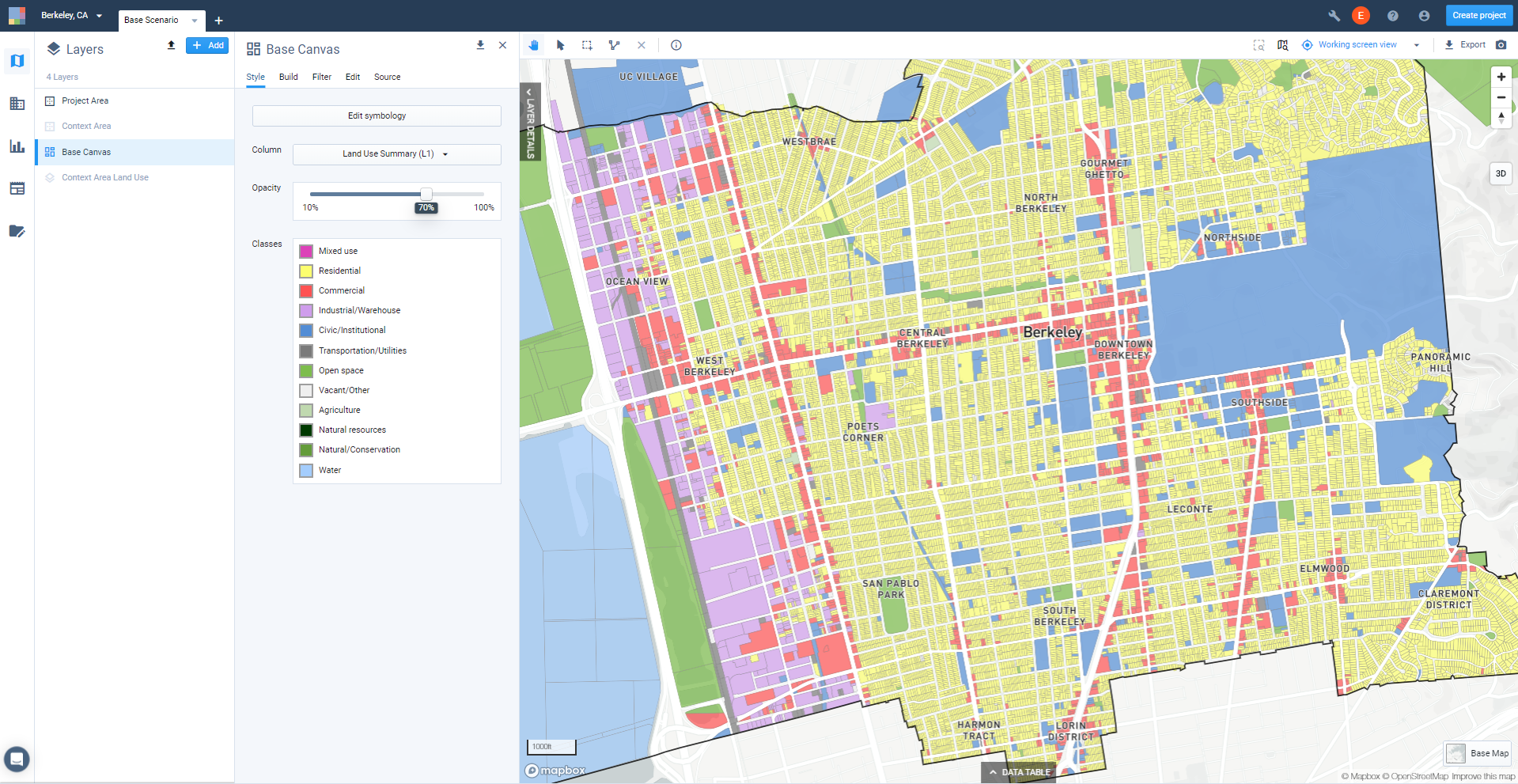
View of Base Canvas symbology selection
L1, as mapped below, is suitable for creating high-level maps. Zoom out to see how L1 looks at the project-wide scale, or for a similarly broad area.
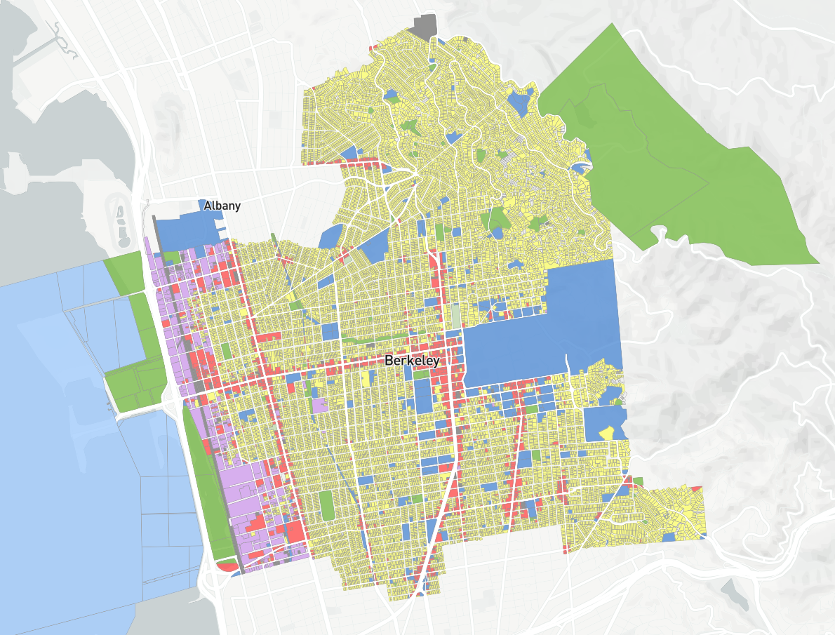
Base Canvas mapped using Land Use Summary (L1) column
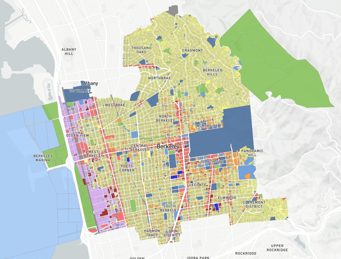
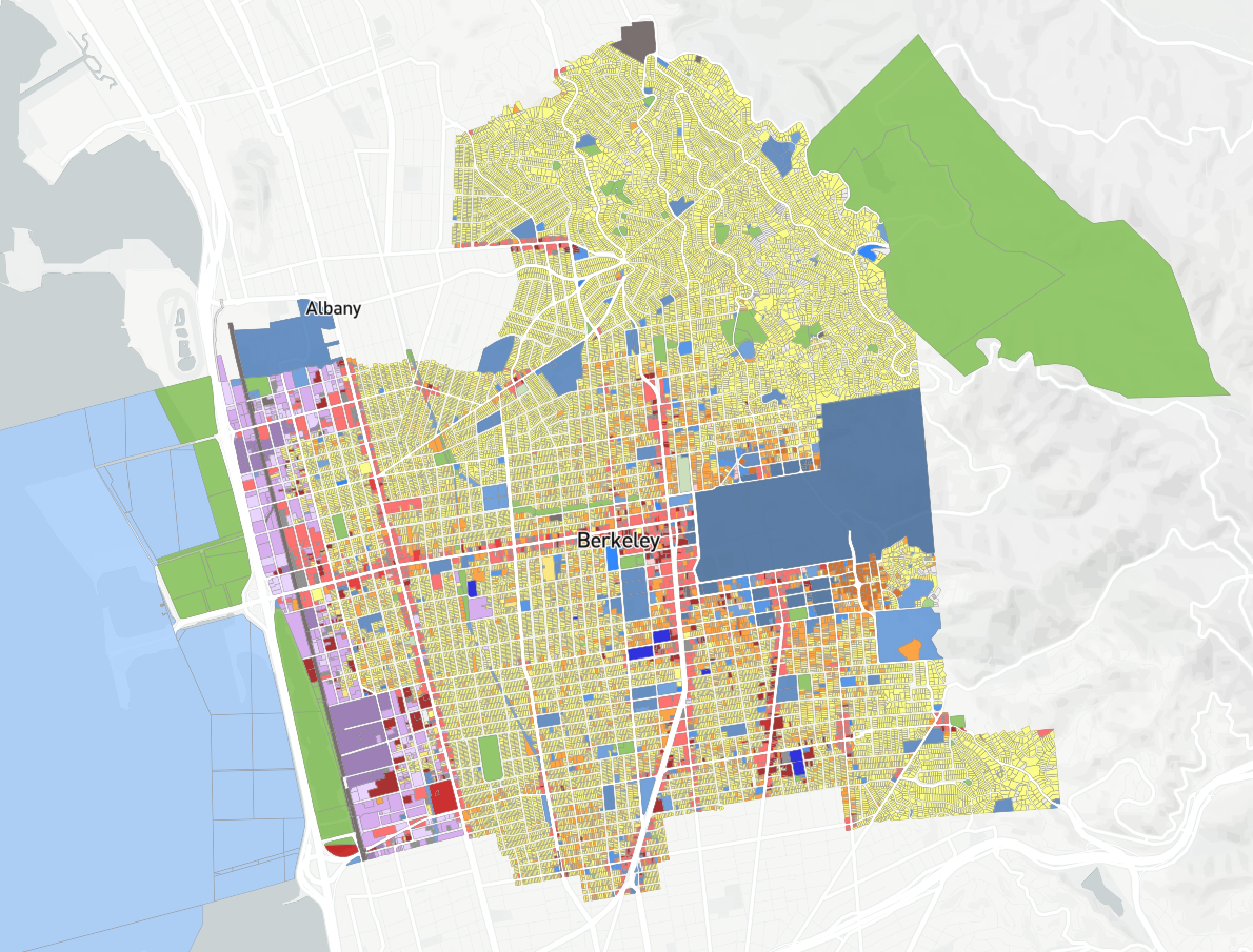
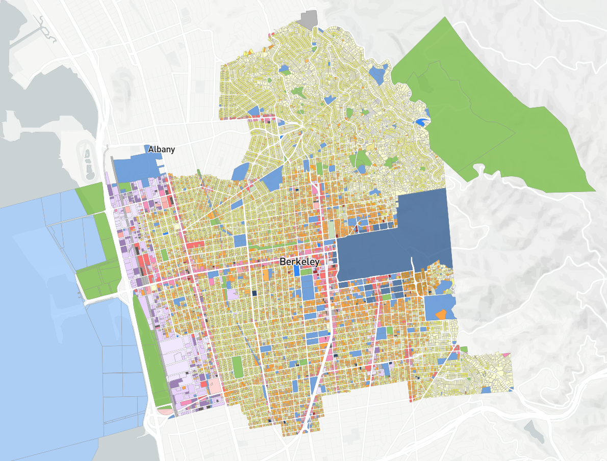
Continue exploring by selecting, in turn, the Land Use Summary (L2), LandUse Summary (L3), and Land Use Summary (L4) columns. L2 further differentiates by use, notably between single-family and multifamily residential. L3 goes yet further in differentiating by use, with corresponding symbology variations that are legible at the neighborhood scale or smaller. L4, finally, depicts the Base Canvas according to Building Types for parcel-level canvases, or Place Types for block-level canvases.
Base Canvas mapped using Land Use Summary (L2) column
Base Canvas mapped using Land Use Category (L3) column
Base Canvas mapped using Land Use Type (L4) column
Select the land use level appropriate for your map. From here you may choose to layer in other reference layers.
Export your map(s). When ready, export your map as needed. Use the map snapshot option to save a copy of the map as it appears on screen, or use the Export option to set size, resolution, legend, and scale options and export a full map layout. For guidance on map layout and export options, see Export a Map to PNG.
Highlighting Land Use by Type
You may be interested in highlighting specific land uses in your maps. For this example, we'll identify retail areas.
Apply a filter to the Base Canvas to select parcels with retail development.
From the Filter tab of the Layer Details pane for the Base Canvas layer, click the Add filter button and select L2 from the list. A list of L2 classes will appear. The count of features in each class is indicated to the right of the class name.
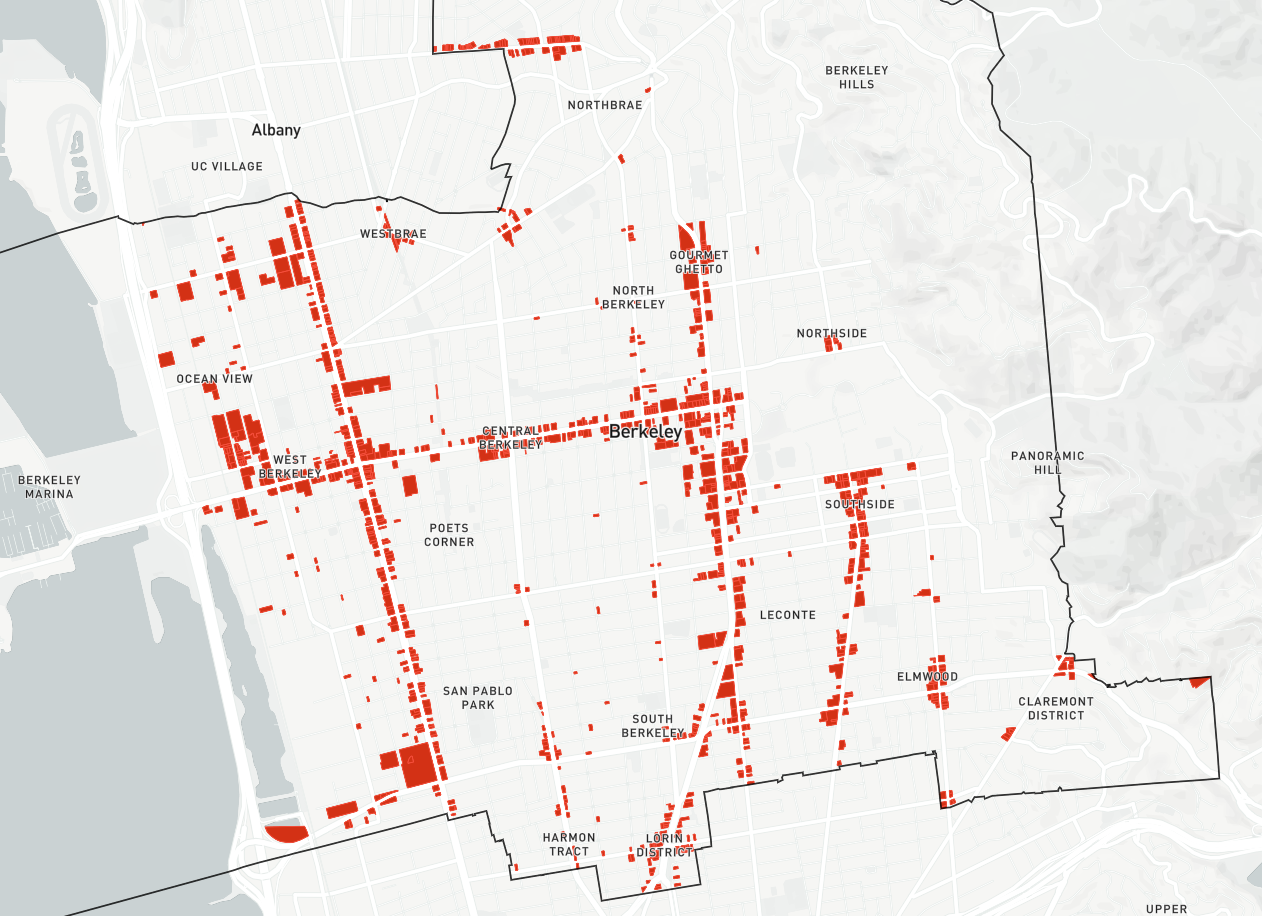
From the list of L2 classes that appears, select Retail/Commercial. All features in the Retail/Commercial class will be selected.
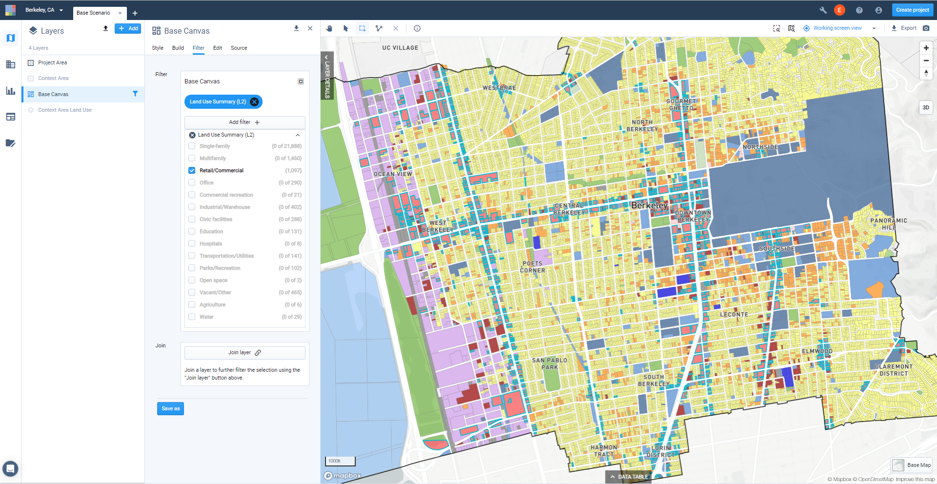
Filtered selection of Land Use Summary (L2): Retail/Commercial parcels
Click the Save as button to save the selection of Base Canvas features as a new filtered layer. We'll call this "Filtered: Base Canvas: L2 Retail/Commercial". By saving the selection of parcels as a layer, you can easily return to it, or export to CSV and other formats to summarize information for the selection of features. You can also show the filtered layer separately in maps, which we'll do next.
Note
Note that filtered layers created from the Base Canvas (or scenario canvases) are dynamic layers. If you make changes to the Base Canvas or scenarios, the content of the filtered layers will be updated to match.
View the new filtered Retail/Commercial layer. Find the new filtered layer in the Layers List, and click and drag to order it atop the Base Canvas. Show the layer by clicking the Show icon
 .
.Style the Retail/Commercial layer. From the Layer Details pane, click the Style tab. By default, the filtered layer uses the same symbology as the Base Canvas. If desired, you can change the symbology. In this case, we'll symbolize using a single symbol for the layer and increase its opacity.
Select No column (single symbol) from the Column list in the Style tab. With this option, all features in the layer are styled the same way.
Click the Edit symbology button.
Style the layer using the fill, stroke, and opacity controls. You can choose from the available color options, or specify colors using hex codes or RGB values. We'll use the settings as shown below.
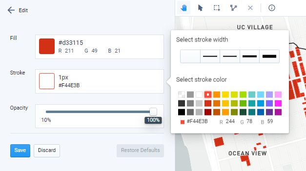
Stroke options
Save your symbology settings.
View your map. You can now see your selection of parcels. Hiding the Base Canvas highlights the location of retail areas throughout the city, as shown below.
Map snapshot of existing retail areas
Export your map. When ready, export your map as needed. Use the map snapshot option to save a copy of the map as it appears on screen, or use the Map Export option to set size, resolution, legend, and scale options and export a full map layout. For guidance on map layout and export options, see Export Maps to PNG or SVG.
Map Existing Development Densities
In this tutorial, we'll use the Base Canvas layer to map residential densities, and apply extrusion to visualize the data in 3D.
Data used | Features used |
View the Base Canvas in Explore mode. Select the Base Canvas from the Layers list to make it the active layer. Hide any other layers that may be shown by clicking the Hide icon
 .
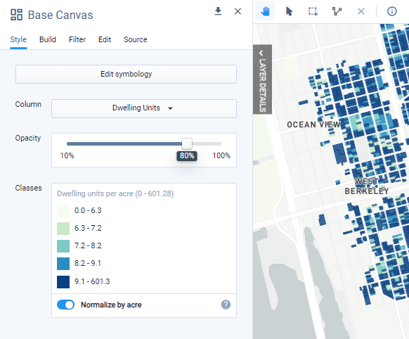
.Symbolize the Base Canvas on the Dwelling Units column. From the Layer Details pane, click the Style tab to view the layer symbology. Select Dwelling Units from the Column menu.
Normalize the column values by acre. Turn on the Normalize by acre toggle that appears below the list of classes. This option is available for all numeric columns in the Base Canvas and scenario canvases, including employment and building area characteristics. Normalizing dwelling units displays the column values as per-acre densities rather than absolute dwelling unit totals. Dwelling units are divided by the area, in acres, of each feature. The resulting values for a parcel canvas are thus net densities, since they are measured over parcel area only.
Edit the layer classes. Click Edit symbology to open the symbology editing controls.
Manually adjust the density classes. By default, the classes will be defined using the Natural Breaks method. We'll use a custom classification to map the calculated densities. Edit class bounds by clicking the Edit icon and entering new values. To add new classes, click the button displaying the number of classes. Adjust your net residential density classes as appropriate for your project.
Apply or re-apply a fill ramp. Reset the fill ramp by clicking the Fill ramp control and selecting from the options that appear. If desired, you can manually edit the fill colors for the classes by clicking their individual swatches.
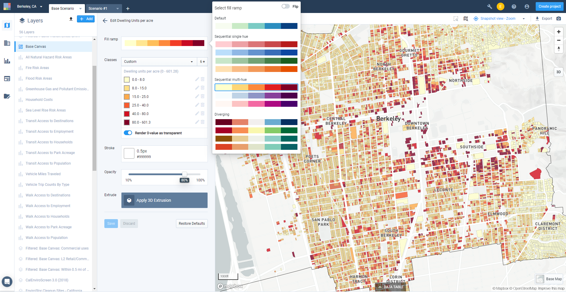
Symbology options
Explore your resulting map.
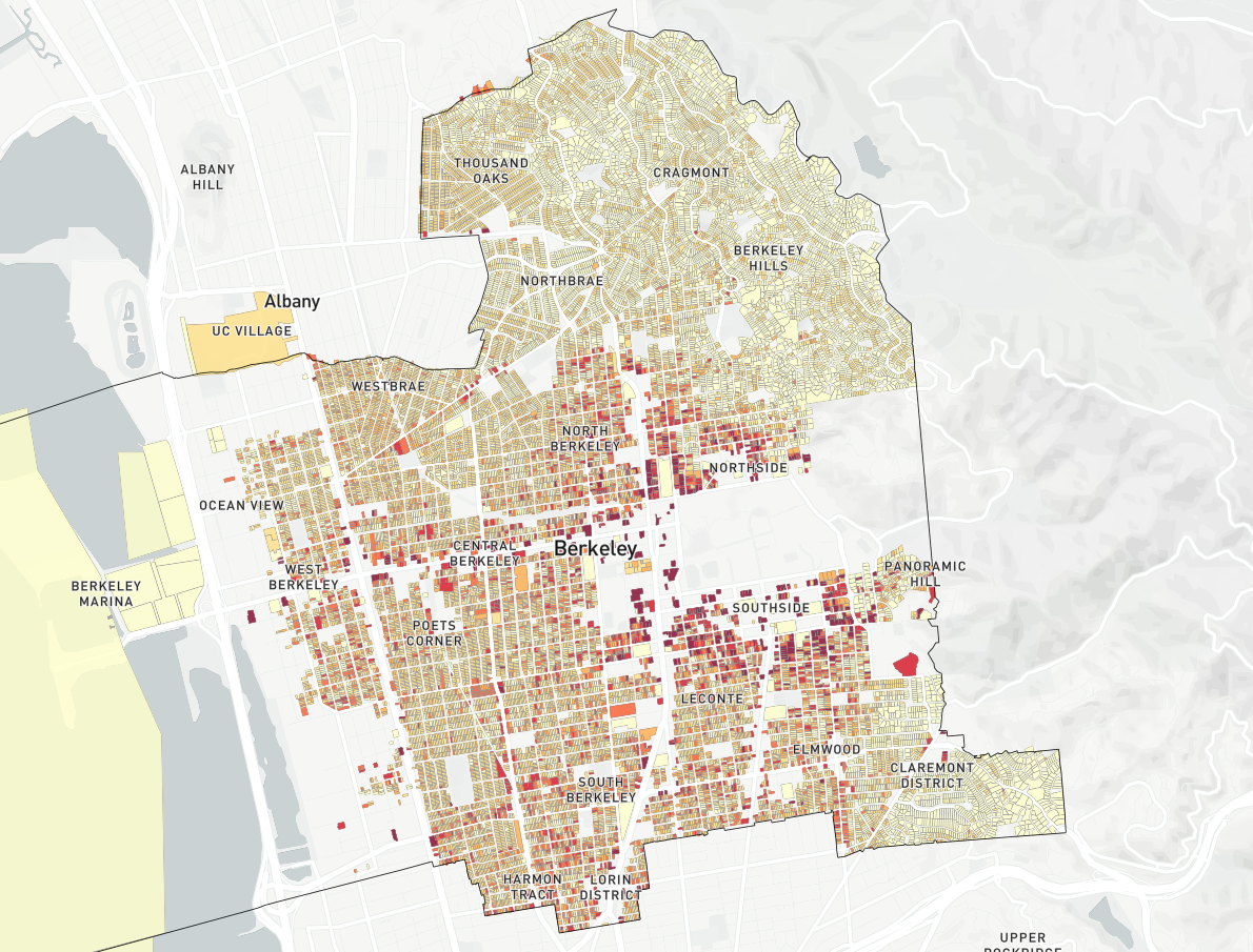
On-screen map view of housing densities
Save the layer symbology. Once you're satisfied with your data classes and layer style selections, click Save. Don't close the symbology editor yet, though. In the next step, we'll apply 3D extrusion to the layer to add another dimension to our map.
Extrude the Dwelling unit per acre data. Extruding the data will allow you to visualize variations in residential densities using feature height.
Enter 3D map view mode by clicking the 3D button on the map.
Click Apply 3D Extrusion. The extrusion controls appear.
Turn on the Extrude column values toggle.
Adjust the scale factor using the slider to set the extrusion height range.
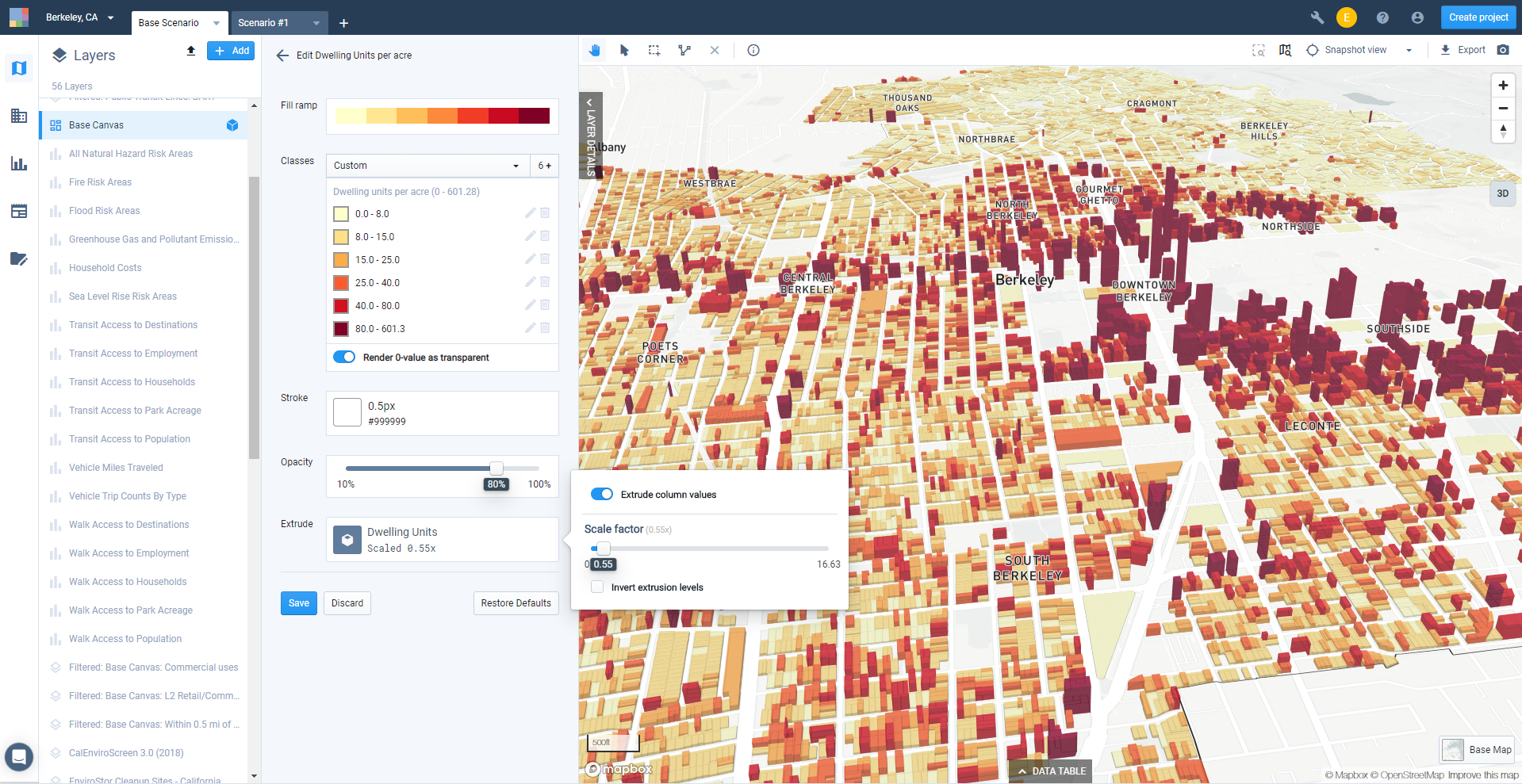
Extrusion controls
Explore your resulting map. You can use the map bearing control
 to adjust the tilt and rotation of your map view. Click and hold, then move your mouse to adjust. Moving up and down tilts the view, while moving left and right rotates it. Double-clicking the map bearing control resets the bearing to north while maintaining your tilt level.
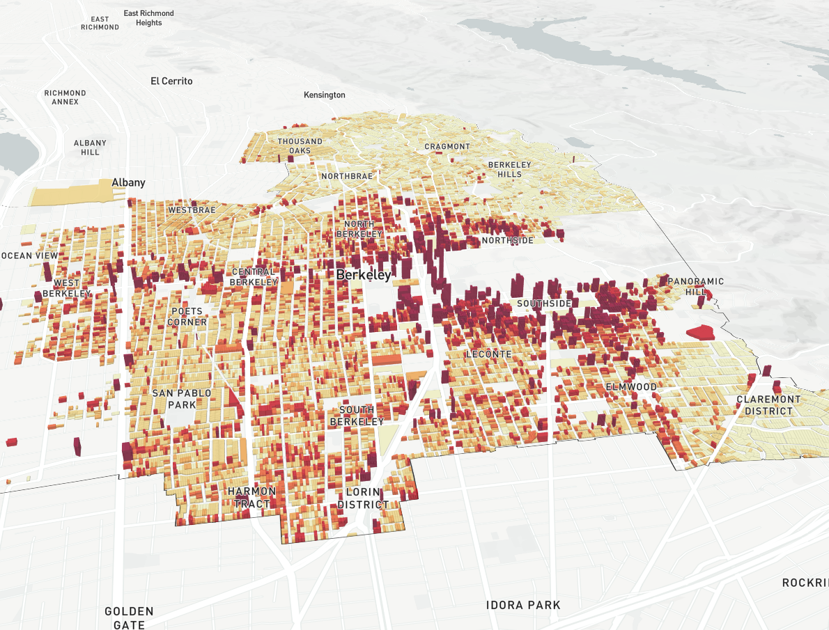
On-screen map view of housing densities with 3D extrusion
Save the layer symbology. Once you're satisfied with your extrusion settings, click Save.
Complete and export your map. For our example, we've added layers to show the three BART metro stations in Berkeley, and half-mile radius station areas around them that were created as buffers. For more information on using buffers, see Create a Buffered Layer. For more information on map layout and export options, see Export Maps to PNG or SVG.
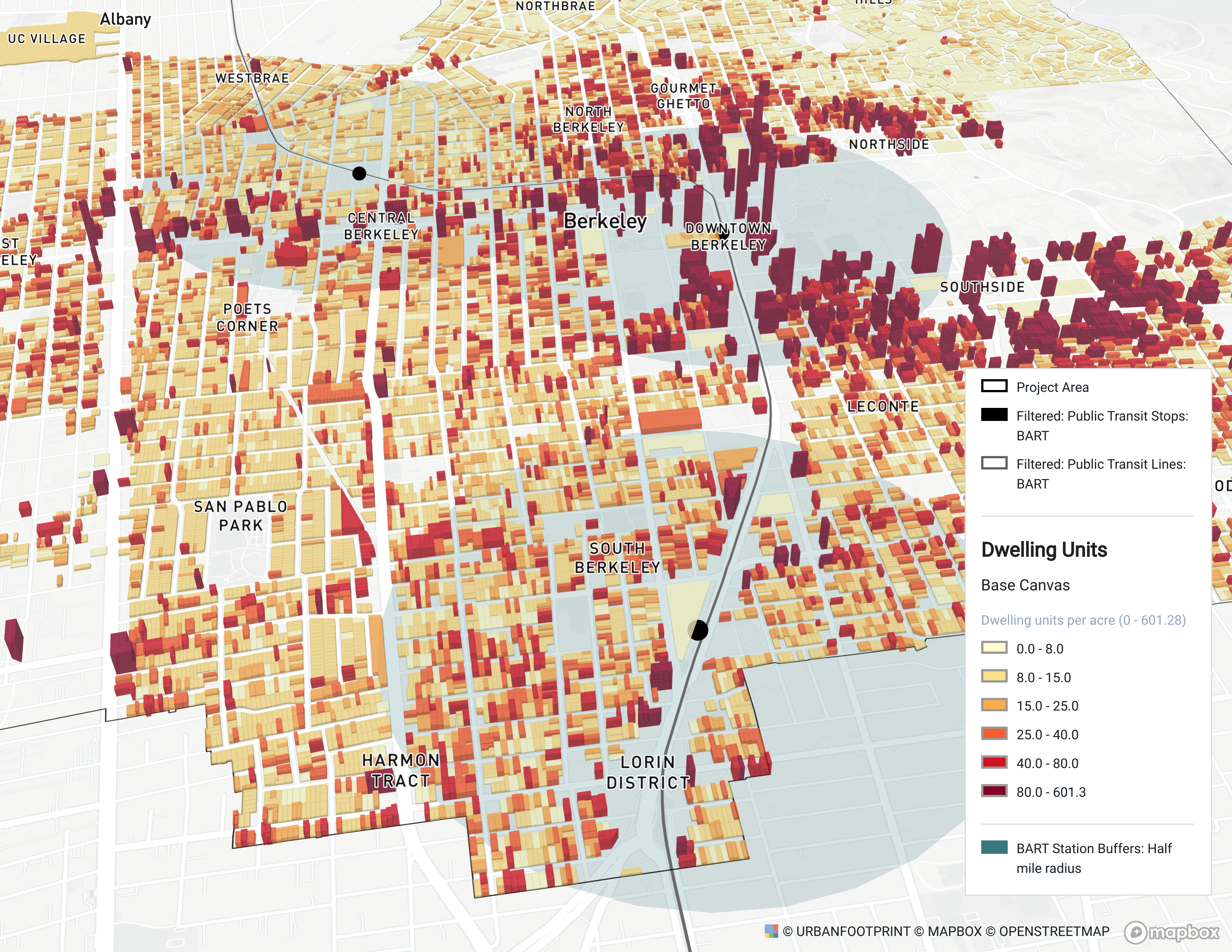
Housing densities around BART stations in Berkeley, 3D view with extruded data
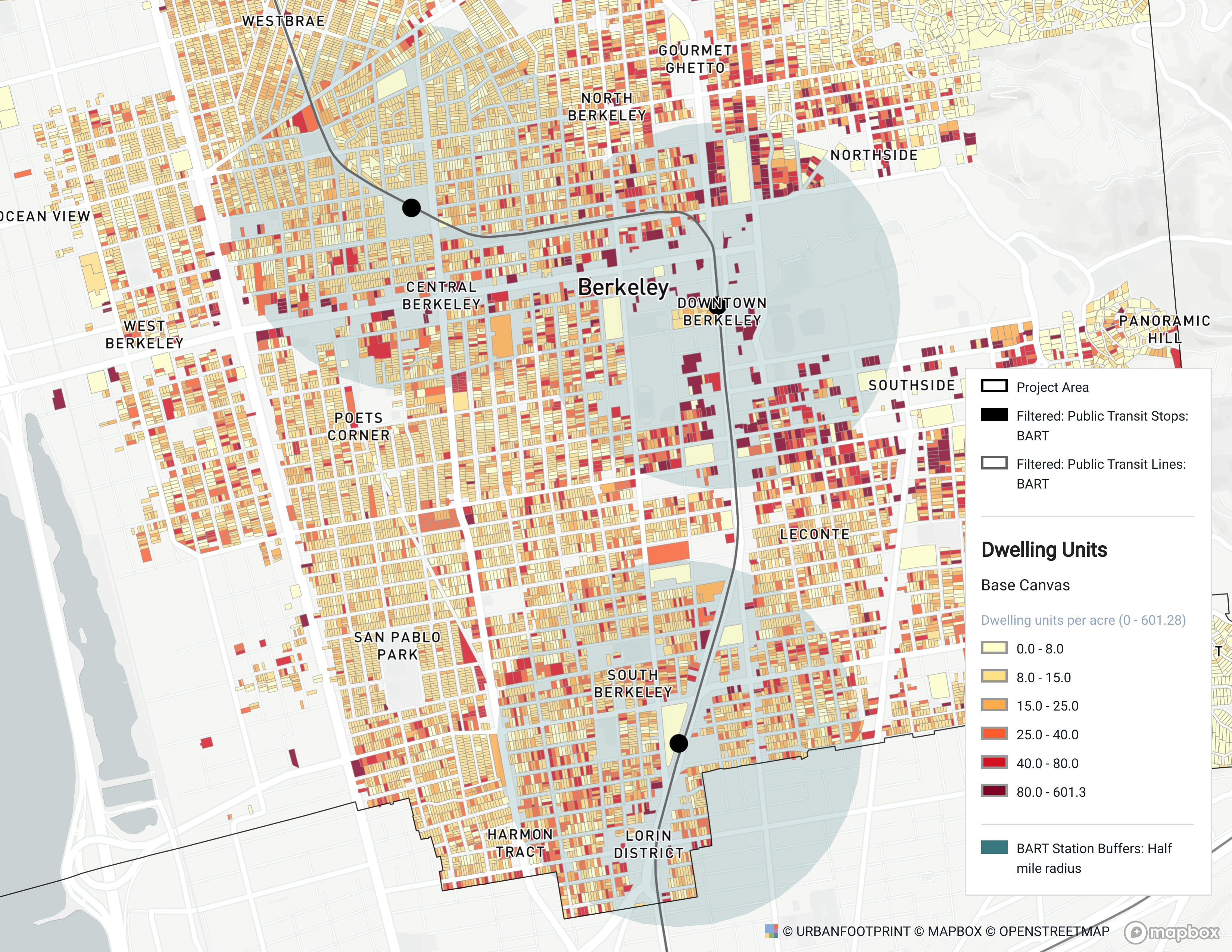
Housing densities around BART stations in Berkeley, flat view
Map Environmental Layers
In this tutorial, we'll explore and map reference data reflecting where development isn't appropriate, such as flood zones. You'll need to have a project to work with before you begin (see Create Projects for instructions).
Data Layers | Features |
Reference data layers |
Select Add > Add pre-defined layers at the top of the Layers pane to open the Layer Manager.
Browse for relevant reference data layers. The Layer Manager organizes reference data by category. Expand the Environment & Land Cover category to see what datasets are available in your project and context area. Analyst includes a number of reference datasets with national coverage, including conservation areas, endangered species critical habitat, hydrography, terrestrial ecoregions, watersheds, wetlands, wildlife corridors, and more from multiple sources.
You may also find datasets from state and local or other sources. For example, Analyst includes extensive data used to support the Conservation module (available for projects in California); these layers can be found in the Conservation category.
You can also look up datasets by name using the search box. Any layer names containing the text you enter will be returned.
Clicking on a layer displays its metadata, including a description of the dataset, the data source, scale, last updated date, and a column reference table including column descriptions and data types.
To add new data layers to your project, click the + button for a layer to add it to your project's Layers list. You can add multiple layers at once. Click Close to close the Layer Manager. The selected reference data layers will appear in your Layers list.
Explore the data layers on your map. Reference data layers generally come loaded with default symbology for a selected column. Other columns may contain relevant data for your project. You can view the column descriptions through the Source tab of the layer details pane, and explore the values through the map or data table.
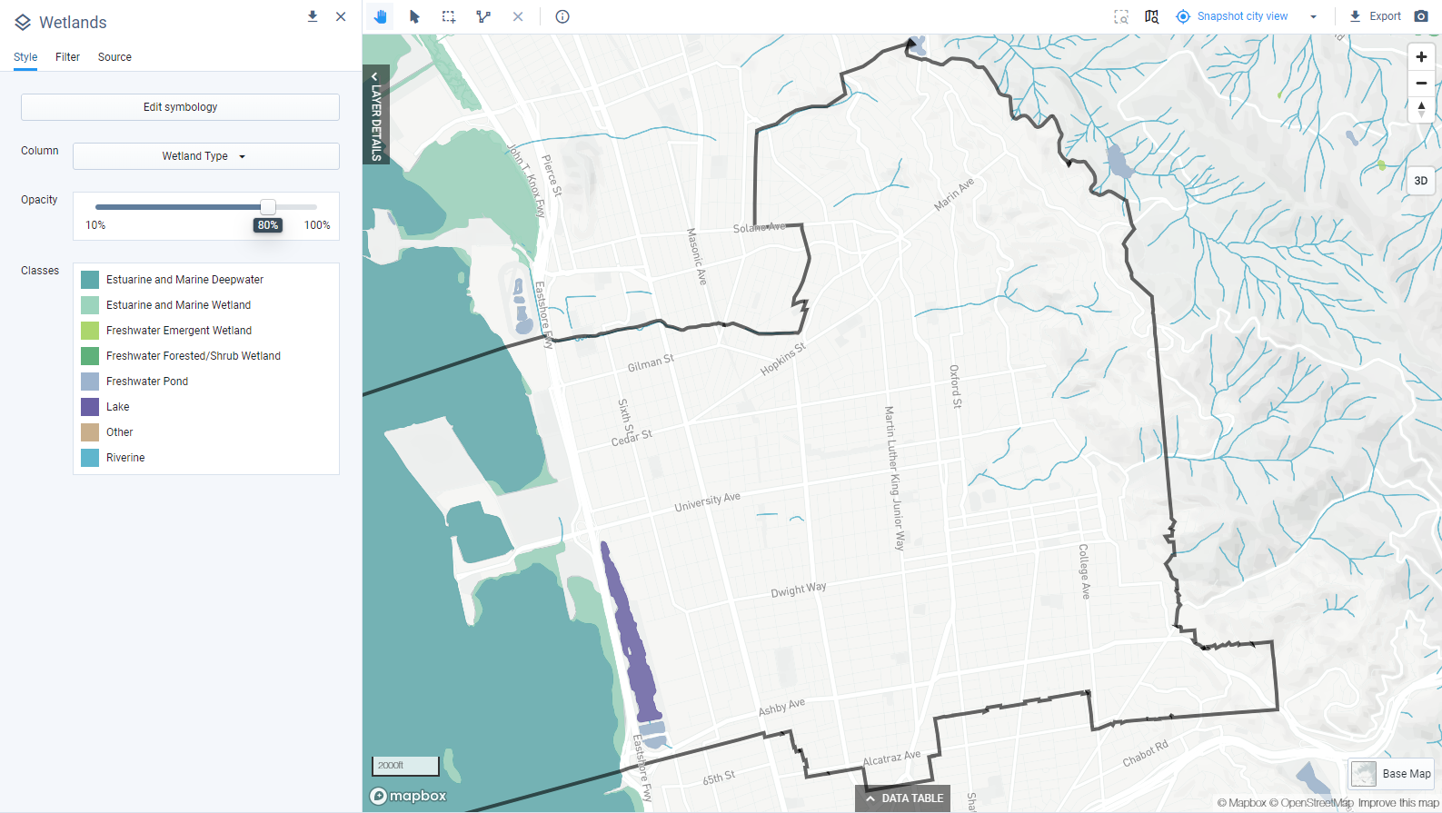
View of Wetlands reference data layer
Design your map. Determine which layers you want to show, and set symbology for each. For guidance on styling layers, see Edit Layer Symbology.
When ready, export your map as needed. Use the map snapshot option to save a copy of the map as it appears on screen, or use the Export option to set size, resolution, legend, and scale options and export a full map layout. For more information on map layout and export options, see Export Maps to PNG or SVG.
Map Reference Data: Public Transit Lines
Symbology can be used highlight spatial patterns in your data. In this tutorial we'll use the Symbology Editor to classify data and apply styles. Then, we'll create a map export. You'll need to have the Public Transit Lines reference layer loaded to your project before you begin. See Explore Reference Data for steps on adding data from the Layer Manager.
Data used | Features Used |
Public Transit Lines reference data layer |
Select Add > Add pre-defined layers to open the Layer Manager.
Add the Public Transit Lines layer. For our example, we'll work with the Public Transit Lines reference layer to assess transit service frequencies in Berkeley. You can find the layer quickly by typing into the search box. Select the layer and click the + button to add them to your project. Click Close to close the Layer Manager.
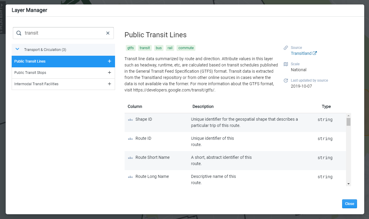
Layer Manager view of metadata for the Public Transit Lines reference data layer
Activate the Public Transit Lines Layer. Click on the layer in the Layers list. The Layer Details pane opens to the Style tab. By default, this layer is symbolized on the Mode column, as shown below.
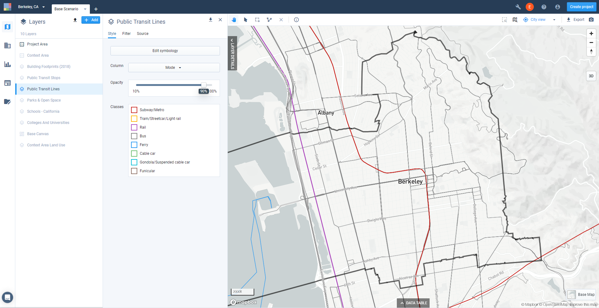
Default symbology for the Public Transit Lines reference layer
Select a column to symbolize. From the Column menu, select Weekday Daytime - Headway Avg. This column indicates the average headway (the amount of time between vehicle arrivals) for each route over the course of a representative weekday from 6 am to 10 pm. (You can view definitions for each column via the Source tab of the Layer Details pane.)
The map is updated to show the default symbology for the column.
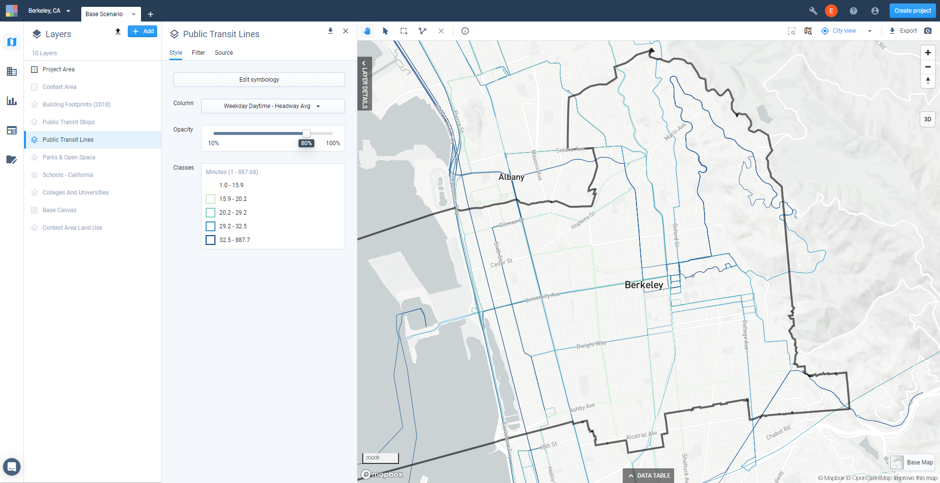
Default classes and symbology for a selected column
Open the Symbology Editor. Click Edit symbology.
Edit class bounds. By default, the numeric classes for the column are defined using the Natural Breaks method. We'll keep the same number of classes, but manually edit the bounds. For each entry, click the Edit icon
 , enter the desired bounds, then click Apply. For our example, we'll set the thresholds between classes at 15, 20, 25, and 30 minutes.
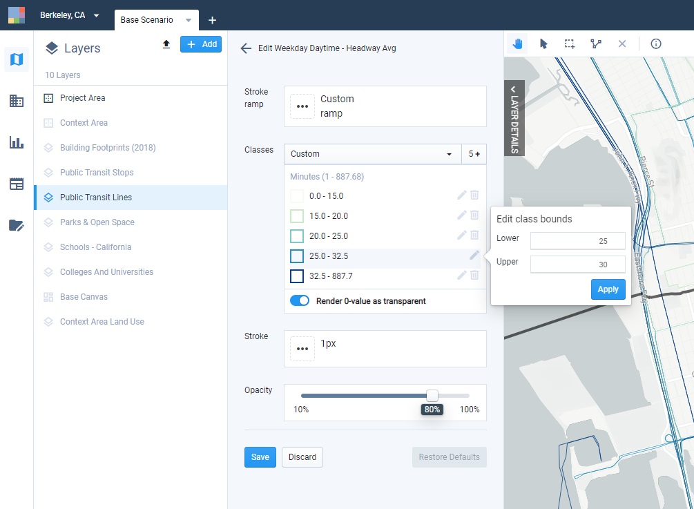
Manually editing class bounds
Adjust the stroke ramp. Click the Stroke ramp control to select another color ramp. We'll use a diverging ramp to see very clear delineations among the classes. Use the Flip toggle to reverse the order of the colors. Click outside the stroke ramp selection window to close it.
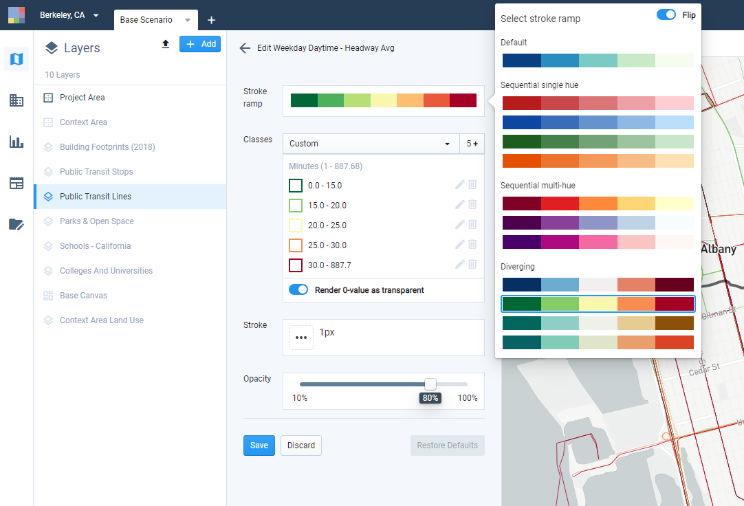
Selecting a stroke ramp
Change the stroke width. Click the Stroke control to select a different width. We'll use a 2px stroke. Click outside the stroke width selection window to close it.
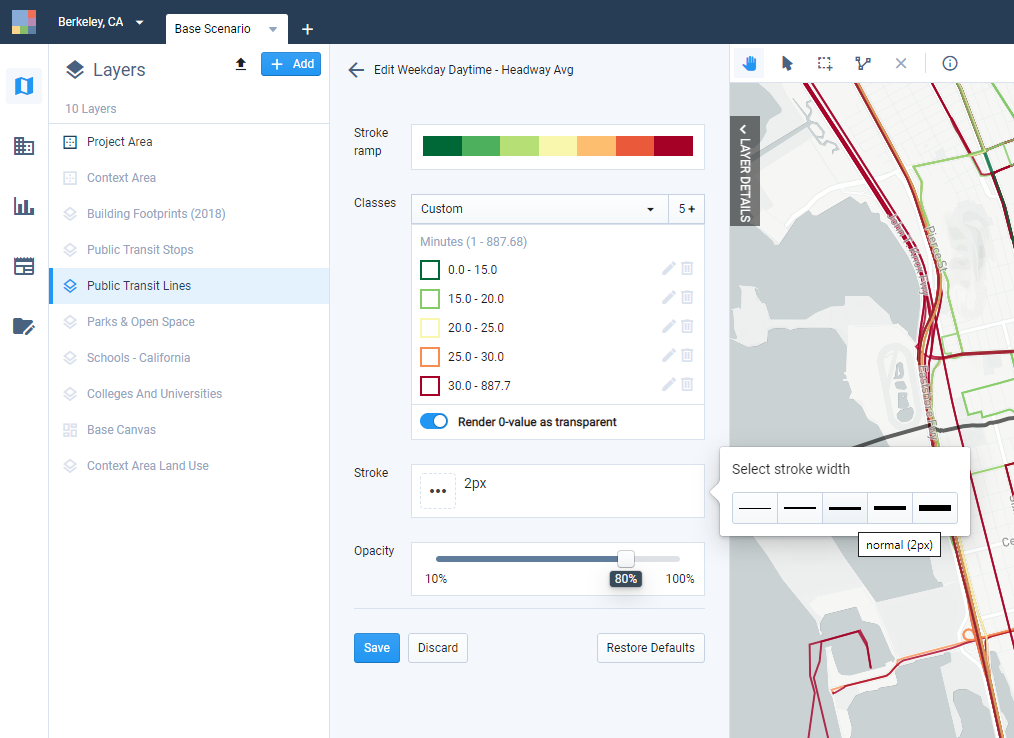
Selecting a stroke width
Click Save to save your settings. If you navigate away from the Symbology Editor before saving, your changes will be lost. You can always return to the default symbology by clicking Restore Defaults.
Change your base map options. Click the Base Map control at the lower right corner of the map view to open the Base Map Features window. Select the Dark base map option to clearly see all the classes using the color ramp we selected. Turn on Roads and Rail Labels. Click outside the window to close it.
Create a map snapshot. Click the Map Snapshot button
 to quickly export a PNG image of your map as it appears on screen. Here's a snapshot of our resulting map. Snapshots can be useful for quickly sharing maps, or for use in slide presentations.
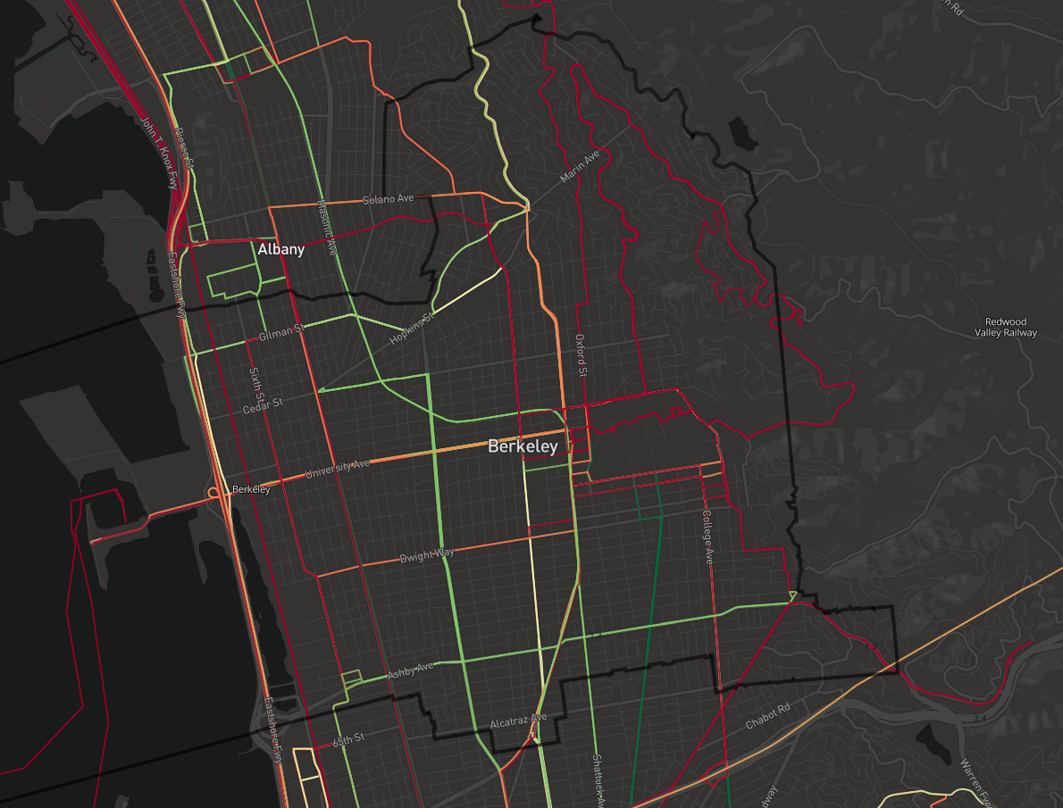
Map snapshot showing Public Transit Lines layer
Create a map export. Using Map Export, you can set map size, resolution, legend, and scale options and export a full layout.
Click the
 Export button that appears above the top right corner of the map to open the Map Export window.
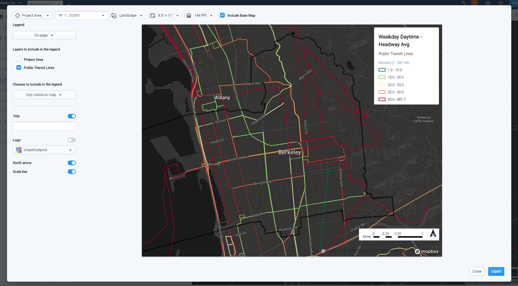
Map Export window
Select the PNG export option at the top left corner of the window.
Set your map orientation, size, and resolution.
Pan, zoom, and set a map scale to adjust your map view.
Save your map position. Map positions (known elsewhere as bookmarks) are saved map views defined by their center point and scale. Map positions can be saved from the Map Export window or from the main map view. You can reproduce the same map view for future maps given a saved map position in combination with the same orientation and size settings.
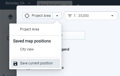
Saving a map position
Specify settings for a map legend. You can select the layers to include, as well as categorical classes according to their visibility on the map. If desired, you can include the legend as a separate image file, which can be useful in creating a custom legend outside of Analyst.
Include a map title, if desired.
Include a logo, if desired. You can upload a custom logo by selecting Upload a new logo from the Logo menu, then dragging an image file to the window.
Include a north arrow and scale bar, if desired.
Select whether to include the base map or not. The base map is included by default, but you can turn it off.
For more detailed information on map layout and export options, see Export Maps to PNG or SVG.
Click Export to export your map. Exporting your map will take time depending on its scope. When complete, you will be prompted by a notification to download your map.
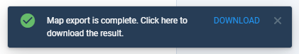
Click Download in the notification bar. A PNG file for your map, or a zip file containing PNG files for your map and legend, will be downloaded to your computer.
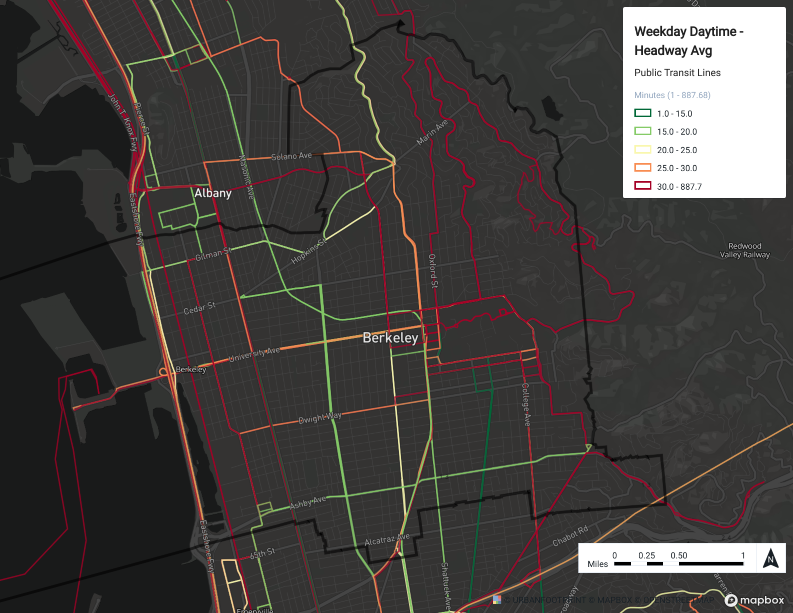
Completed map export
Map Local Areas of Interest: Landmarks, Parks, and Open Space
In this tutorial we'll create and export a map to show local landmarks, parks, and open space. Along the way, we'll create a filtered layer to focus on landmarks within the project area.
Data Used | Features Used |
|
Select Add > Add pre-defined layers at the top of the Layers pane to open the .
Add the Landmarks (Census Points of Interest) and Parks & Open Space layers. You can find the layers quickly by typing into the search box. Select the layers and click the + button to add them to your project. Click Close to close the Layer Manager.
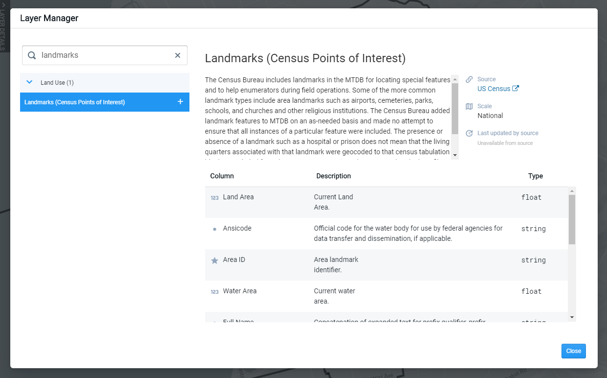
Layer Manager view of metadata for the Landmarks reference data layer
Show the newly added layers. Once loaded to your project, the reference data layers will appear at the bottom of your Layers list, and will be hidden by default. Show the Landmarks and Parks & Open Space layers by clicking the Show icon
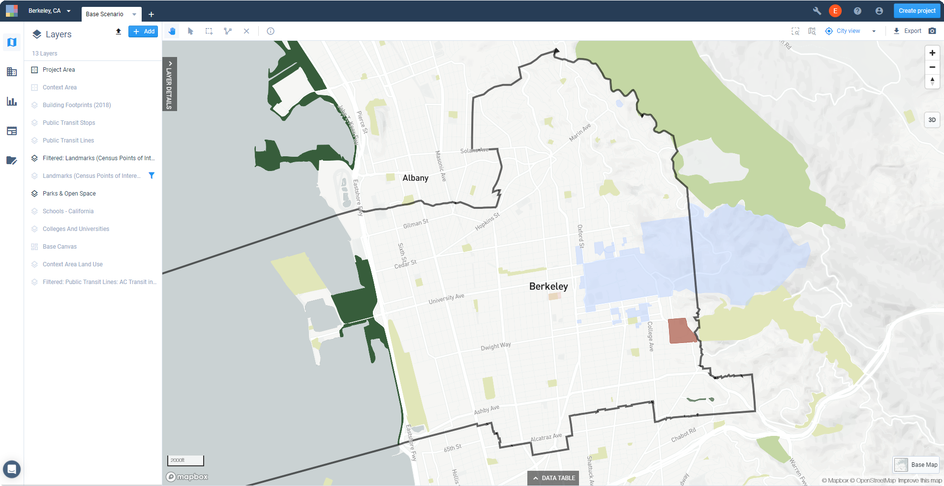
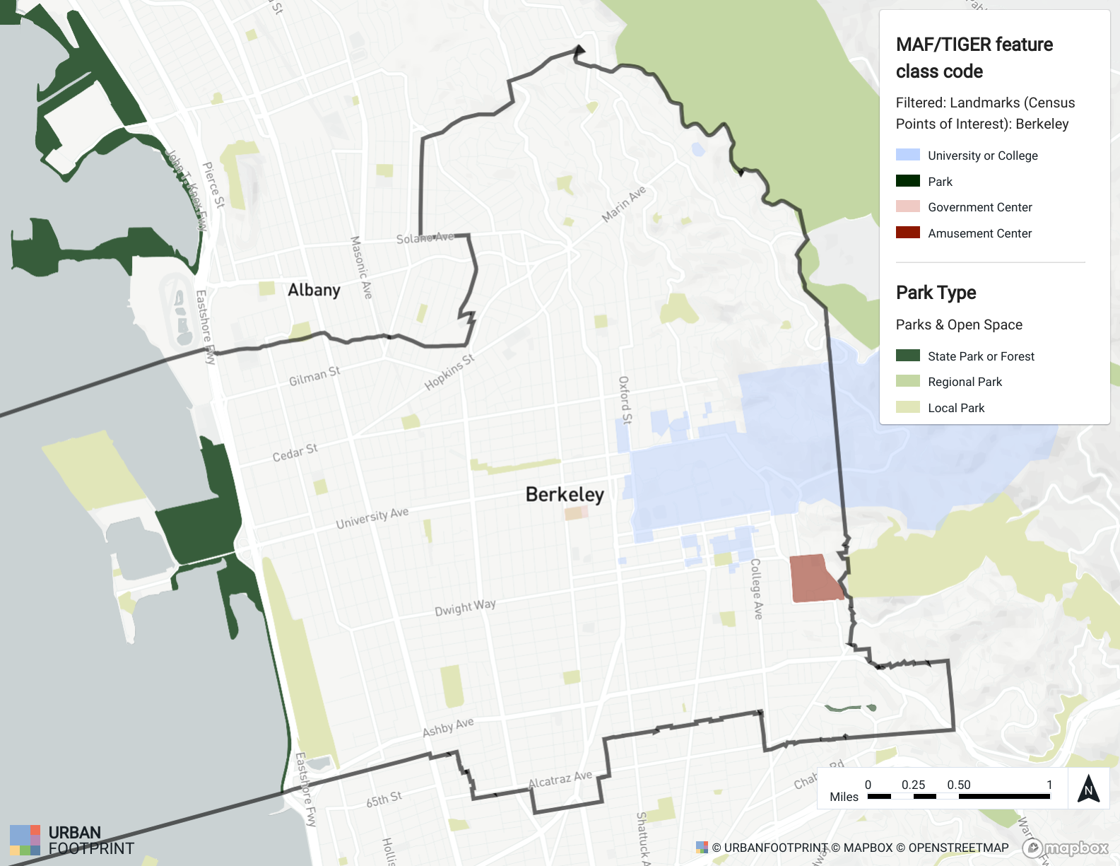
for their entries in the Layers list. Click and drag the Landmarks layer to sit above the Parks & Open Space layer.Looking at the map for our example, we can see some overlap between the reference layers. We want a map that includes parks and open space as well as other points of interest in Berkeley. To remedy this, we'll create a filtered selection of features from the Landmarks layer to include features in Berkeley only, and exclude those parks that are also represented by the Parks & Open Space layer.
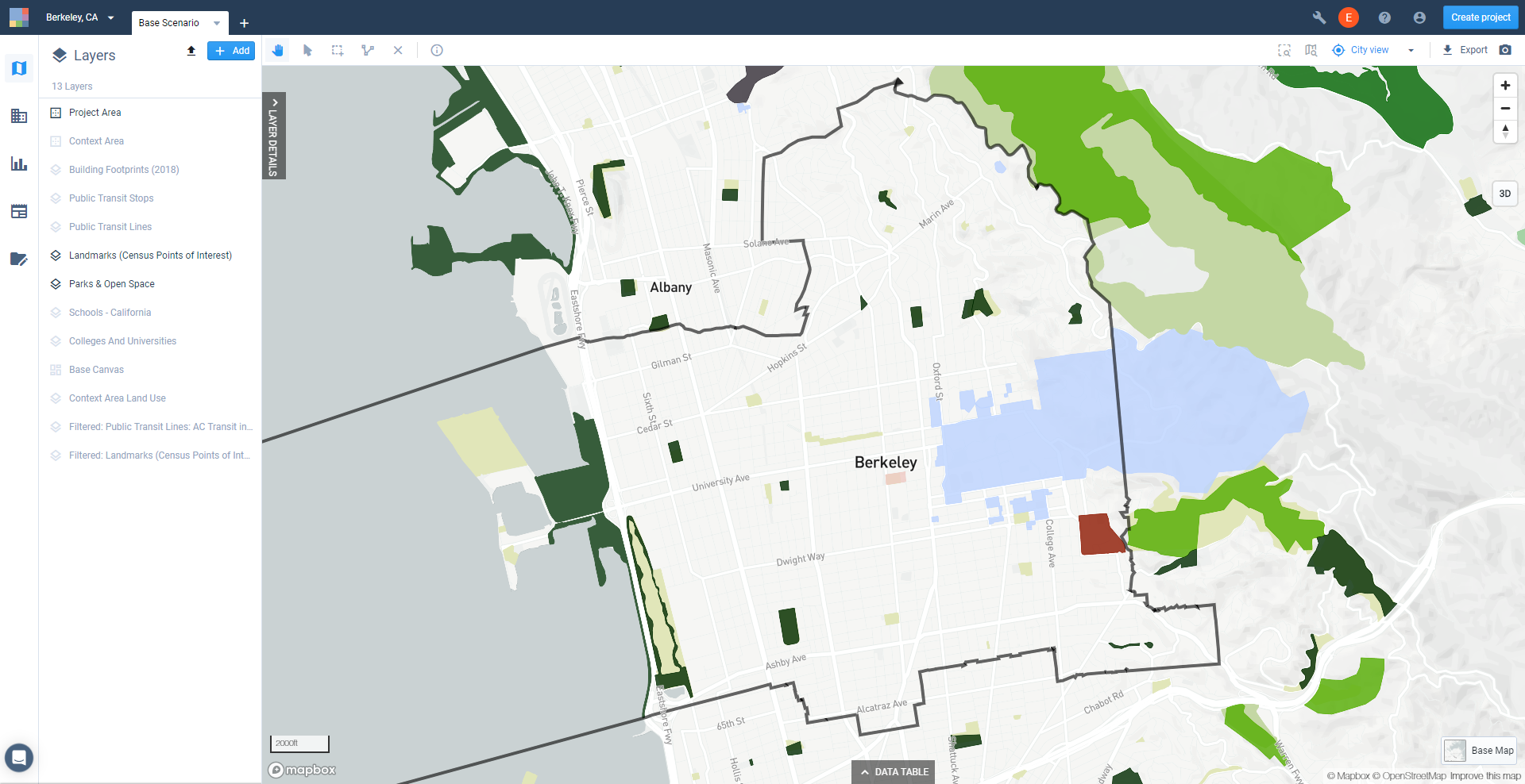
Landmarks and Parks & Open Space layers, shown with overlapping features
Create a selection of features from the Landmarks layer. Activate the layer in the Layers list, then open the Filter tab of the Layer Details pane.
Click the Join layer button and select Project Area from the list of layers that appears. This will filter your layer to include only those features that intersect the project area, and highlight (in turquoise) the selection on the map.
In our example, you can see that the join filter has selected features that touch the border of our project area boundary, but are effectively outside it. We need to refine the selection.
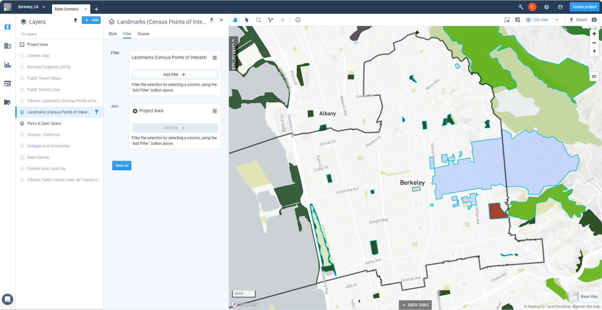
Resulting selection of a join to the Project Area boundary
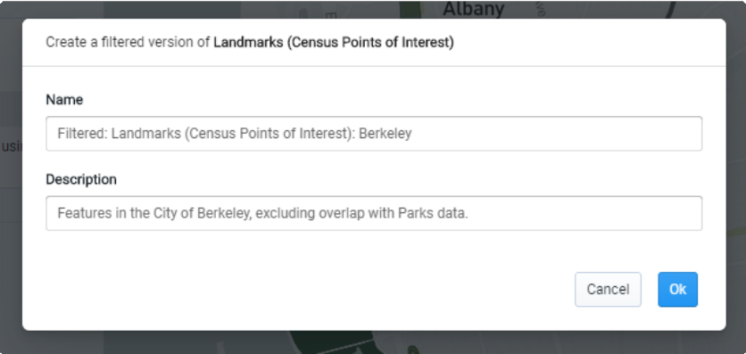
Use the Point Selection tool
 to manually edit the filtered selection. We'll edit the selection to exclude the outside features touching the project area boundary, and those that overlap with features in the Parks & Open Space dataset.
Click the Point Selection tool
at the upper left of the map view. Then, hold down the Shift key and click on the features to exclude from your selection.Save your edited selection of features as a filtered layer. Click Save as and give your new filtered layer a name. You can add a description too.
Show your new filtered layer. We'll use the newly saved filtered layer in place of the original reference data layer. The filtered layer will have the same symbology properties of the original layer.
Find the filtered layer, and show it by clicking the Show icon
. Click and drag it in the Layers list to sit above the Parks & Open Space layer. Hide the original Landmarks layer by clicking the Hide icon  .
.
Map view showing the filtered Landmarks layer and the original Parks & Open Space layer
Specify the properties of your map export. Using Map Export, you can set map size, resolution, legend, and scale options and export a full layout.
Click the
Export button that appears above the top right corner of the map to open the Map Export window.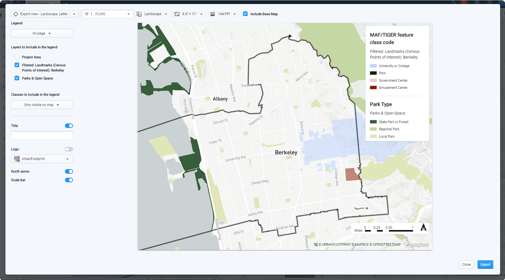
Map Export window
Select the PNG export option at the top left corner of the window.
Set your map orientation, size, and resolution.
Pan, zoom, and set a map scale to adjust your map view.
Save your map position. Map positions (known elsewhere as bookmarks) are saved map views defined by their center point and scale. Map positions can be saved from the Map Export window or from the main map view. You can reproduce the same map view for future maps given a saved map position in combination with the same orientation and size settings.
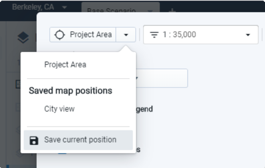
Saving a map position
Specify settings for a map legend. You can select the layers to include, as well as categorical classes according to their visibility on the map. If desired, you can include the legend as a separate image file, which can be useful in creating a custom legend outside of Analyst.
Include a map title, if desired.
Include a logo, if desired. You can upload a custom logo by selecting Upload a new logo from the Logo menu, then dragging an image file to the window.
Include a north arrow and scale bar, if desired.
Select whether to include the base map or not. The base map is included by default, but you can turn it off.
We'll use the settings shown below. For more detailed information on map layout and export options, see Export Maps to PNG or SVG.
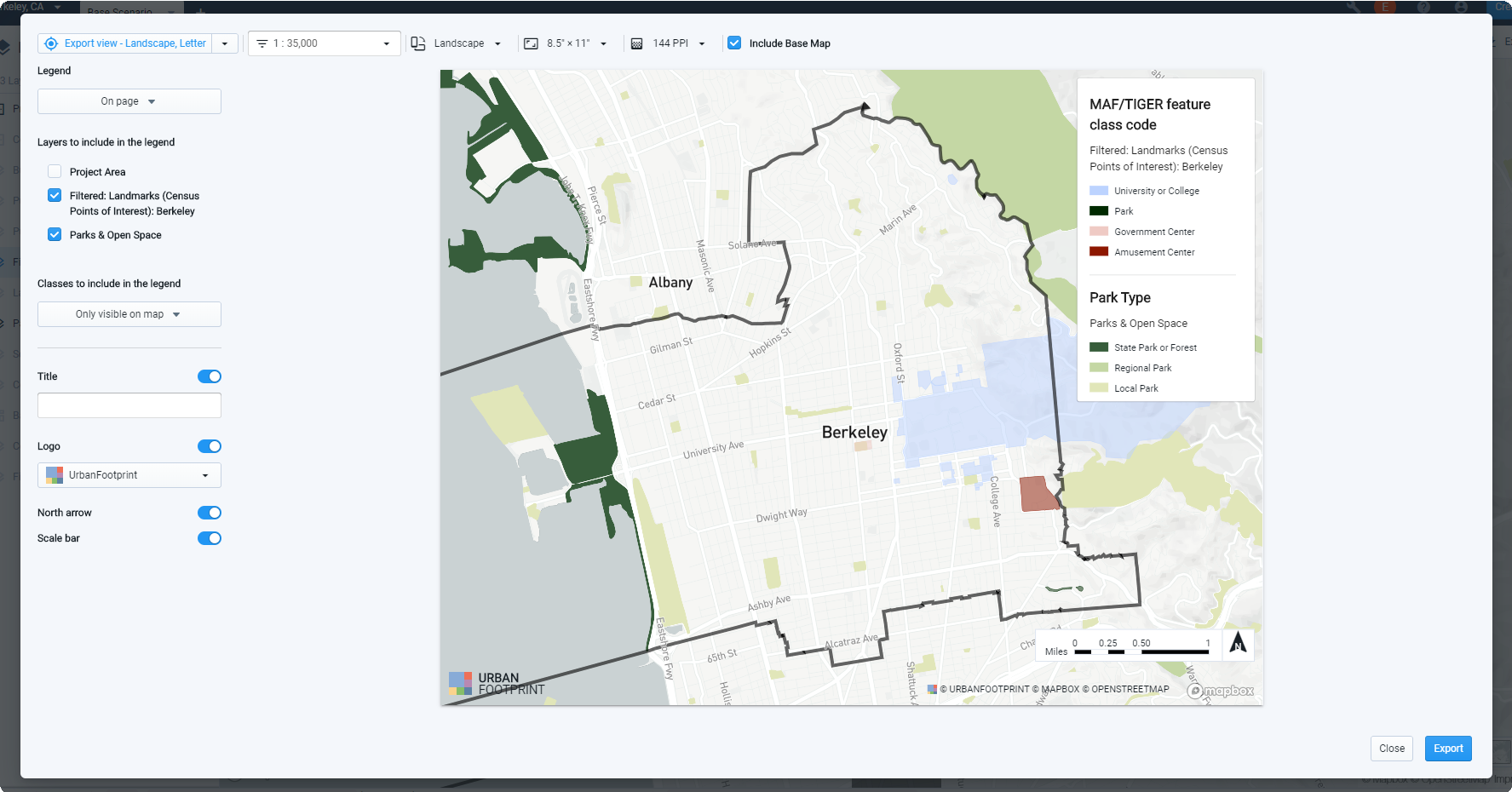
Map export settings
Export your map. Click Export. Exporting your map will take time depending on its scope. When complete, you will be prompted by a notification to download your map.
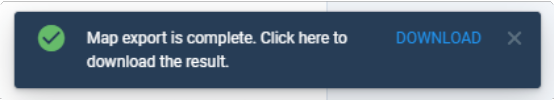
Download your export. Click DOWNLOAD in the notification bar. A PNG file for your map, or a zip file containing PNG files for your map and legend, will be downloaded to your computer.
Completed map export
Assess Natural Hazard Risk
In this tutorial, we'll run the Risk and Resilience module for the Base Scenario to gauge the potential impacts of natural hazards, including fire, flood, and sea level rise risk. The module produces spatial outputs that show what canvas features fall within hazard zones, and reports the land area, population, dwelling units, and jobs in each.
Note that the hazard area layers used as inputs to the module, which show the full geographic detail of areas at risk, are included as reference data. See the next tutorial, Map Natural Hazard Risk Areas, for guidance on adding them to your project.
All analysis modules can be run on the Base Scenario to reflect existing conditions, with results that serve as a comparison point for future scenarios. (The one exception to this is the Land Consumption module, which measures change with respect to land use development in growth scenarios.) The steps to run modules and access outputs are common to all analysis modules. For more information on using analysis modules in Analyst, see the Features documentation for Run Analysis Modules, and links to the analysis module methodologies for more detailed information.
Data Layers | Features |
Risk and Resilience analysis output layers |
Click on the Base Scenario tab. Modules are run for individual scenarios. The Base Scenario, which consists of the Base Canvas, is generated upon project creation to reflect existing conditions.
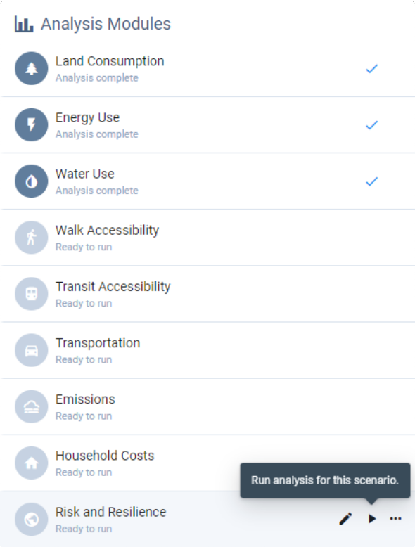
Enter Analyze mode by clicking the Analyze mode button
 in the Mode bar. The Analysis Modules pane appears. All available modules are listed, and the current state of each is indicated.
"Ready to run" indicates that analysis has not yet been run.
"Analysis complete" indicates that a module has been run and the results are up to date.
"Analysis out of date" alerts you that a module has been run, but changes have since been made to the scenario's land use or analysis parameters; in this case, analysis needs to be re-run to update the results. Updating the Base Canvas will render all modules in all scenarios out of date.
Hover over the Risk and Resilience module and click the Run analysis button. The module will start running. As it runs, you will see an in-progress indicator. When complete, a checkmark will appear. You can then view your results.
Note
Analysis run times vary according to the size of your project and the complexity of the modules, with some requiring a few minutes or more. While you wait, you can run other modules, continue using other features in the platform, switch to another project, or even close Analyst.
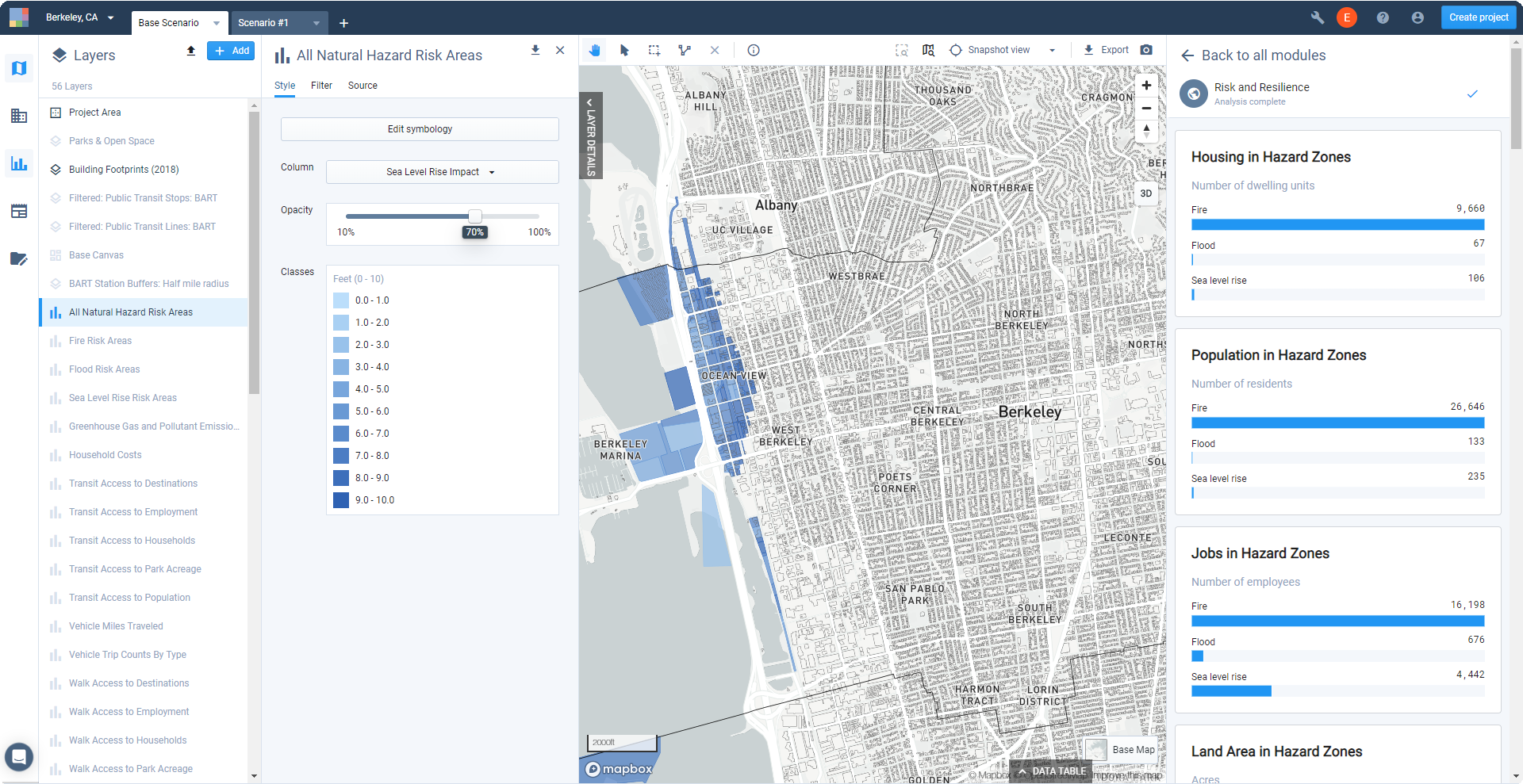
View the Risk and Resilience module results in Analyze mode. Analysis results can be viewed on the map and data table, via charts for the current scenario, or via charts in Report mode that compare results across multiple scenarios. We'll first look at the results for the Base Scenario in the Analysis pane.
Select the Risk and Resilience module in the Analysis pane. A set of charts appears, depicting a range of summary results including housing, population, jobs, land area, and number of canvas features in hazard zones, by type of hazard and hazard designation.
View the Risk and Resilience module results in Report mode. Enter Report mode by clicking the Report mode icon
 in the Mode bar, then select the Risk and Resilience module. Report mode allows you to compare the results for the Base Scenario with other scenarios. If you haven't developed scenarios or run analysis on others yet, only the Base Scenario results will be shown.
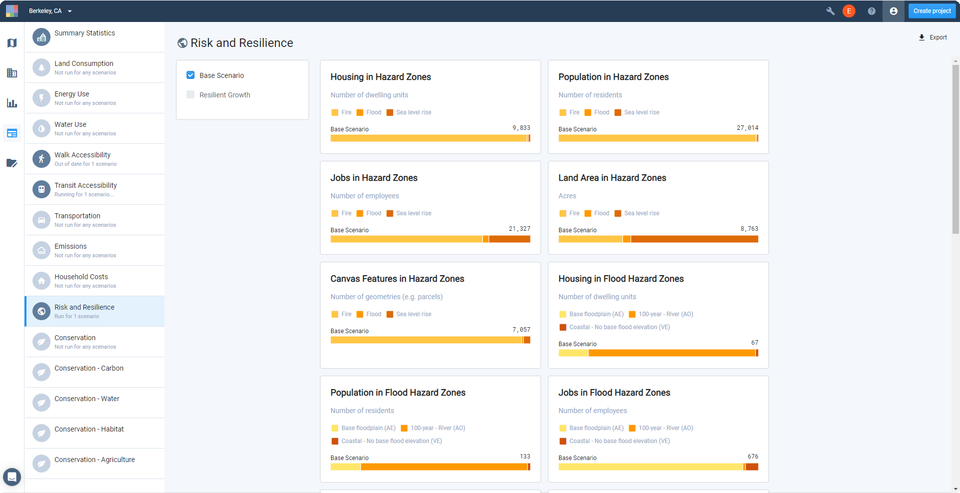
Export the module results summary. Click the
Export button to export the results. An Excel report containing all data as represented by the summary charts will be downloaded to your computer. You will also have the option of exporting the output layers or their data tables to work more closely with the results.View the Risk and Resilience module output layers. Once an analysis run is completed, one or more output layers for the module appear in your Layers list. The Risk and Resilience module produces four output layers:
All Natural Hazard Risk Areas – a composite layer that brings together the Flood Zone, Sea Level Rise Impact, and Fire Hazard Zone designations (if any one applies to a feature) as separate columns. The layer also includes columns for canvas feature area (in acres), population, dwelling units, and jobs.
Fire Risk Areas – a layer that includes Fire Hazard Zone designations for features if High, Moderate, or Very High, along with columns for canvas feature area (in acres), population, dwelling units, and jobs.
Flood Risk Areas – a layer that includes Flood Zone designations for features (if any are applicable), along with columns for canvas feature area (in acres), population, dwelling units, and jobs.
Sea Level Rise Risk Areas – a layer that includes Sea Level Rise Impact designations for features that will be inundated at sea level rise heights up to 10 feet, along with columns for canvas feature area (in acres), population, dwelling units, and jobs.
The layers include only those canvas features that are impacted by hazards. The All Natural Hazard Risk Areas composite layer includes canvas features that are impacted by at least one of the hazard types.
Each layer comes loaded with default symbology for the hazard designations. Explore the layers on your map to see what areas in your project are affected.
Select features from the output layers. You can use a combination of filters, join filters, buffers, and the manual selection tools to select groups of features, for example for features in particular areas or for specific hazard designations. For information on using filters, join filters, and buffers to select features, see Filter and Join Data and Create a Buffered Layer.
You can save selections of analysis output layer features as filtered layers. Note, however, that filtered layers saved from analysis outputs are not dynamic. That is, the filtered layers will not be updated if analysis results are re-run.
Use the data table to view and export data for the selected features. Expand the data table. You'll see that the row count at the top right of the data table pane indicates the number of selected features. The column summary options allow you to see the sum, mean, min, or max for numeric data columns. This may provide all the information you need, or you might opt to export the data for use outside Analyst.
Export the data for the selected Base Canvas features. You can export CSV data from the data table, or to other formats using layer export.
To export the CSV data, click the Export as CSV button above the data table for either the active Base Canvas selection, or the filtered layer that you saved. When your export is ready, click the notification to download to your computer.
To export the saved filtered layer to CSV, CSV with geometries, GeoJSON, GeoPackage, shapefile, or SVG formats, use the Layer Export control at the top right of the Layer Details pane. See Export Layer Data for more details.
Now you can work with your exported data using Excel or other tools to summarize information as needed. You can also use the new filtered data layers for highlighting features and areas in maps.
Use the output layers in maps as needed. For guidance on styling layers, see Symbolize Data Layers. For more information on map layout and export options, see Export Maps to PNG or SVG.
Map Natural Hazard Risk Areas
In this tutorial, we'll explore the natural hazard risk layers used by the Risk and Resilience module. While you don't need to add these reference data layers to your project in order to run analysis, the layers are useful for data exploration and map production, and to indicate where development isn't appropriate, such as in a flood zone.
Data Layers | Features |
|
Select Add > Add pre-defined layers at the top of the Layers pane to open the Layer Manager.
Expand the Risk & Resilience category. The datasets used by the Risk and Resilience module are available here as reference layers. They include:
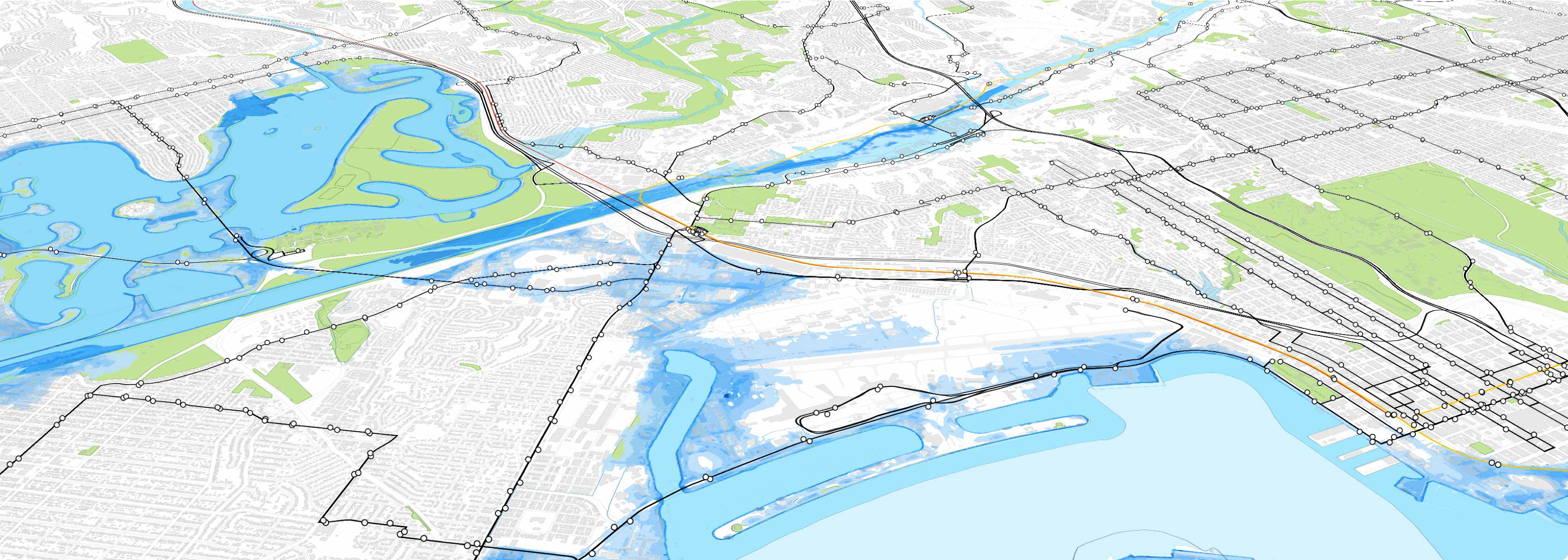
Fire – Wildfire Hazard Potential from the US Forest Service Fire Modeling Institute is used nationally outside California. Fire Hazard Severity Zones from the California Department of Forestry and Fire Protection (CAL FIRE) is used in California.
Flood – Flood Hazard Areas from the Federal Emergency Management Agency (FEMA) is used nationally.
Sea Level Rise – Sea Level Rise (x ft) from the National Oceanic and Atmospheric Administration (NOAA) is used nationally.
You can view the metadata for the reference layers via the Layer Manager. The Risk & Resilience category also includes other reference data layers, including earthquake, storm surge, and toxic release hazards. (Reference data not used by the Risk and Resilience module can be used to assess risk via a process of joining hazard layers to the Base Canvas or scenario canvases.)
Add the hazard layers to your project. Click the + button next to the layer names in the Layer Manager to add them to your Layers list.
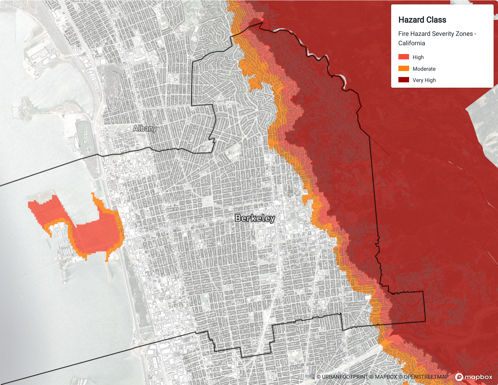
Fire Hazard Zones
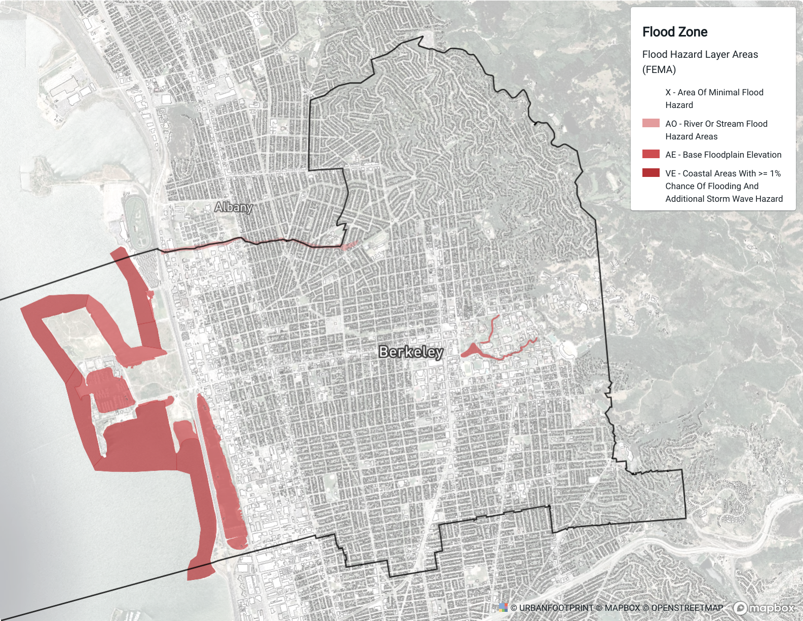
Flood Zones
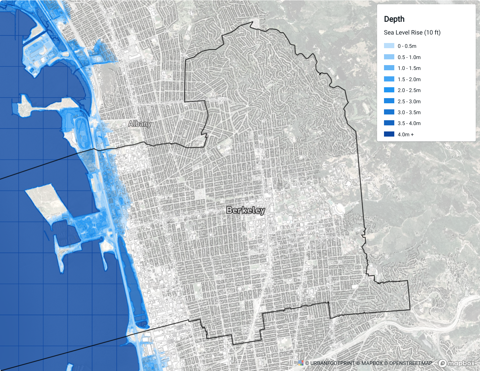
Sea Level Rise areas
Explore the hazard layers. The layers come loaded with default symbology for a selected column. Other columns may also contain relevant data for your project; you can view the column descriptions through the Source tab of the layer details pane, and explore the values through the map or data table.
Use the hazard layers in maps as needed. For guidance on styling layers, see Symbolize Data Layers. For more information on map layout and export options, see Export Maps to PNG or SVG.